Color Drenching 101: How to Pull Off the Monochromatic Trend Without Regrets

Color Drenching 101

There’s a particular kind of design confidence that walks into a room and doesn’t apologize. It doesn’t hedge with safe neutrals or break up bold choices with anxious white trim. It commits, fully and unapologetically. This is the essence of color drenching, the design technique that’s rewriting the rules of how we think about color in living rooms.

If you’ve scrolled through design Instagram lately, you’ve seen it: rooms saturated in a single hue from ceiling to skirting board, where terracotta walls meet terracotta trim, where forest green envelops every surface, where dusty pink becomes not just a color but an atmosphere. It looks fearless. It looks expensive. And if you’re like most people staring at your builder-beige living room, it probably looks impossible to pull off without professional help or deep regret.

Here’s what the design industry knows that most homeowners haven’t figured out yet: color drenching 101 isn’t about being brave with color. It’s about being smart with it. When you understand color drenching 101 properly, you realize it’s the difference between painting everything the same shade and creating a room that breathes in monochrome. Between a space that feels like it’s suffocating under too much sameness and one that feels architecturally complete, visually sophisticated, and emotionally resonant

The traditional approach to living room color, white or cream walls, maybe one accent wall if you’re feeling adventurous, trim in a crisp contrasting white, was designed to be safe. And it is. Soul-crushingly safe. It fragments rooms into disconnected pieces. It shrinks spaces by creating visual breaks. It makes even beautiful furniture feel like it’s floating in a showroom rather than belonging to a cohesive home.

Color drenching rejects this timidity entirely. It understands that when you commit to a single color family across all surfaces, something almost magical happens: the room stops being a collection of walls, ceiling, and trim, and starts being a unified space. The architecture recedes. The color becomes the architecture. Your living room transforms from a box you’ve decorated into an environment you’ve created.

This isn’t a trend borrowed from European heritage interiors or maximalist hotels because it looks good in photographs (though it absolutely does). It’s resonating because we’re collectively exhausted by the sterile, over-brightened, Instagram-white interiors that promised calm but delivered cold. We’re craving spaces that feel like something cozy, dramatic, serene, and energizing rather than carefully designed to offend no one.

But here’s where most people get color drenching catastrophically wrong: they think it’s as simple as picking a bold paint color and applying it everywhere. They ignore undertones. They skip finish variation. They forget about texture. They create rooms that are technically monochromatic but feel flat, oppressive, or hotel-lobby generic rather than layered, personal, and lived-in.

This guide to color drenching 101 exists because when executed with intention and intelligence, color drenching is the single most transformative thing you can do to a living room. But it requires understanding not just color, but how color behaves in three-dimensional space, in changing natural light, across different materials and finishes.

What follows are the five non-negotiable rules for color drenching your living room in a way that feels confident rather than chaotic, immersive rather than overwhelming, and deeply personal rather than slavishly trendy. These aren’t beginner tips for adding color to your space. This is color drenching 101 at the level where design actually works, where rooms feel expensive because they’ve been thought through, not because you’ve spent a fortune

The single biggest mistake people make when learning color drenching 101 is treating color selection like choosing a favorite shade. They fall in love with a saturated emerald green in a boutique hotel bathroom, decide their north-facing living room needs that exact color, and six months later they’re repainting everything builder white because they can’t stand being in the space.

Color drenching magnifies everything about a color—its undertones, its relationship with natural light, its psychological weight. In a living room, where you spend hours daily, where morning light and evening light create entirely different color experiences, where the color will interact with your existing furniture and the view through your windows, choosing the wrong hue doesn’t just look bad. It makes the room fundamentally unliveable.

The Natural Light Equation

Before you even think about color swatches, you need to understand your living room’s light personality. South-facing rooms flood with warm, consistent light that can handle cooler tones without feeling sterile. North-facing rooms receive cooler, more constant light that will make cool colors feel icy and uninviting but will add complexity to warm tones. East-facing living rooms are warm and golden in the morning, shadowy by evening. West-facing rooms do the opposite.

Here’s what this means for color drenching 101: that perfect sage green you tested on a sunny Saturday morning in your west-facing living room will look muddy and depressing by 4pm on a winter afternoon. The rich terracotta that feels cozy and enveloping in natural daylight might turn aggressively orange under evening artificial lighting. You’re not choosing a color. You’re choosing how that color performs across twelve hours of changing light conditions.

Test your shortlisted colors for at least three full days. Paint large poster boards (at least 2×3 feet) and move them around the room. Observe them in morning light, afternoon light, evening artificial light. Watch how they interact with your sofa, your curtains, your flooring. A color that works at all times of day is rare. A color that works at most times of day and fails only during hours you’re not home? That’s your winner.

Color Drenching 101: How to Pull Off the Monochromatic Trend Without Regrets

Undertones Are Everything

Every color has an undertone—a secondary hue that becomes more apparent when you saturate a room with it. Grays have blue, green, or purple undertones. Beiges can lean pink, yellow, or gray. Even “pure” colors like navy or forest green will reveal unexpected warmth or coolness when applied to every surface.

In traditional decorating, undertones matter but can be corrected with contrasting trim or accent colors. In color drenching, undertones become the dominant visual experience. A gray with blue undertones will make your living room feel cold and unwelcoming, no matter how sophisticated it looked on the paint chip. A beige with pink undertones might create an accidentally rosy effect that feels either romantic or like you’re living inside a salmon, depending on your furniture choices.

The fix: test colors against the largest fixed element in your living room—usually your flooring. If you have warm oak floors, cool-toned colors will create visual tension. If you have gray-toned carpet or concrete, warm colors need to be intentionally warm enough to create deliberate contrast rather than muddy confusion.

Color Drenching 101: How to Pull Off the Monochromatic Trend Without Regrets

Mood Mapping Before Color Commitment

Different colors create profoundly different psychological experiences, and in a color-drenched living room where you can’t escape to a neutral wall, this matters intensely. Warm, earthy tones (terracotta, ochre, warm rust) create cozy, grounding spaces that feel intimate and protective. Mid-tone blues and greens (sage, eucalyptus, slate blue) feel calming and contemplative. Deep, saturated colors (navy, forest green, charcoal) feel dramatic and cocooning but can shrink spaces visually. Soft, dusty pastels (dusty pink, pale sage, soft lavender) feel romantic and airy but require careful handling to avoid looking too sweet or childish.

Ask yourself: how do you actually use your living room? If it’s your decompression zone after work, saturated jewel tones might be overwhelming rather than luxurious. If you entertain frequently, you want colors that feel sophisticated and conversational, not so dramatic they become the only topic of conversation. If you work from home and spend daylight hours in this space, ensure the color doesn’t drain you visually over eight hours.

The Renter’s Calculation

If you rent, color drenching 101 still works, but your color choice needs to account for reversibility. Lighter, softer tones are easier to paint over when you move (one coat rather than three). Consider your security deposit relationship with bold color realistically. That said, many landlords care less about color choice than color execution—a perfectly painted deep navy room might cause less concern than a badly painted beige one.

Alternatively, use color drenching principles without paint: layer textiles, curtains, cushions, throws, and removable wallpaper in your chosen hue. You won’t achieve the full architectural immersion of painted surfaces, but you’ll create enough tonal saturation to understand whether you can live with this color before making permanent commitments.

Color Drenching 101: How to Pull Off the Monochromatic Trend Without Regrets

If Rule 1 of color drenching 101 is about choosing the right color, Rule 2 is about understanding that this technique isn’t actually monochromatic in the way most people think. It’s not about making everything exactly the same. It’s about creating enough variation within a unified color family that the room feels layered, dimensional, and alive rather than flat and one-note.

This is where most DIY color drenching attempts fail. They paint walls, ceiling, and trim in the same finish and wonder why the room feels oppressively uniform rather than sophisticatedly cohesive. They match their sofa, curtains, and cushions too precisely and create a showroom effect rather than a lived-in space. They forget that the human eye craves visual interest, and when you remove color contrast, you must replace it with textural and tonal variation.

The Three-Finish Strategy

In a traditionally painted room, you might use the same paint finish throughout—usually matte or eggshell on walls, perhaps semi-gloss on trim. In color drenching 101, finish variation becomes your primary tool for creating visual interest without breaking the color story.

Use matte on the majority of wall surfaces. Matte absorbs light, creates depth, and makes colors feel rich and velvety. It’s forgiving of wall imperfections and creates that expensive, heritage-interior look that makes color drenching feel intentional rather than accidental.

Use eggshell or satin on trim, skirting boards, and architectural details. The subtle sheen creates definition without the harsh contrast of white trim. In natural light, these elements will catch light differently than the matte walls, creating shadow lines and depth that prevent the room from reading as a single flat plane.

Consider gloss or semi-gloss on one unexpected element—perhaps window frames, door frames, or built-in shelving. This creates focal points and reflects light in ways that add luminosity to the space. In a deep-colored room, glossy trim can prevent the color from feeling heavy. In a pale-colored room, it adds sophistication and prevents the space from feeling too soft.

The result: your living room is technically one color, but it’s performing three different visual jobs. The eye travels. The space breathes. You’ve created dimension without diluting the color’s impact.

Color Drenching 101: How to Pull Off the Monochromatic Trend Without Regrets

Texture as the Second Color

When you remove color variation, texture becomes exponentially more important. This is where textiles, materials, and surface finishes do the heavy lifting that accent colors would normally provide.

In a color-drenched living room, you want multiple textures within your chosen color family: chunky knit throws, smooth velvet cushions, linen curtains, wool rugs, leather accents, woven baskets, ceramic vases, glass table surfaces. Each material reflects and absorbs light differently. Velvet looks rich and deep. Linen looks soft and lived-in. Leather adds warmth and patina. Ceramic adds smoothness and refinement.

Layer these deliberately. A sage green living room becomes infinitely more interesting when you have a sage linen sofa, sage velvet cushions, a sage wool rug in a slightly different tone, sage ceramic table lamps, and natural wood furniture that picks up the green’s undertones. You’ve stayed rigidly within the color family but created a room that feels curated and dimensional rather than matched and monotonous.

Avoid the matchy-matchy trap. If your walls are a specific shade of terracotta, don’t try to match your textiles to that exact shade. Instead, work with the color family: burnt orange, rust, clay, warm pink, soft coral. The variation reads as intentional rather than “couldn’t find the right match,” and it creates the tonal depth that makes color drenching 101 feel professionally executed.

Color Drenching 101: How to Pull Off the Monochromatic Trend Without Regrets

Tonal Gradation Within the Same Hue

Professional designers using color drenching rarely use exactly the same color on every surface. They create subtle gradations: walls might be one tone, ceiling a shade lighter (which prevents the ceiling from visually lowering), trim a shade darker or glossier (which creates definition), and textiles span the range from lightest to darkest within the family.

This requires trusting your eye and testing extensively. Take your chosen wall color and create a palette of five related tones: two lighter, two darker, plus the original. Use these strategically. Lighter on the ceiling and upper walls can make the room feel taller. Darker on lower walls or accent walls creates grounding. Darker trim adds weight and definition.

The effect is subliminal. Most people won’t consciously register that your trim is three shades darker than your walls. They’ll simply experience the room as more sophisticated, more layered, and more professionally designed than rooms where everything is exactly matched.

Color Drenching 101: How to Pull Off the Monochromatic Trend Without Regrets

There’s a purist version of color drenching 101 that treats any break from the dominant color as failure. This is dogmatic and impractical. Real rooms need visual anchors. They need moments of rest. They need elements that ground the color and prevent it from becoming visually exhausting.

The skill isn’t avoiding contrast entirely. It’s knowing where to introduce it strategically so it enhances rather than undermines the color-drenched effect.

The Neutral Relief Points

Even the most committed color-drenched living room benefits from neutral elements that let the eye rest. These should be materials that feel natural rather than painted: wood flooring, natural wood furniture, natural fiber rugs, cane or rattan accents, stone or concrete surfaces, unpainted plaster, raw brass or copper hardware.

These elements work because they don’t read as a different color—they read as texture and material. A terracotta living room with medium oak flooring doesn’t feel like it’s breaking the color story. The wood feels like a natural foundation that grounds the color. Similarly, a navy living room with a jute rug and teak coffee table doesn’t feel compromised. The natural materials anchor the bold color in something organic and familiar.

The key is proportion. Natural materials should represent roughly 15-25% of the visual field—enough to prevent color fatigue, not so much that they compete with the drenched color for dominance. Think: wood flooring (which is foundational), one or two pieces of wood furniture, perhaps natural fiber window treatments or a sisal rug.

Color Drenching 101: How to Pull Off the Monochromatic Trend Without Regrets

Metallic Accents as Punctuation

Metallics in a color-drenched room function like punctuation in good writing. They create emphasis, they catch light, they add refinement without adding color confusion.

For warm-colored rooms (terracotta, rust, ochre, warm pink), use warm metallics: brass, copper, bronze, rose gold. These amplify the warmth and create a cohesive, sun-soaked feeling. For cool-colored rooms (sage, blue-gray, dusty blue, charcoal), use cooler metallics: brushed nickel, pewter, aged silver, gunmetal. These reinforce the sophisticated, contemporary feel.

Introduce metallics through lighting fixtures, cabinet hardware, picture frames, decorative objects, table legs, mirror frames. Keep the metallic consistent—mixing brass and chrome in a color-drenched room creates visual noise rather than interest. You want the metallic to feel like an intentional finishing layer, not a collection of mismatched accents.

Color Drenching 101: How to Pull Off the Monochromatic Trend Without Regrets

When to Introduce High-Contrast Elements

Certain architectural features or functional elements actually benefit from high contrast in a color-drenched living room. Window frames, if you have control over them, can be painted in a contrasting dark color (black, charcoal, deep brown) to create definition and frame views. This works especially well in pale-colored drenched rooms where windows might otherwise disappear.

Built-in shelving or alcoves can be painted in a deeper or lighter version of your primary color, creating architectural interest without breaking the color story. Floor-to-ceiling curtains in a shade darker than the walls add drama and make ceilings feel taller.

The principle: contrast should clarify architecture and add dimension, not fragment the space. A single high-contrast element (black window frames in a pale pink room, white marble fireplace in a deep green room) creates a focal point. Multiple contrasting elements create chaos.

Color Drenching 101: How to Pull Off the Monochromatic Trend Without Regrets

The ceiling is where most people lose their nerve with color drenching 101. Decades of “white ceiling” dogma have created the belief that colored ceilings make rooms feel smaller, darker, and cave-like. This is sometimes true. It’s also often completely wrong.

Painting your ceiling the same color as your walls is the move that transforms color application into true color drenching. It’s what creates that enveloping, immersive atmosphere that makes these rooms feel expensive and intentional. But it requires understanding the rules of when it works and when it doesn’t.

When Colored Ceilings Expand Space

In living rooms with good natural light and high ceilings (9 feet or more), painting the ceiling in your wall color—or a shade lighter—actually makes the room feel larger. The visual breaks disappear. The eye can’t easily determine where wall ends and ceiling begins, so the perceived boundaries of the room soften. The space reads as one unified volume rather than a collection of surfaces.

This works especially well with mid-tone and light colors. A living room drenched in soft sage with a sage ceiling feels airy and expansive because there’s no harsh white ceiling visually lowering the space. The color wraps around you without weighing you down.

When Colored Ceilings Create Intimacy

In living rooms with lower ceilings (8 feet or below) or limited natural light, the same principle works differently. A colored ceiling will make the room feel more intimate and cocooning—which isn’t necessarily bad. If your living room is your relaxation space, your reading nook, your evening entertainment area, intimacy might be exactly what you want.

Deep colors on ceilings in small living rooms create drama and confidence. They say “this room is deliberately cozy, not apologetically small.” Navy, forest green, charcoal, deep terracotta on walls and ceiling can make a compact living room feel like a jewel box rather than a compromise.

The trick is committing fully. A dark ceiling with lighter walls reads as a mistake. A dark ceiling in a fully dark-drenched room reads as sophisticated and intentional.

Color Drenching 101: How to Pull Off the Monochromatic Trend Without Regrets

The Gradient Approach for Cautious Beginners

If you’re not ready to commit to identical ceiling and wall colors, use a gradient approach that maintains the color-drenched principle while creating subtle spatial manipulation. Paint walls in your chosen color, ceiling in a shade 25-50% lighter from the same color family, and trim either matching the walls or split the difference.

This maintains color immersion while preventing the ceiling from visually lowering. It works especially well in rooms with architectural details (crown molding, ceiling medallions, picture rails) that you want to preserve some definition for.

The Technical Execution That Matters

When painting ceilings in bold colors, technique matters more than with traditional white ceilings. You need even coverage (bold colors show roller marks and missed spots that white ceilings hide). You need good quality paint (cheap ceiling paint in bold colors looks chalky and flat). You need to paint ceiling and walls in the same session so the paint batches match perfectly.

Consider paying for professional execution on the ceiling while DIYing the walls. A perfectly painted ceiling sets the standard for the entire room. A badly painted ceiling in a bold color makes the whole project look amateur.

The final rule that separates successful color drenching 101 from regrettable color experiments: you cannot drench a room in color and use the same lighting approach you used when it was white or beige. Color absorbs light. Bold color absorbs even more light. If you don’t compensate with thoughtful, layered lighting, your beautiful color-drenched living room will feel dark, oppressive, and uninhabitable after sunset.

This isn’t about adding more light necessarily. It’s about adding the right kinds of light in the right places with the right warmth.

Warm Color Temperature Is Non-Negotiable

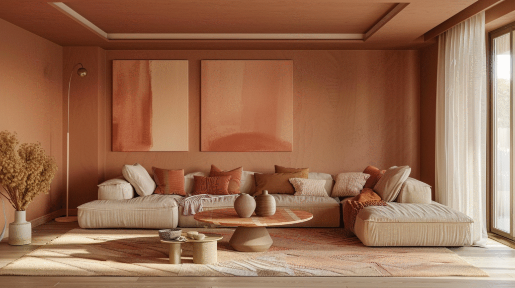
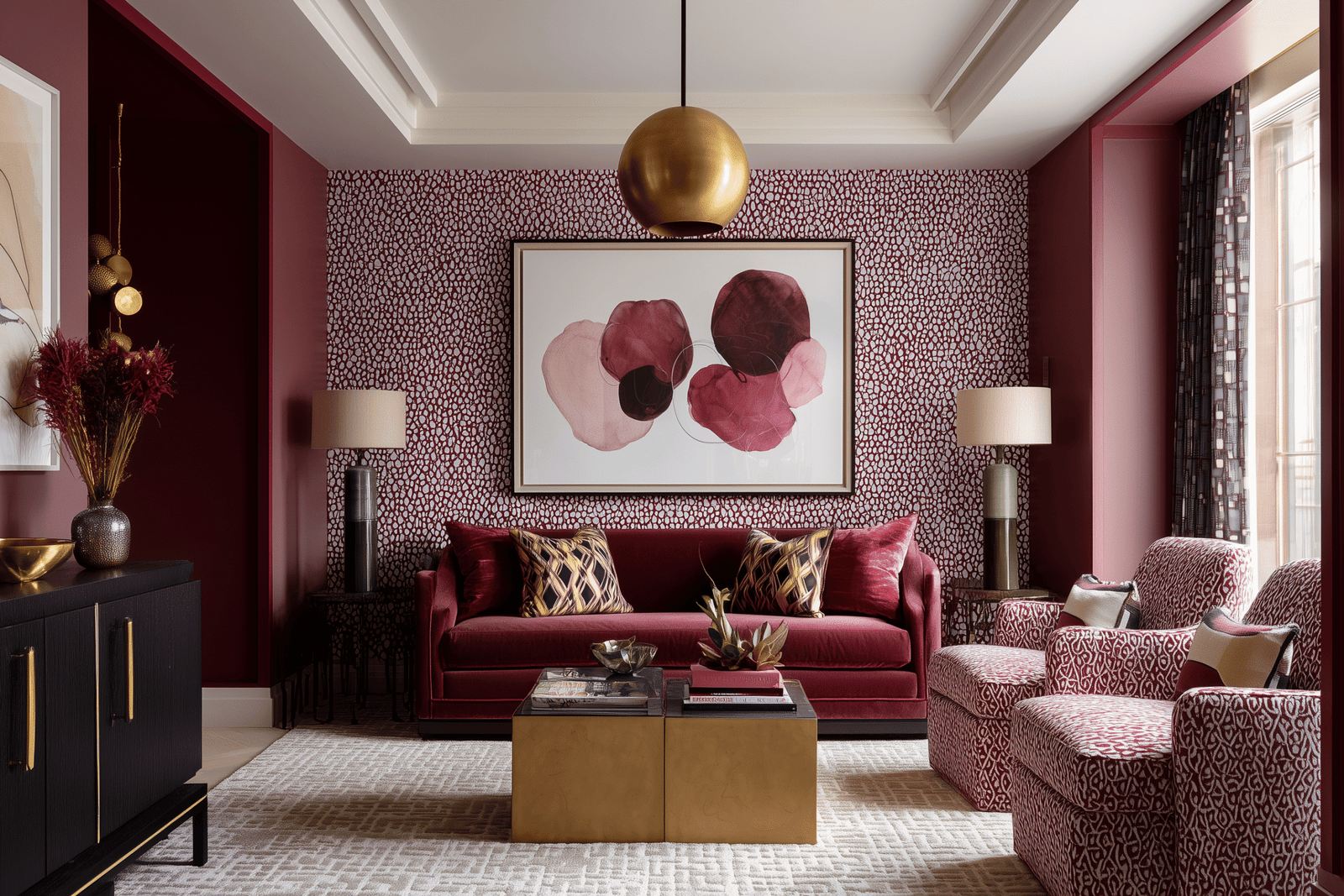
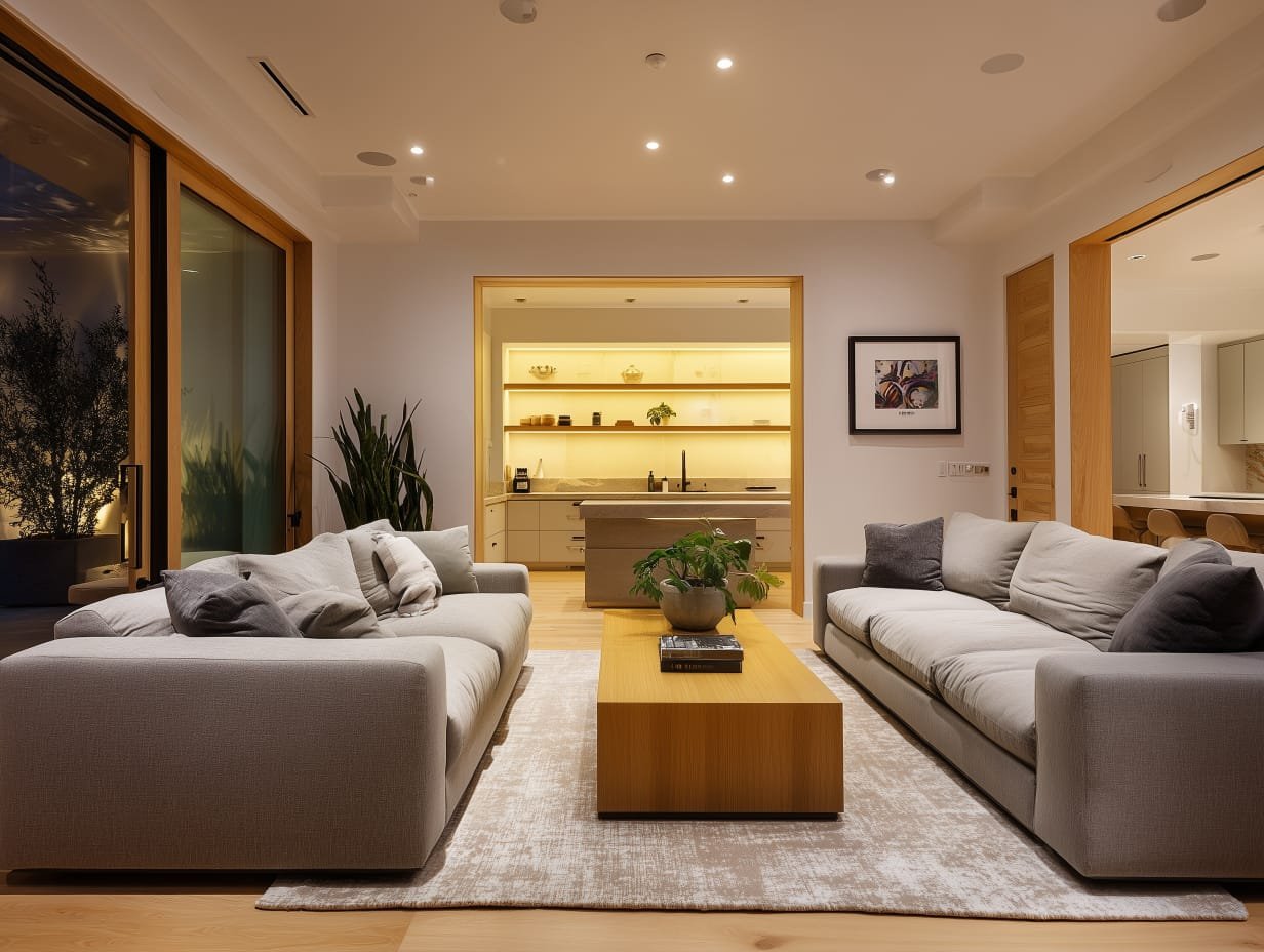
In a color-drenched living room, bulb color temperature becomes critically important. Cool white bulbs (4000K-5000K) will make warm-colored rooms look muddy and make cool-colored rooms feel sterile and hospital-like. You need warm white bulbs (2700K-3000K) in virtually every color drenching scenario.

This affects not just ambience but how your carefully chosen color actually looks. Colors have different undertones under different light temperatures. The terracotta that looks warm and inviting in 2700K lighting can look orange and aggressive in 4000K lighting. The sage green that feels sophisticated in warm light can look institutional in cool light.

Replace every bulb in your color-drenched living room. Every table lamp, floor lamp, ceiling fixture, picture light. Consistent color temperature creates visual cohesion and prevents weird pockets where the color looks “off.”

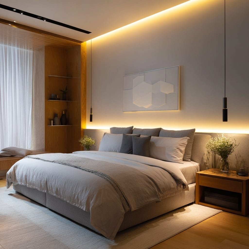
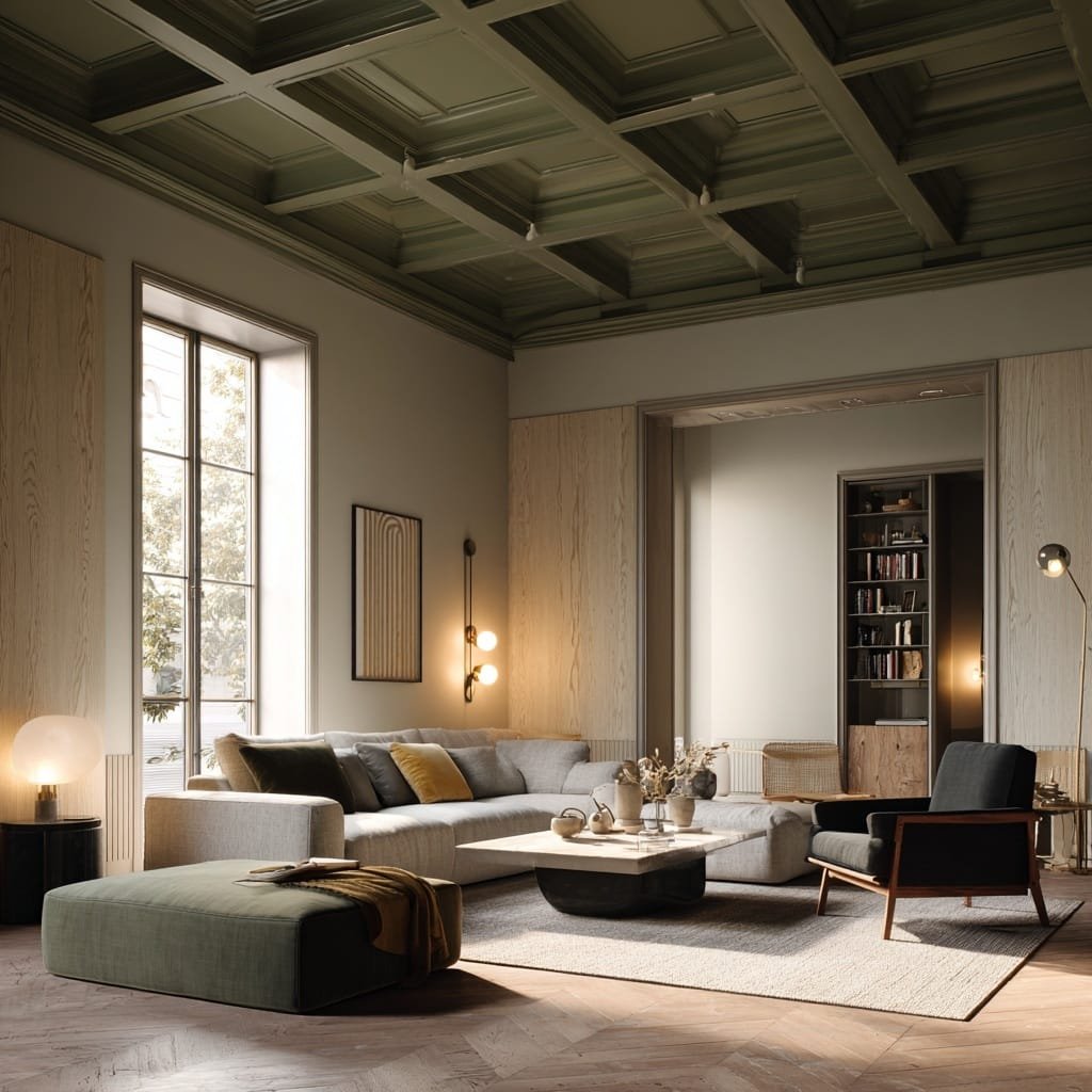
Layered Lighting at Multiple Heights

Color-drenched walls need light to bring out their depth and variation. This means multiple light sources at different heights: overhead ambient lighting (dimmed significantly—you don’t want harsh top-down light in a colored room), mid-height lighting through floor lamps and table lamps (this is where most of your practical lighting should come from), and low-level accent lighting through picture lights, sconces, or LED strips under furniture.

The goal is to create pools of light that interact with the colored surfaces and create shadow and dimension. A single overhead light in a color-drenched room flattens everything and makes it feel like you’re living in a colored box. Multiple light sources at different heights make the color feel alive and dynamic.

Task Lighting Without Visual Clutter

Reading lights, work lights, and task lighting need to be both functional and aesthetically consistent with your color story. In a color-drenched living room, you don’t want white or metallic task lights that visually disrupt the color immersion.

Instead, choose task lighting in materials that complement your color: brass or copper for warm colors, dark metal or matte black for cool colors, ceramic or colored glass that echoes your wall color. The light output is what matters functionally, but the fixture itself should feel like it belongs to the room’s color world.

Dimmer Switches Are Mandatory

Color drenching creates strong visual impact, and sometimes you’ll want to soften that impact depending on time of day, activity, or mood. Dimmer switches on all light sources give you control over how intensely the color reads.

Bright lighting makes colors feel more saturated and energetic. Dimmed lighting softens colors and makes them feel more intimate and relaxed. This flexibility is essential in a living room where you might want energizing lighting for daytime working and soft, low lighting for evening relaxation.

Install dimmers on overhead fixtures, use smart bulbs in table and floor lamps that allow dimming via app or remote, and create lighting scenes that allow you to adjust the room’s entire lighting atmosphere with one command.

Natural Light Maximization

Finally, because color drenching absorbs natural light more than neutral palettes, you need to maximize whatever natural light your living room receives. This means lightweight or sheer window treatments that allow maximum light penetration during the day, mirrors positioned to reflect natural light deeper into the room, and furniture arrangements that don’t block windows.

If your living room has limited natural light, consider whether color drenching is the right choice at all, or whether you should focus on lighter, more reflective tones within your chosen color family. A dark navy living room with one small north-facing window will feel like a cave unless you have exceptional artificial lighting. The same navy in a living room with large south-facing windows and good layered lighting will feel sophisticated and enveloping.

Color Drenching 101: How to Pull Off the Monochromatic Trend Without Regrets

COLOR DRENCHING 101: THE PSYCHOLOGICAL PAYOFF NOBODY TALKS ABOUT

Beyond the visual drama and the Instagram-worthy aesthetics, there’s something profound that happens when you live in a well-executed color-drenched space. It affects you psychologically in ways that neutral rooms simply don’t.

Color-drenched living rooms create emotional clarity. When you walk into a room saturated in a single color, you immediately know how you’re supposed to feel. A terracotta living room tells you to relax, warm up, decompress. A pale dusty blue living room tells you to breathe, think, create calm. A deep forest green living room tells you to cocoon, focus, shut out the world.

This emotional direction is why people describe color-drenched rooms as feeling “complete” or “finished” in ways their previous neutrally decorated living rooms never did. The room has a personality. It has intentions. It’s not waiting for you to decide what it should feel like—it already knows.

There’s also unexpected spatial confidence. In traditional decorating, we’re taught to use light colors to make rooms feel bigger and dark colors sparingly as accents. Color drenching 101 rejects this entirely and often proves it wrong. A fully committed color—even a deep one—can make a room feel more spacious because it removes visual fragmentation. There are no competing surfaces, no harsh transitions, no visual interruptions that make you aware of the room’s actual dimensions.

And perhaps most importantly: color-drenched living rooms feel personal in a way carefully coordinated neutral spaces never quite achieve. They require decision-making, commitment, and confidence. They reflect taste and intention. They say “someone thought carefully about how they want to feel in this space and made it happen.”

This is the real transformation of color drenching 101—not just how the room looks to visitors, but how it feels to live in it every single day.

After all this guidance, it’s worth highlighting the most common failures so you can avoid them:

Choosing trendy colors without personal connection. That burnt orange everyone’s using on Instagram might look terrible in your specific living room with your specific light. Choose colors you’re genuinely drawn to, not colors that are having a moment.

Ignoring your existing furniture. If you have a large navy sofa and you paint everything sage green, you’ve created a problem, not a color-drenched room. Work with what you have or be prepared to replace it.

Skipping the sample testing phase. Paint chips lie. Small samples lie. Only large-scale samples observed over days in your actual space tell the truth about how a color will perform.

Perfect matching everything. Your walls, curtains, cushions, and rug should all be in the same color family, but they shouldn’t match exactly. Variation creates interest.

Forgetting about the fifth wall. The ceiling is part of the room. Leaving it white in a color-drenched space looks unfinished and breaks the immersion.

Using the wrong paint finish throughout. All matte or all gloss makes everything flat. Mix finishes strategically.

Inadequate lighting planning. You cannot light a color-drenched room the way you lit it when it was white. Plan for more light sources, warm color temperature, and dimming capability.

Commitment issues showing through half-measures. Color-drenched rooms work because they commit fully. One accent wall in a bold color with the rest in white isn’t color drenching—it’s just an accent wall, and it won’t create the immersive effect you’re hoping for.

Color Drenching 101: How to Pull Off the Monochromatic Trend Without Regrets

THE BUDGET-CONSCIOUS PATH TO COLOR DRENCHING 101

Full room repainting, new textiles, upgraded lighting—color drenching can become expensive quickly. Here’s how to achieve the effect on a limited budget:

Start with paint only. The walls, trim, and ceiling painted cohesively in your chosen color creates 70% of the impact. You can phase in textiles and lighting over time.

Use what you have strategically. Existing neutral furniture (beige sofa, gray armchair) works fine in a color-drenched room if you add colored textiles—throws, cushions, blankets—in your wall color.

Prioritize lighting over new furniture. Correct lighting makes budget furniture look expensive. Bad lighting makes expensive furniture look cheap. Invest in good bulbs, a few key lamps, and dimmer switches before you invest in new seating.

Shop secondhand for colored textiles. Vintage rugs, curtains, and throws in your color family cost a fraction of new ones and often have better quality and more character.

One room at a time. Color drenching doesn’t need to happen throughout your home. A single perfectly executed living room has more impact than multiple rooms done timidly.

Color Drenching 101: How to Pull Off the Monochromatic Trend Without Regrets

Here’s what every designer knows but most homeowners haven’t discovered yet: color drenching 101 is not advanced interior design. It’s foundational spatial thinking that happens to look dramatic. When you drench a living room in color, you’re not decorating. You’re creating atmosphere, manipulating perception, and establishing emotional territory.

The transformation isn’t just aesthetic. It’s psychological. A well-executed color-drenched living room changes how you inhabit space. It gives you permission to feel things—calm, energized, cocooned, sophisticated—because the room itself is feeling those things with you.

This is why color drenching 101 has moved from boutique hotel lobbies and heritage British interiors into contemporary homes worldwide. We’re tired of rooms that look good but feel like nothing. We’re ready for spaces that have point of view, that create mood, that commit to an emotional experience rather than hedging with safe neutrality.

The five rules outlined here—choosing color with eyes wide open to light and undertone, creating variation within unity, using strategic contrast intelligently, embracing the ceiling as spatial opportunity, and lighting the color properly—are not restrictions. They’re the framework that makes bold color liveable, sustainable, and genuinely transformative rather than a regrettable experiment.

Your living room is waiting. Not for more furniture. Not for more accessories. Not for the perfect gallery wall or the trendy coffee table styling. It’s waiting for you to make a decision about how it should feel, then commit to creating that feeling through deliberate, confident, immersive color.

Color drenching 101 isn’t about being brave. It’s about being intentional. It’s disciplined chromatic thinking. It’s the understanding that color, used with intelligence and commitment, becomes architecture itself.

Start with one living room. Choose one color that makes you feel something true. Test it properly. Plan the lighting. Mind the undertones. Vary the textures. Paint the ceiling. Live with it.

The timid version of your living room—the one that plays it safe, that fragments space with competing colors, that apologizes for every bold choice with contrasting white trim—is already behind you. The color-drenched version, the one that feels complete and intentional and unmistakably yours, is one committed paint decision away.

What do you think?
Leave a Reply

Blog

Get fresh home inspiration and helpful tips from our interior designers

top
0
    0
    Your Cart
    Your cart is emptyReturn to Shop

    Inactive

    Privacy Overview

    This website uses cookies so that we can provide you with the best user experience possible. Cookie information is stored in your browser and performs functions such as recognising you when you return to our website and helping our team to understand which sections of the website you find most interesting and useful.