Neutral Farmhouse Color Schemes: Timeless & Relaxing

neutral farmhouse color schemes

The New Neutral – Why Farmhouse Still Feels Fresh

There’s a quiet magic in neutral farmhouse color schemes. In a world dominated by design trends that often demand loud colors, heavy textures, and statement pieces, the neutral farmhouse look continues to endure because it whispers rather than shouts. It’s not just a style—it’s a mood. One that invites comfort, calm, and connection. Neutral farmhouse color schemes use soft whites, warm grays, gentle taupes, and muted beiges to set a stage for a lifestyle rooted in authenticity.

What’s driving the resurgence of this look isn’t just a nod to nostalgia or rural charm. It’s about creating homes that feel like sanctuaries. The rise of remote work, digital burnout, and minimalistic living has encouraged homeowners to seek tranquility indoors. Enter the timeless charm of neutrals: colors that don’t scream for attention but instead soothe the eye and soften the room.

Designers often highlight that the best neutral farmhouse color schemes aren’t boring—they’re nuanced. The trick lies in layering shades of similar tones, playing with finishes, and integrating natural textures that bring warmth and tactile richness. A matte alabaster wall paired with a weathered oak console table. A slipcovered cream sofa next to a stone fireplace. These aren’t just combinations; they’re experiences.

Furthermore, neutral palettes have incredible staying power. While jewel tones and pastels come and go with the seasons, neutrals offer timeless versatility. They’re a blank canvas for seasonal decor, evolving trends, or even bold accent pieces that can be swapped in and out without a full renovation.

Ultimately, the appeal of neutral farmhouse color schemes is deeply emotional. They evoke peace. They feel honest. They make space for memory and meaning. Whether you’re designing a new home from scratch or refreshing a beloved family cottage, embracing these colors can help ground your space in something that feels lasting and alive.

In this in-depth guide, we’ll explore the psychology of neutral palettes, the top farmhouse shades to consider, room-by-room styling ideas, layering techniques to avoid flatness, and trending design approaches for 2025. By the end, you’ll be equipped with the tools—and inspiration—to craft a neutral farmhouse interior that’s both timeless and relaxing.

The Psychology Behind Neutral Palettes

neutral farmhouse color schemes

The success of neutral farmhouse color schemes isn’t accidental. It taps into our most basic psychological responses to color. Research in color theory and environmental psychology shows that we’re naturally drawn to colors found in nature—stone, sand, clay, wood, and sky. These tones make us feel more connected to the earth, more grounded, and more at peace. It’s no surprise that they’ve become the cornerstone of modern farmhouse interiors.

One of the greatest psychological benefits of a neutral palette is its ability to reduce visual noise. In busy households or urban environments, the mind craves relief. Neutral tones create harmony and order. Whites and creams open up space, making rooms feel larger and airier. Taupes and warm grays add weight and coziness. When balanced thoughtfully, these colors can set the emotional tone for an entire home.

It’s also important to consider how warm vs. cool neutrals affect mood. Warm tones—think beige, honey, cream—tend to feel inviting and nurturing. They create a sense of familiarity. Cool neutrals like stone gray or greige can feel more formal and composed. The best neutral farmhouse color schemes blend both for emotional and aesthetic depth. For example, a warm beige sofa against a cool gray wall creates tension and interest without disrupting calm.

Texture plays a crucial role here. A monochrome beige room might seem dull on paper—but introduce nubby linen curtains, raw wood beams, and matte pottery, and suddenly it comes alive. The brain interprets this tactile diversity as comforting and engaging. This is especially important in neutral spaces, where color variation is subtle.

Another psychological advantage is flexibility. Neutral tones accommodate different personalities and needs over time. A child’s nursery in soft whites and woods can transition to a teen’s retreat with a few textile swaps. The same goes for multipurpose living areas. The palette evolves without needing a full redesign.

Lastly, there’s the nostalgia factor. Neutral farmhouse color schemes remind us of simpler times. Vintage farmhouse kitchens. Grandmother’s quilted linens. The whitewashed barns of our collective imagination. These colors don’t just look beautiful—they feel meaningful.

In short, neutrals don’t merely fill a space; they shape how we experience it. They anchor us emotionally, provide a backdrop for life, and bring us home—even on the most chaotic days. And that’s why they remain a cornerstone of farmhouse style.

Iconic Farmhouse Neutrals — From Greige to Alabaster

Farmhouse Neutrals

The strength of any farmhouse color scheme lies in its palette. While the options might seem endless, certain shades have proven themselves time and again. These iconic colors form the foundation of the most beloved neutral farmhouse interiors.

First on the list: Greige. A perfect balance between gray and beige, greige is the chameleon of neutrals. It adapts to warm wood tones just as well as cool metals, making it ideal for open-concept homes. Depending on the light, it can lean soft and warm or crisp and modern. Use it on walls, cabinetry, or even upholstery for a balanced base.

Alabaster white, made popular by paint brands like Sherwin-Williams, is another cornerstone. Unlike stark gallery whites, alabaster has a subtle warmth that softens a space without turning yellow. It works especially well in homes with ample natural light and can make rooms feel clean, open, and fresh.

Creams and taupes are the heart of cozy farmhouse spaces. These tones pair beautifully with rustic woods, vintage decor, and antique metals. They offer depth without darkness and help unify a room’s elements. For example, a creamy wall color can tie together a jute rug, a slipcovered chair, and a distressed pine hutch.

Mushroom tones—a muddy mix of gray and brown—have surged in popularity in recent years. These earthy neutrals feel rooted and organic. They’re especially striking on kitchen cabinets or bathroom vanities, offering contrast without harshness.

Finally, warm charcoals act as sophisticated anchors in a neutral palette. Whether used on trim, furniture legs, or light fixtures, they give a grounded touch that prevents rooms from feeling washed out.

When building your palette, consider undertones. Are you working with a cool gray that leans blue, or a taupe that has hints of pink? Undertones matter because they influence how colors interact with light and neighboring hues. The most successful neutral farmhouse color schemes pay close attention to these subtle shifts.

Another tip: test paint in large swatches on different walls before committing. Neutrals are notoriously tricky and can change dramatically depending on the room’s lighting and surrounding materials.

The right farmhouse neutrals will never feel bland when chosen with care. They provide the ideal backdrop for personality to shine—whether through a vintage armchair, a woven throw, or a vase of fresh hydrangeas. With these iconic colors, you’re not just decorating a home; you’re creating a timeless story.

Room-by-Room Styling Ideas

room-by-room

One of the most exciting parts of working with neutral farmhouse color schemes is the opportunity to tailor each room to suit both its function and feel—while maintaining a harmonious overall look. Whether it’s the cozy intimacy of a bedroom or the communal warmth of a kitchen, neutral palettes can be artfully curated to create spaces that feel both cohesive and distinct. Below is a detailed breakdown of how to bring neutral farmhouse style to life in every room of the house.

Living Room: Layered Comfort and Casual Elegance

The living room often sets the tone for the entire home, and a neutral farmhouse palette here is all about comfort and inviting warmth. Start with a foundational color like creamy white or soft greige for the walls—these hues expand the space and provide a fresh canvas. Opt for slipcovered sofas in durable, washable fabrics like cotton or linen, sticking to tones such as ivory, oatmeal, or flax.

Layer in texture with oversized knitted throws, jute or sisal rugs, and weathered wooden coffee tables. Use vintage or rustic metal accents, like matte black floor lamps or aged bronze curtain rods, to introduce contrast without straying from the neutral theme. Incorporate greenery through potted olive trees or eucalyptus stems to add life and soften the space.

Kitchen: Functional Beauty in a Neutral Frame

Kitchens are the heart of farmhouse interiors, and neutral palettes excel at creating a warm, functional vibe that still feels upscale. Consider painting cabinetry in soft mushroom or warm taupe tones, paired with a creamy backsplash like handmade subway tile or light travertine. Natural wood elements—open shelves, butcher block countertops, or oak stool legs—enhance the rustic vibe.

For hardware, aged brass or oil-rubbed bronze provides a refined finish that pairs perfectly with neutrals. Keep surfaces uncluttered but styled: a ceramic fruit bowl, a linen dish towel, and a terracotta herb planter subtly reinforce the color story. Lighting should be warm and welcoming—think pendant lights with a vintage patina or simple schoolhouse-style glass fixtures.

Bedroom: Restful Retreats with Softened Hues

Neutral farmhouse bedrooms embrace softness, both in tone and material. Use a calming paint color like pale taupe, soft beige, or even a subtle greige with warm undertones. Anchor the room with a natural linen or upholstered headboard in a flax or pebble color. Bedding should be layered: start with crisp white sheets, add a textured duvet in ivory or sand, and finish with accent pillows in muted patterns like faded florals or ticking stripes.

Wooden nightstands in distressed or whitewashed finishes add character without overpowering the room. Keep accessories minimal and purposeful: a ceramic lamp, a small stack of vintage books, a neutral-hued throw blanket folded at the foot of the bed. These touches reinforce the simplicity and serenity that defines neutral farmhouse color schemes.

Bathroom: Clean, Earthy, and Serene

Bathrooms benefit greatly from the refreshing qualities of neutral tones. Wall colors like alabaster or foggy gray keep things light and spa-like. White or cream cabinetry with subtle veining in the countertops adds depth without distraction. Pair with hardware in brushed nickel or antique bronze for a touch of warmth.

Consider layering in organic textures: a wooden stool, stone soap dishes, and waffle-knit towels in off-white or soft tan. Use natural light wherever possible, and incorporate understated decor like a small vase with dried flowers or a woven basket for rolled towels.

Each room provides a different opportunity to showcase the richness of neutral farmhouse color schemes. By adapting the palette to the function of the space while maintaining a consistent tone throughout the home, you create a seamless flow that feels both intentional and deeply comforting.

Layering Techniques to Avoid Flatness

Avoid Flatness

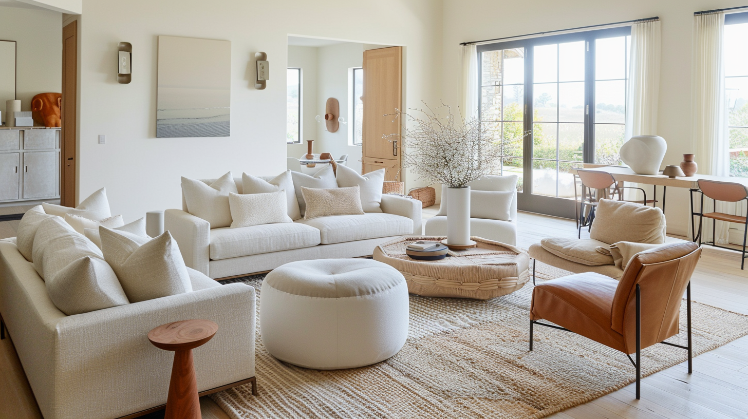
One of the most common challenges when working with neutral farmhouse color schemes is avoiding a look that feels flat or one-dimensional. While a palette of whites, creams, beiges, and soft grays can certainly exude calm and elegance, it requires thoughtful layering to bring it to life. Successful neutral interiors are never boring—they’re rich with texture, depth, and subtle contrast.

The key to dimension in a neutral space is layering textures. Start with the basics: walls in soft matte paint, whether that’s warm ivory or a gentle greige. Then introduce contrasting materials—think about linen drapes, rough-hewn wooden beams, rattan lighting, or a smooth marble tabletop. These textures interact with light differently, catching shadows and adding interest where color is intentionally restrained.

Textiles are the easiest and most impactful way to introduce texture. Mix nubby knits with crisp cotton, soft velvet pillows with raw-edge linen throws. In a living room, for instance, a neutral sectional in flax linen comes alive when paired with a chunky knit blanket, a patterned jute rug underfoot, and perhaps a few smooth leather or velvet cushions in complementary tones.

Layered patterns—even in the same color family—add movement without visual clutter. Try pairing ticking stripes with faded florals or classic buffalo check in soft taupe and ivory. Keep scale in mind: a large-scale pattern anchors a room, while smaller ones can be used in accents like pillows, curtains, or upholstery.

Another important layer? Finish and sheen. Use matte wall paint alongside glossy subway tiles, or juxtapose rustic wooden cabinets with a honed stone countertop. Playing with how surfaces reflect or absorb light creates an understated sophistication. Even small details like brushed brass knobs or hammered metal trays can add texture and character.

Light and shadow also contribute to the richness of a neutral room. Maximize natural light wherever possible—it enhances the subtleties of neutral tones. Sheer white curtains soften sunlight and add movement. In darker areas, incorporate layered lighting: ambient pendant lights, task lighting like wall sconces or reading lamps, and accent lighting such as under-shelf LEDs. Each source casts different shadows, creating depth even in the most monochromatic setting.

Plants and natural elements are underrated tools in breaking up flatness. A neutral room can benefit immensely from the vibrancy of greenery—even muted eucalyptus or sage-colored foliage can bring contrast. Consider textural planters in terracotta, clay, or woven baskets to stay within the rustic farmhouse theme.

Furniture and accessories should also reflect the idea of visual layering. Choose pieces that blend eras and materials: an antique pine bench next to a streamlined modern coffee table, or a weathered oak sideboard topped with contemporary ceramic vases. The contrast is subtle but striking—creating a dynamic yet serene environment.

Finally, embrace imperfection. Neutral farmhouse interiors thrive on authenticity. Weathered finishes, visible wood grain, hand-thrown pottery, and handmade textiles bring soul into a room. These imperfections are not flaws; they are texture in the truest sense—both visual and emotional.

In essence, layering in a neutral space is about creating a sense of touch and temperature. You want the room to feel warm, welcoming, and interesting from every angle, even if the color palette remains restrained. Through texture, material variety, light play, and natural contrasts, you can ensure your neutral farmhouse design is anything but flat.

Designing Calm That Lasts

Neutral farmhouse color schemes aren’t just about aesthetics—they are about crafting emotional sanctuaries. In a time where overstimulation is constant and design trends evolve at lightning speed, there’s something revolutionary about choosing calm over chaos. A neutral palette in a farmhouse context tells a different story: one of longevity, comfort, and deep-rooted connection to home.

Designing calm that truly lasts requires more than painting your walls greige or layering on cream-colored throws. It’s about intention. From the initial color palette to the last curated detail, every choice contributes to the atmosphere. And the beauty of the neutral farmhouse look is that it doesn’t just age well—it actually improves with time. Patinas deepen. Textures soften. Stories settle into surfaces.

Throughout this blog, we’ve explored the spectrum of neutrals that anchor this design style—from iconic shades like alabaster, greige, and mushroom, to earthy tones inspired by natural materials. We’ve examined how each room of the home benefits from a tailored yet cohesive approach to neutrals—how the kitchen gains warmth from pale oak and matte black contrasts, how bedrooms become havens of rest with whisper-soft fabrics, and how entryways can set a peaceful tone for the entire house.

We’ve also demystified layering techniques. Neutral doesn’t mean flat—quite the opposite. By combining multiple textures (linen, wool, rattan, leather, brushed metal), you activate the senses without visual clutter. This sensory depth is what makes a space feel rich and comforting, even when the palette is restrained. The same is true for lighting, proportion, and negative space—all are tools in the service of serenity.

Farmhouse calm isn’t sterile. It’s not cookie-cutter minimalism. It’s lived-in luxury—simple, soulful, and tactile. This style embraces imperfection: knots in wood grain, wrinkles in linen, the sun-faded side of a woven rug. These details don’t disrupt the calm; they anchor it. They make the room feel human.

As trends come and go, the neutral farmhouse palette remains. Why? Because it transcends surface style. It taps into something timeless: the need for home to feel like a safe place to land. And as long as that need exists, the quiet magic of neutrals will never go out of style.

What do you think?
Leave a Reply

Blog

Get fresh home inspiration and helpful tips from our interior designers

top
0
    0
    Your Cart
    Your cart is emptyReturn to Shop

    Inactive