Color Capping Guide: Why Painting Your Ceiling 2 Tones Darker is the 2026 Trend You Need

Color Capping

You walk into your freshly painted living room—walls a beautiful, moody sage green—and something feels… incomplete. The furniture is styled, the lighting is perfect, but your eyes keep drifting upward to that stark white ceiling floating above like an afterthought. It’s the design equivalent of wearing a stunning outfit with gym socks. Enter color capping: the 2026 trend that’s finally giving ceilings the attention they deserve by painting them two shades darker than your walls, creating a cocooned, intentional space that feels both elevated and intimate.

For decades, white ceilings reigned supreme—safe, neutral, forgettable. But as maximalism returns and designers embrace bolder, more layered interiors, color capping has emerged as the antidote to visually flat rooms. This isn’t about painting your ceiling navy blue on a whim; it’s a strategic technique that adds architectural depth, enhances color saturation, and makes rooms feel deliberately designed rather than accidentally decorated. Whether you’re working with blush pink walls and a terracotta ceiling or warm grays topped with charcoal, color capping transforms the fifth wall from blank canvas to design statement.

In this guide, we’ll break down what color capping is, why it works psychologically, showcase seven stunning combinations to try, and walk you through execution like a pro—complete with budget hacks, common mistakes, and when to skip the trend altogether. Ready to look up and finally love what you see?

Color Capping Guide: Why Painting Your Ceiling 2 Tones Darker is the 2026 Trend You Need

Color capping is the practice of painting your ceiling two shades darker than your wall color, creating a visual “cap” that wraps the room in cohesive color. Think of it as the design world’s answer to monochromatic dressing—except instead of head-to-toe beige, you’re layering tonal depth from floor to ceiling.

The effect is immediate: rooms feel cozier, more intimate, and architecturally interesting without adding crown molding or expensive millwork. A bedroom with dusty rose walls and a clay-toned ceiling suddenly feels like a jewelry box. A dining room with warm gray walls and a charcoal ceiling becomes a moody, candlelit sanctuary. Color capping adds dimension that all-white ceilings simply can’t achieve.

So why now? The shift away from stark, clinical white ceilings mirrors broader design trends embracing warmth, texture, and emotional resonance. After years of Scandinavian minimalism and safe neutrals, homeowners are craving spaces that feel wrapped, layered, and intentional. Darker ceilings also complement the resurgence of jewel tones, earthy palettes, and moody maximalism dominating 2026 interiors. Designers like Kelly Wearstler and Studio McGee have championed the technique in high-profile projects, proving that color capping works in everything from historic brownstones to modern lofts.

Examples in action: navy blue walls (think Farrow & Ball’s Hague Blue) paired with a deep indigo ceiling create a dramatic, library-like vibe. Sage green walls (like Sherwin-Williams’ Clary Sage) topped with forest green ceilings feel organic and grounding. The key is choosing a ceiling shade that’s noticeably darker but still within the same color family—enough contrast to register visually, but not so stark it feels disjointed.

Here’s what most people get wrong about ceiling color: they assume darker automatically means smaller. But color capping doesn’t shrink rooms—it redefines them. When done correctly, a darker ceiling lowers the visual plane just enough to create intimacy without claustrophobia, making sprawling spaces feel curated and small rooms feel intentional rather than cramped.

The science backs this up. Our brains perceive lighter colors as receding and darker colors as advancing. A white ceiling visually “lifts” upward, creating the illusion of height but often leaving rooms feeling cold and unfinished. A ceiling painted two tones darker gently “descends,” wrapping the space in what designers call the envelope effect—a cohesive color story that makes you feel held rather than exposed. It’s why luxury hotels use color capping in guest rooms: it signals comfort, sophistication, and attention to detail.

This technique shines in rooms where you want coziness: bedrooms, dining rooms, libraries, powder rooms. These are spaces designed for lingering, and a darker ceiling reinforces that vibe. In a bedroom with terracotta walls and a burnt sienna ceiling, the envelope effect creates a nest-like sanctuary perfect for rest. In a dining room with warm taupe walls and a mushroom-brown ceiling, candlelight reflects beautifully off the darker surface, enhancing ambiance.

But color capping isn’t universal. It works best in rooms with:

  • Adequate natural light: Darker ceilings absorb light, so south-facing rooms or spaces with large windows handle the technique best.
  • Standard to high ceilings: 8-foot ceilings can work if the room is well-lit, but anything lower risks feeling cave-like.
  • Minimal ceiling clutter: Skip this if you have popcorn texture, heavy beams, or ornate medallions competing for attention.

When it doesn’t work: small, dim spaces with low ceilings and little natural light. In those cases, stick with lighter ceilings or try alternative techniques like painting just the ceiling trim darker.

Color Capping Guide: Why Painting Your Ceiling 2 Tones Darker is the 2026 Trend You Need

7 Stunning Color Capping Combinations to Try in 2026

Combination #1: Blush Pink Walls + Terracotta Ceiling

The palette: Soft blush pink (like Benjamin Moore’s First Light) on walls, warm terracotta (like Sherwin-Williams’ Cavern Clay) on the ceiling.

The vibe: Feminine without being saccharine—think Italian villa meets modern romance. This color capping combo feels sun-drenched and earthy, perfect for spaces that embrace warmth.

Best rooms for it: Bedrooms, nurseries, powder rooms. Anywhere you want a cocoon-like, nurturing energy.

Styling tips: Pair with natural linen bedding, rattan furniture, and brass fixtures. Add terracotta planters and clay pottery to echo the ceiling. Avoid cool-toned metals—stick with warm golds and coppers.

Combination #2: Warm Gray Walls + Charcoal Ceiling

The palette: Warm greige walls (like Farrow & Ball’s Elephant’s Breath), rich charcoal ceiling (like Benjamin Moore’s Kendall Charcoal).

The vibe: Sophisticated, moody, and masculine. This color capping approach works beautifully in modern or industrial spaces.

Best rooms for it: Home offices, dining rooms, living rooms with good natural light.

Styling tips: Layer in black-framed artwork, charcoal velvet furniture, and matte black hardware. Add warmth with wood tones and amber lighting to prevent the space from feeling cold.

Color Capping Guide: Why Painting Your Ceiling 2 Tones Darker is the 2026 Trend You Need

Combination #3: Sage Green Walls + Forest Green Ceiling

The palette: Soft sage (like Behr’s Jojoba) on walls, deep forest green (like Sherwin-Williams’ Evergreens) above.

The vibe: Organic, grounding, and nature-inspired. This combo brings the outdoors in without feeling literal or themed.

Best rooms for it: Bedrooms, sunrooms, reading nooks, bathrooms.

Styling tips: Use natural materials—jute rugs, linen curtains, raw wood furniture. Add plants (but sparingly—you don’t want a jungle). Brass or aged bronze fixtures enhance the earthy palette.

Combination #4: Cream Walls + Warm Beige Ceiling

The palette: Creamy off-white (like Benjamin Moore’s White Dove) on walls, warm beige (like Sherwin-Williams’ Accessible Beige) overhead.

The vibe: Subtle, elegant, and timeless. This is color capping for minimalists who want depth without drama.

Best rooms for it: Living rooms, kitchens, hallways—anywhere you want warmth without bold color commitment.

Styling tips: Layer textures—linen, wool, bouclé—to prevent the palette from feeling flat. Add warmth through wood tones and avoid stark white accents.

Combination #5: Dusty Blue Walls + Navy Ceiling

The palette: Soft dusty blue (like Farrow & Ball’s Borrowed Light) below, deep navy (like Benjamin Moore’s Hale Navy) above.

The vibe: Coastal elegance meets moody sophistication. This color capping combination feels both calming and dramatic.

Best rooms for it: Bedrooms, bathrooms, home offices.

Styling tips: Mix warm and cool metals—aged brass with brushed nickel. Use natural textures like linen and rope to soften the palette. White trim keeps it crisp.

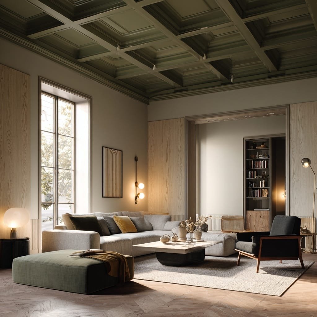
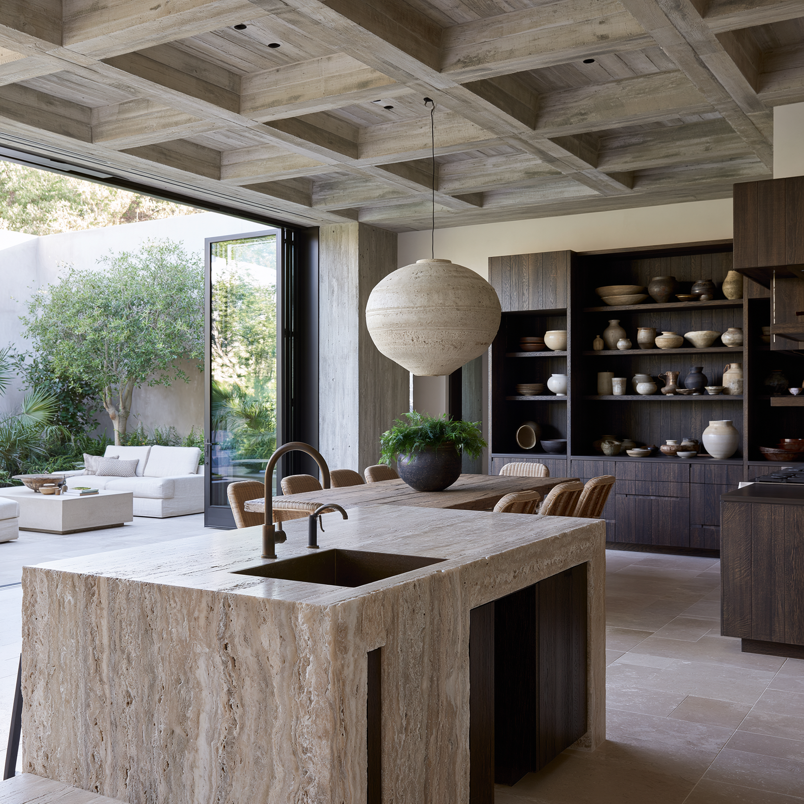
Combination #6: Warm Taupe Walls + Mushroom Brown Ceiling

The palette: Warm taupe (like Sherwin-Williams’ Poised Taupe) on walls, rich mushroom brown (like Farrow & Ball’s London Clay) on the ceiling.

The vibe: Understated luxury. This color capping combo feels European and effortlessly chic.

Best rooms for it: Dining rooms, libraries, primary bedrooms.

Styling tips: Layer in chocolate brown leather, camel-toned textiles, and antique brass. Avoid black accents—they’ll read too stark against this warm palette.

Combination #7: Soft Peach Walls + Rust Ceiling

The palette: Peachy cream (like Benjamin Moore’s Peach Parfait) below, burnt rust (like Sherwin-Williams’ Rojo Dust) above.

The vibe: Warm, inviting, and slightly retro. This color capping approach channels ’70s desert modernism in the best way.

Best rooms for it: Breakfast nooks, powder rooms, cozy living spaces.

Styling tips: Use natural wood furniture, woven textiles, and vintage-inspired lighting. Add pops of olive green or burnt orange in accessories.

Color Capping Guide: Why Painting Your Ceiling 2 Tones Darker is the 2026 Trend You Need

How to Execute Color Capping Like a Pro

Ready to try color capping? Here’s your step-by-step game plan:

Step 1: Choose your base wall color first. Your ceiling color depends on your walls, not the other way around. Select a wall color you love, then find a shade within the same color family that’s two tones darker. Most paint brands organize colors in strips showing light to dark progressions—this makes finding your ceiling shade easy.

Step 2: Test before committing. Buy sample pots of both colors and paint large swatches (at least 2×2 feet) on both walls and ceiling. Live with it for a few days, observing how it looks in morning light, afternoon sun, and evening artificial light. Color capping relies on tonal harmony, so undertones matter—a warm gray wall with a cool gray ceiling will feel disjointed.

Step 3: Prep your ceiling properly. Ceilings show imperfections more than walls, especially in darker colors. Fill cracks, sand rough patches, and prime if you’re going from white to a dark shade. Skipping prep is the fastest way to regret your color capping decision.

Step 4: Choose the right finish. For ceilings, use matte or flat finish—it hides imperfections and minimizes light reflection. Eggshell works in high-moisture rooms like bathrooms but can look shiny elsewhere. Walls can be eggshell or satin for easier cleaning.

Step 5: Paint the ceiling first. Use an angled brush to cut in along the wall-ceiling line, then roll the rest. A long-handled roller and extension pole save your neck. Apply two coats for even coverage—darker colors often need more layers than whites.

Step 6: Finish with crisp trim. If you have crown molding or ceiling trim, paint it after the ceiling in either the wall color or white. This creates a clean transition between wall and ceiling.

Common DIY mistakes: Going more than two shades darker (it overwhelms), choosing a ceiling color from a different color family (it clashes), and skipping the sample phase (expensive to fix). Also, don’t trust paint chips alone—colors look completely different at scale.

Color Capping Guide: Why Painting Your Ceiling 2 Tones Darker is the 2026 Trend You Need

Common Color Capping Mistakes to Avoid

Mistake #1: Ignoring undertones. You pick what looks like a perfect gray for walls and a darker gray for the ceiling, but in natural light, one reads blue and the other reads purple. The result? Visual chaos. Color capping demands tonal consistency. Always check undertones by looking at paint swatches against white paper in natural light. If your wall color has warm beige undertones, your ceiling needs warm undertones too.

Quick fix: Use paint brand color strips that show progressive shades within the same color family. Stay within that family for guaranteed harmony.

Mistake #2: Going too dark too fast. You love the idea of color capping and jump straight to charcoal walls with black ceilings. Unless you live in a sun-drenched loft, this will feel oppressive. The two-tone rule exists for a reason—it creates depth without darkness overload.

Quick fix: Start with a three-tone difference max, and only in rooms with excellent natural light. Test samples for at least three days before committing.

Mistake #3: Skipping ceiling prep. Ceilings are unforgiving, especially in dark colors. Every crack, uneven patch, or texture flaw shows. You slap on dark paint over a poorly prepped ceiling and suddenly every imperfection is spotlit.

Quick fix: Fill holes with spackle, sand smooth, and prime with a high-quality primer. If your ceiling has texture you hate, consider skim-coating before painting. It’s extra work, but color capping rewards proper prep.

Mistake #4: Forgetting about lighting. You paint your ceiling two tones darker and suddenly realize your overhead lighting creates weird shadows or makes the space feel dim. Darker ceilings absorb light, so your existing fixtures might not cut it.

Quick fix: Layer lighting—add table lamps, sconces, and floor lamps to compensate for the light absorption. Consider swapping to higher-wattage bulbs or adding dimmers for flexibility.

When NOT to Use Color Capping

Color capping isn’t a universal solution. Here’s when to skip it:

Low ceilings in small spaces. If your ceiling is already 7.5 feet or lower and the room is small with limited natural light, a darker ceiling will feel oppressive rather than cozy. In these cases, keep ceilings light or try an alternative: paint just the ceiling trim darker while keeping the main ceiling white.

Rooms with heavy architectural details. If you have ornate crown molding, ceiling medallions, or exposed beams, adding a dark ceiling creates visual competition. The architecture is already the statement—let it breathe. Instead, paint the ceiling white and use color capping in simpler rooms.

Spaces that need to feel open and airy. Open-plan kitchens, home gyms, and workspaces benefit from light, expansive feels. Color capping creates intimacy, not openness. If your priority is maximizing perceived space, stick with lighter ceilings.

When you’re renting (usually). Most landlords won’t approve dark ceilings, and painting a ceiling back to white is tedious. If you’re renting but desperate to try the trend, ask first or use removable wallpaper on a single accent wall instead.

Alternative techniques for these spaces:

  • Paint just the ceiling trim or crown molding darker
  • Use a tonal wash or glaze for subtle depth
  • Add architectural interest with beams or coffered ceilings instead of color
Color Capping Guide: Why Painting Your Ceiling 2 Tones Darker is the 2026 Trend You Need

Budget-Friendly Color Capping Tips

Sample pot strategy: Before buying gallons of paint, invest in sample pots ($5–10 each). Paint large swatches on poster board, tape them to walls and ceiling, and live with them for 3–5 days. This prevents expensive mistakes and lets you test multiple shades without commitment. You’ll spend $30 on samples vs. $200+ on full gallons you hate.

DIY vs. hiring a painter: Painting ceilings is physically demanding but not technically complex. If you’re comfortable on a ladder and have time, DIY saves $300–800 depending on room size. Budget 2–3 days for prep, painting, and drying time. If you have high ceilings (10+ feet), vaulted ceilings, or zero patience for overhead work, hire a pro. Get quotes from 2–3 painters—expect $400–1,200 for a standard bedroom.

Test the look temporarily: Not ready to commit to color capping? Try peel-and-stick ceiling tiles in darker shades (available from brands like Art3d, starting around $25 for a pack). Install them in a small area like an entryway or powder room to see how you feel about the darker ceiling vibe before painting. Another option: use removable wallpaper on the ceiling for a temporary test run.

Buy paint strategically: Check for paint sales at major retailers (Memorial Day, Labor Day, Black Friday often have 30–40% off). Many brands offer “oops paint”—custom colors that were mixed incorrectly and sold at steep discounts. If you’re flexible on exact shade, this can cut costs by 50–70%. Also, consider paint brands’ budget lines—Behr Marquee, Valspar Signature, and Benjamin Moore Regal are mid-tier options that perform well for ceilings without premium price tags.

Borrow or buy used tools: Ceiling painting requires specific tools—extension poles, angled brushes, and roller frames. Borrow from friends, check Buy Nothing groups, or buy used from hardware store trade-in programs. You’ll save $50–100 and avoid accumulating single-use tools.

Conclusion

Color capping is more than a trend—it’s a shift in how we think about the fifth wall. By painting your ceiling two tones darker than your walls, you transform rooms from visually flat to architecturally rich, creating spaces that feel wrapped, intentional, and designed rather than decorated by default. Whether you’re drawn to the moody sophistication of warm gray and charcoal or the organic calm of sage and forest green, color capping offers a low-cost, high-impact way to elevate your interiors in 2026.

The beauty of this technique is its accessibility: you don’t need custom millwork, expensive furniture, or a designer’s budget to achieve a luxury feel. You need paint, patience, and the willingness to look up and see your ceiling as the design opportunity it’s always been.

Start small—choose one room where coziness is the goal (your bedroom is the perfect testing ground), commit to your two-tone palette, and execute with proper prep. Once you experience the envelope effect of color capping, those stark white ceilings everywhere else will start to look unfinished.

Ready to cap it off? Grab those sample pots and start looking up.

What do you think?
Leave a Reply

Blog

Get fresh home inspiration and helpful tips from our interior designers

top
1
    1
    Your Cart
    Giltin Blue Leather Effect Dining Chair Remove
    £296

    Inactive

    Privacy Overview

    This website uses cookies so that we can provide you with the best user experience possible. Cookie information is stored in your browser and performs functions such as recognising you when you return to our website and helping our team to understand which sections of the website you find most interesting and useful.