Tips
THE COLOR GRADING BLUEPRINT FOR SMALL SPACES: MAKE ROOMS LOOK BIGGER OR COZIER
Unveil Luxury, Unleash Comfort – Eclectic Niche.
Unlock the Power of Color: How to Use a Color Grading Blueprint to Enhance the Feel of Small Spaces
In the world of interior design, square footage isn’t everything—color is. When used strategically, color can dramatically shift the perception of space, making even the tiniest room feel expansive or the starkest loft warm and inviting. Whether you want to open up a small room or add a comforting cocoon-like vibe, this color grading blueprint reveals how to transform your interiors effortlessly using the power of color.
The Psychology of Color in Compact Interiors
Colors affect how we feel and perceive space. Lighter tones tend to recede, giving the illusion of a larger room, while darker shades advance, wrapping the space in intimacy. But there’s more to it than just light versus dark—undertones, finish, and where you apply color all play critical roles in your room’s visual impact.
This color grading blueprint helps you select the right palette to create the illusion of more space or to generate a cozy, inviting atmosphere.
Color Grading Blueprint for Small Spaces That Look Bigger
1. Use Light Monochromes

Pale neutrals like soft greys, warm whites, and beiges create a seamless flow, visually erasing boundaries. Choose a single color palette and layer tones for depth without breaking continuity. This is one of the simplest tricks in any color grading blueprint to make a room feel more expansive.
-

North West
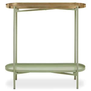
Abiat Green And Gold Iron And Cotton Two Tier Side Table
£196 Add to cart -

Essential Home
Apollo Single Sofa
£5,184 – £7,164 Select options This product has multiple variants. The options may be chosen on the product page -
DI Designs
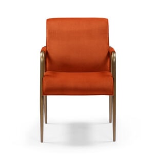
Campden Club Chair – Rust Orange
£590 Add to cart -
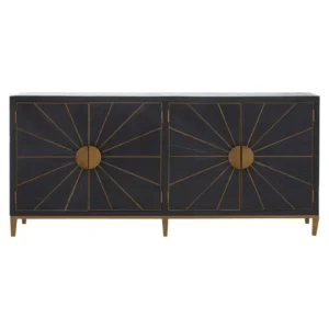
North West
Minia Black and Brass Sideboard
£1,846 Add to cart
2. Extend Wall Color to Ceilings

Painting your ceiling the same shade as your walls removes visual breaks and draws the eye upward, especially effective in rooms with lower ceilings. It’s an essential technique in any color grading blueprint to create the illusion of space.
3. Go Glossy with Finishes

A slight sheen on paint (like satin or eggshell) reflects natural light and makes walls appear more expansive. Avoid high gloss, which can be overwhelming in small spaces.
-

North West
Aiste Round Dining Table
£652 Add to cart -
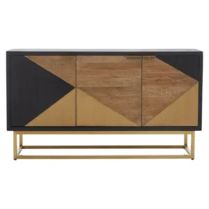
North West
Alamie Three Door Sideboard
£1,030 Add to cart -

North West
Asil 3 Seat Green Velvet Sofa
£1,704 Add to cart -
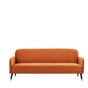
Hamilton Barnes
Holly Sofa Bed
£670 Select options This product has multiple variants. The options may be chosen on the product page
4. Incorporate Mirrors with Similar Hues

Mirrors bounce light around, especially when they reflect walls in light tones. Try placing one across a window to double your space visually.
Color Grading Blueprint for Small Spaces That Feel Cozy
Sometimes, bigger isn’t better. Small spaces can feel intentionally snug and sophisticated with the right palette.
1. Embrace Deep, Moody Tones

Rich hues like navy, forest green, or charcoal gray envelop a room in comfort and style. These create a “jewel box” effect that feels luxurious and intimate. Using deep shades as part of your color grading blueprint adds richness and warmth to any small space.
-
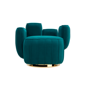
Hommes Studio
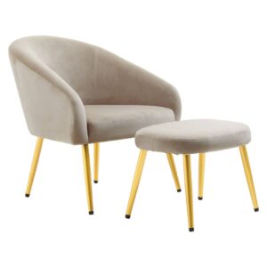
Ajui Armchair
£5,650 Select options This product has multiple variants. The options may be chosen on the product page -
North West
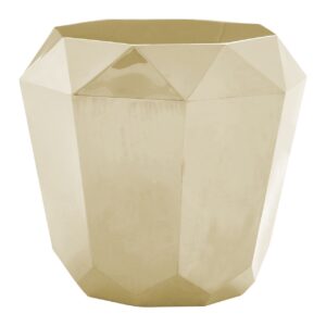
Alia Champagne Gold Diamond Cut End Table
£692 Add to cart -

North West
Alnwick Yellow Fabric Chair
£578 Add to cart -
Hudson Valley Lighting
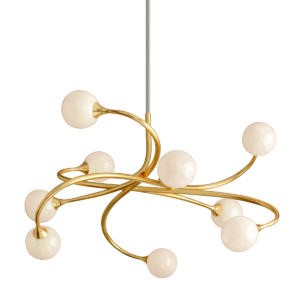
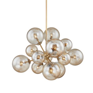
Santee Chandelier
£1,860 Add to cart
2. Add Earthy Accents

Terracottas, clay tones, and dusky pinks work well to make a room feel grounded. Pair with layered textiles and ambient lighting for the ultimate cozy haven.
3. Opt for Warm Neutrals
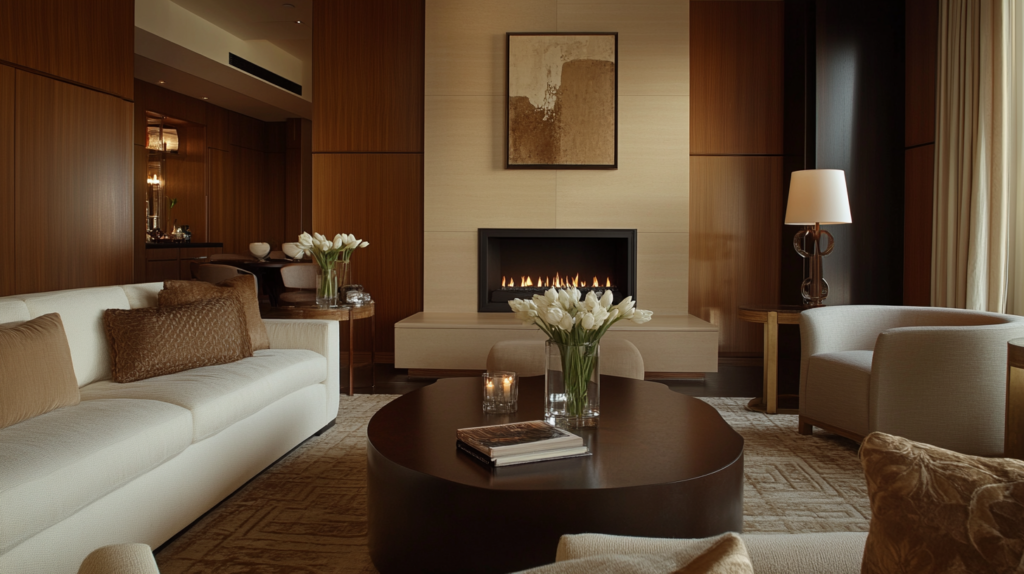
Creamy taupes, caramels, and muted golds strike a balance between bright and snug, adding warmth without overwhelming the senses. Integrating these tones into your color grading blueprint can make a small room feel more inviting and serene.
How to Combine Colors for Dual Impact
If you’re torn between wanting space to feel open and cozy, consider a two-tone or zoning approach:
Color Blocking: Use a lighter shade on top (to open the space) and a deeper hue below (to ground it). This is a popular technique found in every color grading blueprint for optimizing small rooms.
Accent Walls: Create depth by painting one wall a bold color—ideally the wall you want to highlight, such as behind a bed or sofa.
Zoning With Color: Use different colors to designate “zones” in studio apartments or open-concept homes—this keeps things cozy without closing them off.
Pro Tips from Interior Experts
Choose matte finishes in cozy color schemes to absorb light and create warmth.
Always test paint swatches in both natural and artificial light—colors can shift dramatically.
Don’t forget trims and moldings: Painting them the same color as walls can elongate walls and simplify visual lines.
Conclusion
Mastering the color grading blueprint for small spaces is less about following rigid rules and more about understanding the emotional and spatial effects of your palette. Whether you want to make your space feel bigger or wrap yourself in a cozy vibe, the right shades—and how you apply them—make all the difference. Try a few of these tips and watch your space transform.

