Walk into any design-forward home right now and you’ll likely encounter something that would have been unthinkable five years ago: a terracotta accent wall in a minimalist living room. A cobalt velvet sofa anchoring an otherwise neutral space. Fuchsia kitchen cabinets that somehow feel sophisticated rather than chaotic.
This isn’t maximalism having another moment, nor is it eclectic design throwing spaghetti at the wall to see what sticks. This is dopamine decor—the neuroscience-backed design movement that’s turning color from a purely aesthetic choice into a deliberate wellness tool.
If you’ve spent the last decade watching Pinterest boards evolve from Scandinavian white-on-white to greige-on-greige to Sad Beige Mom aesthetics, you’ve witnessed the slow death of joy in our living spaces. Somewhere between Marie Kondo and minimalist aspirationalism, we collectively decided that sophisticated homes should be visually silent—devoid of personality, stripped of emotional resonance, and above all, beige.
But here’s what nobody told us: our brains weren’t designed to thrive in emotionally flat environments. They were designed to seek color, respond to visual stimulation, and quite literally produce happiness chemicals when we encounter hues that resonate with us personally.
Dopamine decor emerged as the antidote to this chromatic depression. Rooted in color psychology, neuroscience research, and a cultural reckoning with mental health, dopamine decor represents the intentional use of color to trigger positive neurological responses, elevate mood, and create spaces that actively support our emotional wellbeing.
It’s not about painting everything neon yellow because some influencer said it would make you happy. It’s about understanding how your brain responds to color, identifying the specific hues that genuinely spark joy for you (not the design world’s version of joy), and strategically integrating them into your home in ways that feel authentic, sophisticated, and psychologically nourishing.
The movement gained serious cultural traction during the pandemic, when our homes transformed from places we briefly occupied between work and social life into 24/7 sanctuaries. Suddenly, those beige walls that looked “clean” and “timeless” in magazine spreads felt soul-crushing when stared at during hour seven of a Zoom workday.
Gen Z and Millennials, already skeptical of aspirational neutrality and increasingly vocal about mental health, began rejecting the idea that grown-up homes must be colorless. TikTok exploded with dopamine decor transformations—not because the algorithm favored them, but because people were genuinely hungry for spaces that felt emotionally alive.
What makes dopamine decor different from previous color trends is its foundation in actual science rather than purely aesthetic whims. While we’ve always known intuitively that color affects mood (hence the cliché advice to “paint your office blue for productivity”), dopamine decor takes this understanding several layers deeper.
It acknowledges that color doesn’t just create visual interest—it triggers neurochemical responses. When you encounter a color that resonates with your personal psychology, your brain releases dopamine, the neurotransmitter associated with pleasure, motivation, and reward.
This isn’t woo-woo wellness speak; it’s measurable brain chemistry. The revolution is in recognizing that we can harness this response intentionally, making our homes active participants in our mental health rather than passive backdrops to our lives.
Let’s clear up the confusion immediately: dopamine decor is not synonymous with “bright colors everywhere.” It’s not maximalism rebranded. It’s not buying whatever Pantone declared Color of the Year and slapping it on every surface.
The term itself—dopamine decor—refers specifically to designing spaces with color choices that trigger dopamine release in your brain, creating genuine emotional uplift rather than simply following trend reports.
The science here matters. Dopamine is a neurotransmitter that plays a crucial role in how we experience pleasure, satisfaction, and motivation. When your brain encounters stimuli it finds rewarding—whether that’s a delicious meal, a meaningful conversation, or yes, a color that resonates with your personal psychology—it releases dopamine.
This chemical response creates feelings of happiness, contentment, and motivation. In the context of interior design, dopamine decor leverages this neurological process by surrounding you with colors that your specific brain finds rewarding.
This is where dopamine decor fundamentally diverges from prescriptive color trends. Traditional interior design advice tells you that blue is calming, red is energizing, yellow is cheerful—as if human brains were factory-programmed with identical color responses.
But neuroscience reveals a more nuanced reality. While there are some universal color associations, your personal dopamine response to color is shaped by individual brain chemistry, cultural background, personal memories, and lived experiences.
The peachy-pink that sends your brain into dopamine overdrive might do absolutely nothing for your neighbor. This is why cookie-cutter dopamine decor fails—authentic implementation requires self-awareness and experimentation.
What dopamine decor is NOT: It’s not childish. Using color intentionally doesn’t mean your home looks like a kindergarten classroom. It’s not chaotic. Strategic color use creates focus and emotional rhythm, not visual noise.
It’s not trend-chasing. If you genuinely hate the color that TikTok insists is “so dopamine,” your brain won’t magically produce happy chemicals when you force it into your space.
And critically, it’s not exclusively about saturated brights. Muted terracotta, dusty sage, soft blush, and deep navy can all function as dopamine colors if they genuinely resonate with you emotionally.
-

Alia Yin-Yang Stainless Steel Coffee Table
£1,082 Add to cart -

Decker Sofa
£13,605 – £31,529Price range: £13,605 through £31,529 Select options This product has multiple variants. The options may be chosen on the product page -
Sale

Joey Armchair
£570Original price was: £570.£536Current price is: £536. Add to cart
Understanding how dopamine decor works requires a brief dive into color psychology and brain chemistry. When light enters your eyes, it’s processed by photoreceptors that send signals to various parts of your brain, including areas responsible for emotion, memory, and physiological responses.
Different wavelengths of light—which we perceive as different colors—trigger distinct neurological and physiological effects.
Red has the longest wavelength and is processed by the brain as stimulating. Studies show that exposure to red can increase heart rate, raise blood pressure, and trigger feelings of urgency or excitement. This isn’t arbitrary—it’s evolutionary biology.
Red signaled danger (predators, blood, fire) but also reward (ripe fruit, healthy skin). Your brain is hardwired to pay attention to it. In a dopamine decor context, red and its softer cousins (coral, terracotta, blush) can energize spaces where you want activation.
Blue sits on the opposite end of the spectrum with shorter wavelengths. Research consistently shows that blue exposure can lower blood pressure, reduce heart rate, and trigger parasympathetic nervous system responses associated with calm and relaxation.
This is why so many people instinctively gravitate toward blue for bedrooms and bathrooms. But here’s where personal preference matters: if you have negative associations with the color, your brain might not produce the expected dopamine response.
Yellow stimulates mental activity and can boost feelings of happiness and optimism—but it’s also the most fatiguing color to the eye when overused. Too much bright yellow can actually increase anxiety rather than alleviate it.
Green, positioned in the middle of the visible spectrum, is processed by the brain with minimal strain, which is partly why it’s associated with balance, restoration, and reduced anxiety. Spending time in green environments has been shown to lower cortisol levels and improve focus.
But here’s the crucial part for dopamine decor: these physiological responses are just the foundation. The real magic happens in the limbic system—the part of your brain responsible for emotion and memory.
When you encounter a color connected to positive memories or personal meaning, your brain doesn’t just register “this is blue and therefore calming.” It triggers a cascade of associations, memories, and emotional responses unique to you.
That specific shade of sage green might remind you of your grandmother’s garden, creating a dopamine hit every time you see it. Or it might remind you of a hospital waiting room, triggering stress instead. This is why generic color advice fails and why dopamine decor requires personal curation.
The rise of dopamine decor isn’t random—it’s a cultural response to multiple converging forces.
The pandemic fundamentally altered our relationship with home. When your living room becomes your office, your gym, your restaurant, and your social space simultaneously, visual monotony becomes psychologically unbearable. Those Instagram-perfect beige interiors that looked aspirational when you spent 10 waking hours per week in them felt actively depressing when they became your entire world.
Mental health awareness has also reached a tipping point, particularly among younger generations. Gen Z and Millennials are significantly more likely than previous generations to discuss mental health openly, seek therapy, and implement wellness practices into daily life.
The idea that your environment should actively support your mental health rather than simply “look good” resonates with a generation that views self-care as non-negotiable. Dopamine decor fits seamlessly into this framework—it’s environmental design meeting preventative mental health care.
The death of minimalist beige also represents a rejection of performative adulthood. For years, design culture implied that growing up meant stripping away color and personality in favor of neutral sophistication. But why?
Who decided that joy and maturity were mutually exclusive? The dopamine decor movement challenges this false dichotomy, insisting that sophisticated design can—and should—include color that makes you genuinely happy.
Social media, particularly TikTok, democratized access to design transformation content in ways traditional media never could. Suddenly, you didn’t need to hire an interior designer or subscribe to expensive shelter magazines to see dramatic before-and-afters.
Regular people were painting their rental apartments fuchsia, installing peel-and-stick wallpaper in dopamine-inducing patterns, and thrifting colorful vintage furniture—and the results were stunning. This accessibility factor cannot be overstated.
Identifying Your Personal Dopamine Colors
Here’s where dopamine decor gets deeply personal. Unlike prescriptive design systems that assign moods to colors universally, your dopamine colors are the specific hues that trigger genuine emotional resonance in your brain.
Start by examining your authentic emotional responses to color, not what you think you should like. Close your eyes and think about the last time you encountered a color that made you physically pause—maybe it was a sunset, a piece of fruit, a stranger’s coat, a building facade.
What was that color? How did it make you feel? This visceral response is your brain telling you something important.
Look at your existing belongings through this lens. What colors naturally accumulate in your life when you’re not consciously curating an aesthetic? Your favorite coffee mug, the throw blanket you reach for constantly, the clothing items you wear until they fall apart—these objects often cluster around your genuine color preferences.
Consider your color memories and associations. Maybe dusty pink reminds you of childhood ballet classes (good memory = dopamine hit) or a failed relationship (negative association = no dopamine response).
These associations aren’t trivial—they’re neurological pathways that determine whether a color triggers reward chemicals in your brain.
Pay attention to the colors that energize versus drain you. Some people find bright yellow exhilarating; others find it anxiety-inducing. Deep navy might feel cocooning and safe to you but oppressive and heavy to someone else.
Test colors in context before committing. Paint large swatches directly on your walls and live with them for at least a week, observing how they make you feel at different times of day and in different lighting conditions.
-

Allida Pendant
£1,342 Add to cart -

Amalia Sofa With Chaise
£9,848 – £12,406Price range: £9,848 through £12,406 Select options This product has multiple variants. The options may be chosen on the product page -

Atom Burl Wood And Cream Boucle Stool
£145 Select options This product has multiple variants. The options may be chosen on the product page
Strategic Color Implementation: From Subtle to Immersive
Once you’ve identified your personal dopamine colors, the question becomes: how much is the right amount? Dopamine decor exists on a spectrum from subtle accent integration to full color immersion.
The Accent Approach: If you’re color-hesitant, start with strategic dopamine accents. Paint a single wall, choose a statement furniture piece, or layer in textiles like throw pillows or curtains.
The 60-30-10 rule works beautifully here—60% neutral, 30% secondary color, 10% accent dopamine color. This approach provides regular dopamine hits without overwhelming your visual field.
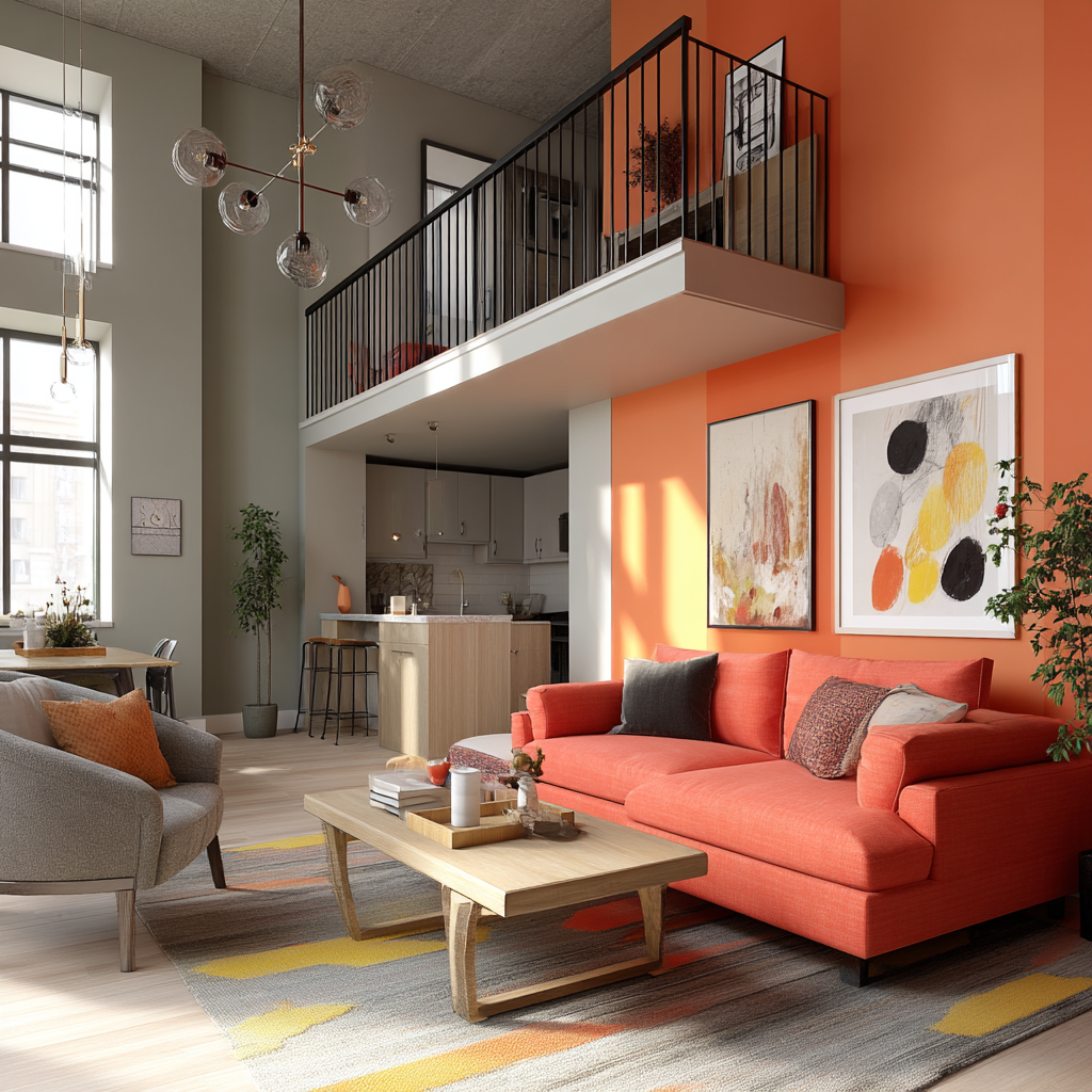
The Focal Wall Strategy: Painting one wall in a bold dopamine color creates a strong psychological anchor point. Your brain registers the color immediately upon entering, triggering that dopamine response, while surrounding neutral walls provide visual rest.
This works particularly well in bedrooms behind the bed, living rooms behind the sofa, or home offices behind your desk for a Zoom-friendly backdrop that energizes you.
The Layered Integration: Layer multiple instances of your dopamine color throughout a space in varying saturations and textures. Maybe it’s sage green walls, a deeper emerald throw, pale mint artwork, and hunter green book spines.
Your brain registers the color repeatedly without creating monotony. This is where dopamine decor gets sophisticated—creating visual harmony through tonal variation rather than relying on a single bold statement.
The Full Immersion: For maximum mood impact, paint all walls (ceiling included) in your dopamine color. Deep terracotta might make a dining room feel intimate. Soft blush can make a bedroom feel restorative.
Sky blue could transform a bathroom into a spa-like escape. The key is choosing rooms where full immersion enhances the room’s purpose rather than fighting against it.
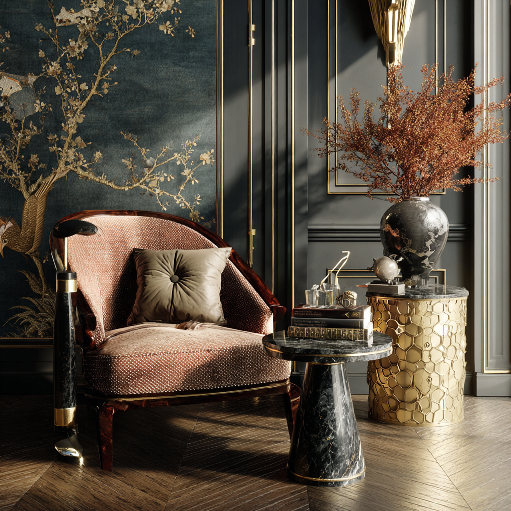
Color Pairing Strategies: Complementary pairings (coral and teal, mustard and purple) create energizing visual vibration. Analogous pairings (blush, coral, terracotta) feel harmonious and soothing.
Unexpected pairings (sage green and dusty pink) create sophisticated tension that keeps your brain engaged without feeling chaotic.
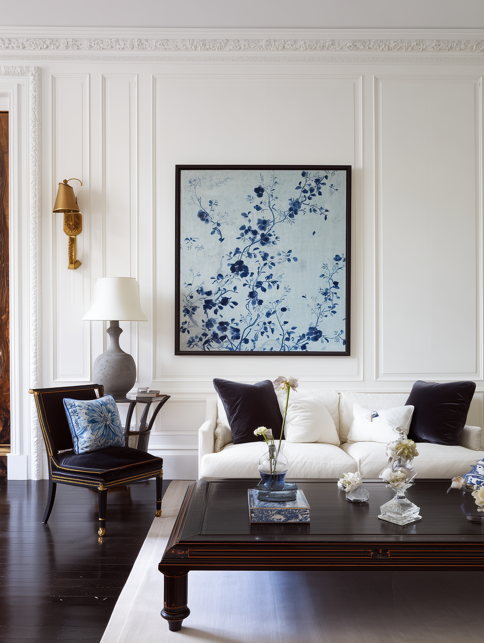
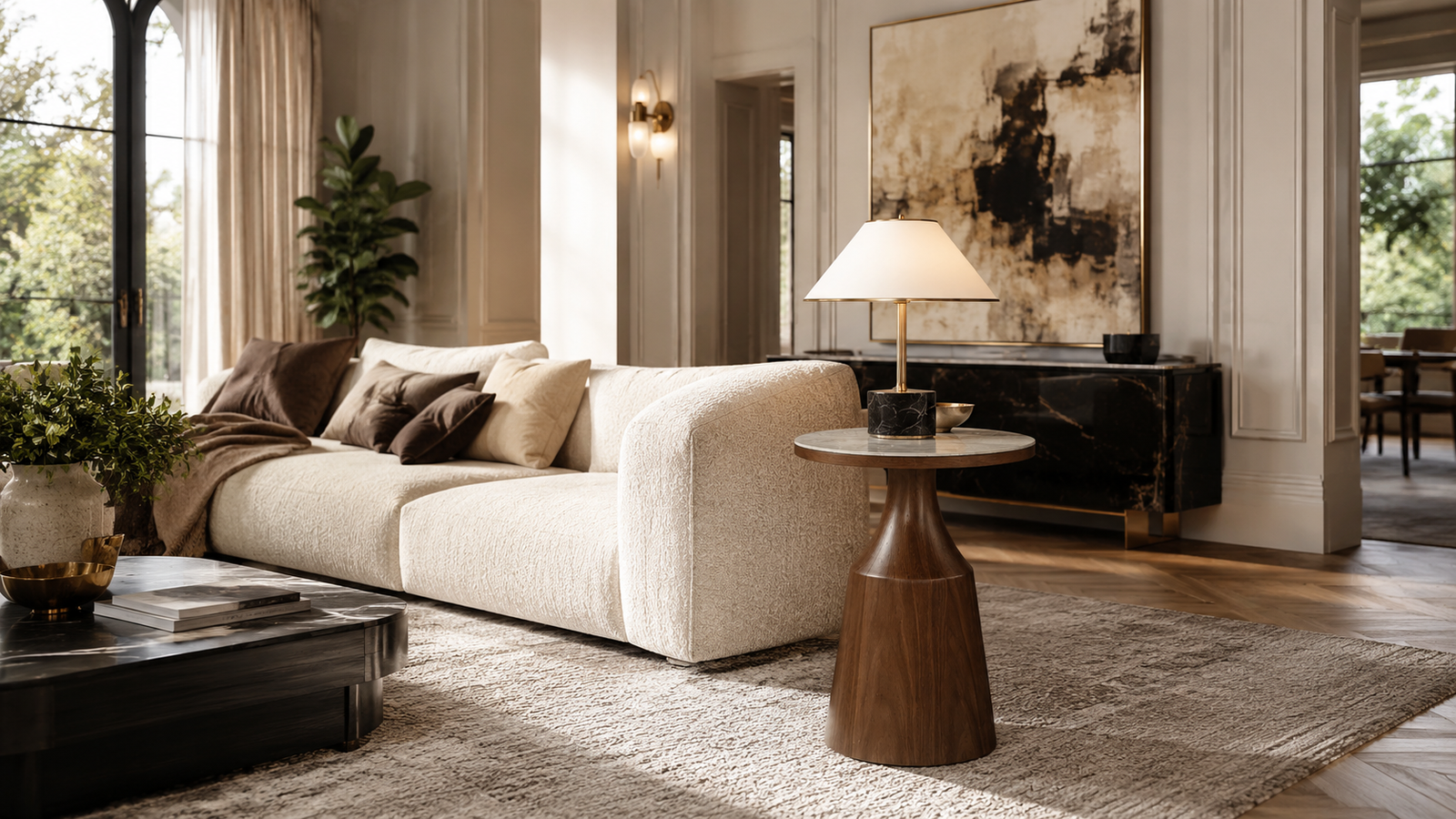
The role of neutrals cannot be overstated. They’re not the enemy—they’re the canvas. White, cream, beige, and gray provide the visual rest that allows your dopamine colors to actually trigger that neurochemical response.
If every surface is screaming for attention, your brain tunes out rather than responds. Strategic neutrals create the contrast necessary for your dopamine colors to land with impact.
Lighting dramatically affects perception. Natural light shifts throughout the day, changing how colors read emotionally. That sunny yellow that feels cheerful at 3 PM might feel aggressive at 7 AM when you’re groggy.
Warm artificial lighting enhances reds and oranges while muting blues. Cool lighting does the opposite. Test your dopamine colors in your actual lighting conditions at different times of day before committing to large applications.
Room-by-Room Dopamine Strategies
Different spaces serve different psychological functions, which means your dopamine color strategy should shift accordingly.
Living Rooms: This is your social hub, so dopamine colors here should encourage connection and conversation. Warm hues—terracotta, coral, peachy-pink, warm yellow—create psychological warmth that makes people feel welcomed and inclined to linger.
If your living room doubles as a relaxation space, consider cooler dopamine colors like sage or soft blue through textiles and accessories while keeping walls neutral. This allows you to enjoy social energy colors when entertaining but dial them back when you need calm.
Bedrooms: Sleep science suggests cooler, more muted dopamine colors work best—dusty lavender, soft sage, pale blue, blush pink. These hues promote rest without sacrificing the joy factor.
But here’s the nuance: if your bedroom is also your morning coffee spot or getting-ready space, add a secondary energizing color through an accent wall or vibrant textiles you can swap seasonally. This gives you flexibility based on your current emotional needs.
Kitchens: Color psychology research shows that warm colors stimulate appetite and conversation. Burnt orange, terracotta, warm yellow, and even red (in moderation) can make this space feel more inviting and creativity-inducing.
If you’re hesitant about bold kitchen walls, consider colorful lower cabinets with neutral uppers, a vibrant backsplash, or open shelving displaying colorful dishware. These smaller commitments still deliver dopamine hits without overwhelming the space.
Home Offices: This is where dopamine decor becomes crucial for mental health. Working from home in a beige box kills motivation and creativity. Colors that enhance focus without overstimulation work best—sage green, dusty blue, muted coral, soft yellow.
Position your dopamine color where you’ll see it during video calls (creating a pleasant backdrop for you and viewers) and where your eyes land when you look up from your screen. These visual breaks reset attention and combat screen fatigue.
Bathrooms: Your bathroom is a self-care sanctuary, so treat it accordingly. Choose dopamine colors that support the rituals you perform here—energizing shades like minty green or coral for morning showers, or wind-down hues like lavender or soft blue for evening baths.
Bathrooms are also ideal for color experimentation because they’re small, private spaces where bold choices feel less risky. You can test dopamine colors here before committing to them in more public areas of your home.
Entryways: This is your first-impression zone both for guests and for yourself. The color that greets you when you come home sets the emotional tone for your entire entry experience.
A dopamine color here—whether on the door itself, an accent wall, or through accessories—can literally trigger happiness chemicals the moment you arrive home, creating a Pavlovian association between “home” and “reward.”
The Psychology and Wellness Connection
Color psychology extends far beyond simple mood associations. Different hues trigger distinct physiological and psychological responses that can be strategically leveraged for specific wellness goals.
Seasonal Affective Disorder and Color Therapy: For people who struggle with seasonal depression during darker months, dopamine decor becomes a therapeutic tool. Warm, saturated colors—particularly in the yellow-orange range—can partially compensate for reduced sunlight exposure.
The Contrast Effect: Dopamine decor works most powerfully against neutral backdrops because of how the brain processes contrast. When your visual field shifts dramatically from neutral to colorful, your brain registers that transition as worthy of attention—and if the color resonates with you, worthy of a dopamine reward.
Color Fatigue and Overstimulation: Your brain can experience color fatigue. Constant exposure to high-saturation, high-contrast colors can drain rather than energize you. This is why visual rest matters—strategic use of dopamine colors with neutral balance prevents psychological fatigue.
Personal vs. Universal Color Response: While certain color associations are relatively universal (green = nature, blue = sky/water), your individual response is filtered through cultural context and personal experience. Your dopamine colors should account for your specific cultural and personal associations.
Texture and Pattern’s Amplifying Effect: Color doesn’t exist in isolation—it interacts with texture and pattern. A dopamine color in velvet feels different than the same color in linen or glossy lacquer. Matte finishes feel calming; glossy finishes feel energizing.
-

Abberley Bedside | Brown
£464 Add to cart -

Airo Table Lamp
£194 Add to cart -

Corin bed
£6,332 – £8,940Price range: £6,332 through £8,940 Select options This product has multiple variants. The options may be chosen on the product page
Practical Implementation: Budget-Conscious Dopamine Upgrades
The beauty of dopamine decor is its accessibility. You don’t need a renovation budget—you need self-awareness and creativity.
Paint Is Your Cheapest Tool: A gallon of paint costs $30-50 and can completely transform a room’s emotional impact. An accent wall takes 2-3 hours. If you’re renting, many landlords allow paint with the agreement that you’ll return it to neutral before moving out.
Textiles Offer Flexibility: Throw pillows, blankets, curtains, and area rugs allow you to test dopamine colors without commitment. Swap them seasonally to address shifting emotional needs. Thrift stores and discount retailers offer affordable options in trend-forward colors.
Renter-Friendly Alternatives: Removable wallpaper has revolutionized renter dopamine decor. Brands like Tempaper and Spoonflower offer peel-and-stick options in every color imaginable. They install in hours and remove without damage.
Secondhand Sourcing Strategy: The vintage and secondhand market is flooded with colorful pieces from earlier decades when color wasn’t stigmatized. Facebook Marketplace, estate sales, and thrift stores yield terracotta lamps, jewel-toned glassware, and vibrant artwork at fraction-of-retail prices.
The Power of Small Doses: Start with a colorful vase, throw blanket, or framed art prints. Live with these small introductions and notice how they affect your mood. If your brain responds positively, scale up.
DIY Projects: Painting terracotta pots, creating your own artwork, or dyeing thrift-store textiles allows you to incorporate exact dopamine colors at minimal cost. YouTube tutorials make these projects accessible to beginners.
Common Dopamine Decor Mistakes to Avoid
As dopamine decor gains popularity, certain missteps have become common.
Trend-Chasing Instead of Self-Reflection: If you’re choosing colors because they’re trending on TikTok rather than because they genuinely resonate with you emotionally, you’re missing the entire point. Your brain won’t produce dopamine in response to colors you don’t actually love.
Overwhelming Every Surface: Dopamine decor requires restraint. If every wall, furniture piece, and accessory screams for attention, your brain experiences decision fatigue rather than joy. Strategic placement against neutral backgrounds creates impact; saturation everywhere creates noise.
Ignoring Undertones: All colors have undertones—warm or cool secondary hues that affect how they read in space. If you mix warm and cool undertones randomly, the result feels visually unsettled. Stick within warm or cool families.
Neglecting the Whole Design: Color alone doesn’t create dopamine decor. Lighting, composition, texture, scale, and proportion all contribute to how your brain experiences a space.
Forcing Colors You Don’t Like: If you genuinely hate pink but bought a blush sofa because trend content told you it would make you happy, your brain knows you’re lying. You’ll experience irritation every time you look at it rather than joy.
Skipping the Testing Phase: Committing to a wall color or major furniture piece without testing it in your actual space, lighting, and lifestyle is a recipe for regret. Paint large swatches and live with them for weeks before making permanent decisions.
Color as Daily Mental Health Practice
Dopamine decor represents a fundamental shift in how we think about interior design—from spaces that look good in photos to spaces that actively support our psychological wellbeing. It’s the recognition that our homes aren’t just shelter; they’re daily environments that profoundly affect our brain chemistry, emotional regulation, and mental health.
The power of dopamine decor lies in its personalization. This isn’t a prescriptive trend telling you which colors to use. It’s a framework for understanding how your specific brain responds to color and leveraging that knowledge to create spaces that genuinely serve you emotionally.
Your dopamine color might be someone else’s nightmare—and that’s exactly the point. This movement gives you permission to trust your authentic emotional responses rather than deferring to external authorities about what sophisticated homes should look like.
Implementing dopamine decor doesn’t require expertise, wealth, or perfection. It requires self-awareness, experimentation, and courage to choose joy over aspiration. It’s permission to paint that accent wall terracotta even though it’s not currently trending.
It’s freedom to buy the cobalt velvet chair that makes your heart race even though it doesn’t match anything. It’s the recognition that a home that makes you genuinely happy is more valuable than a home that looks impressive to strangers on the internet.
As we continue navigating an increasingly complex, digital, and often overwhelming world, the spaces we return to every day matter more than ever. Dopamine decor offers a science-backed, accessible, deeply personal approach to making those spaces work for us psychologically rather than against us.
Color becomes more than decoration—it becomes a daily mental health practice, a small but significant tool for mood regulation, and a reminder that your home should feel like a reward, not a waiting room.
The beige era taught us that neutrality is safe. The dopamine decor movement teaches us something better: that joy is sophisticated, that color is courage, and that the best homes aren’t the ones that look perfect—they’re the ones that make you feel genuinely, authentically happy every time you walk through the door.

