Interior Design Mistakes That Make Your Home Look Cheap — and How to Fix Them

interior design mistakes that make a home look unfinished

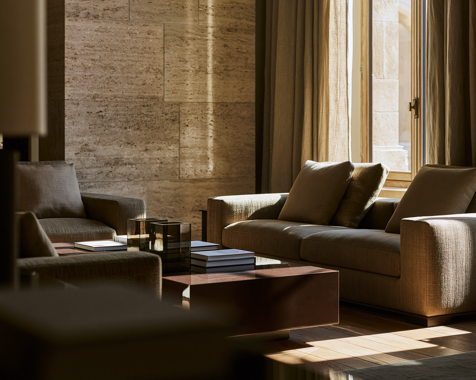
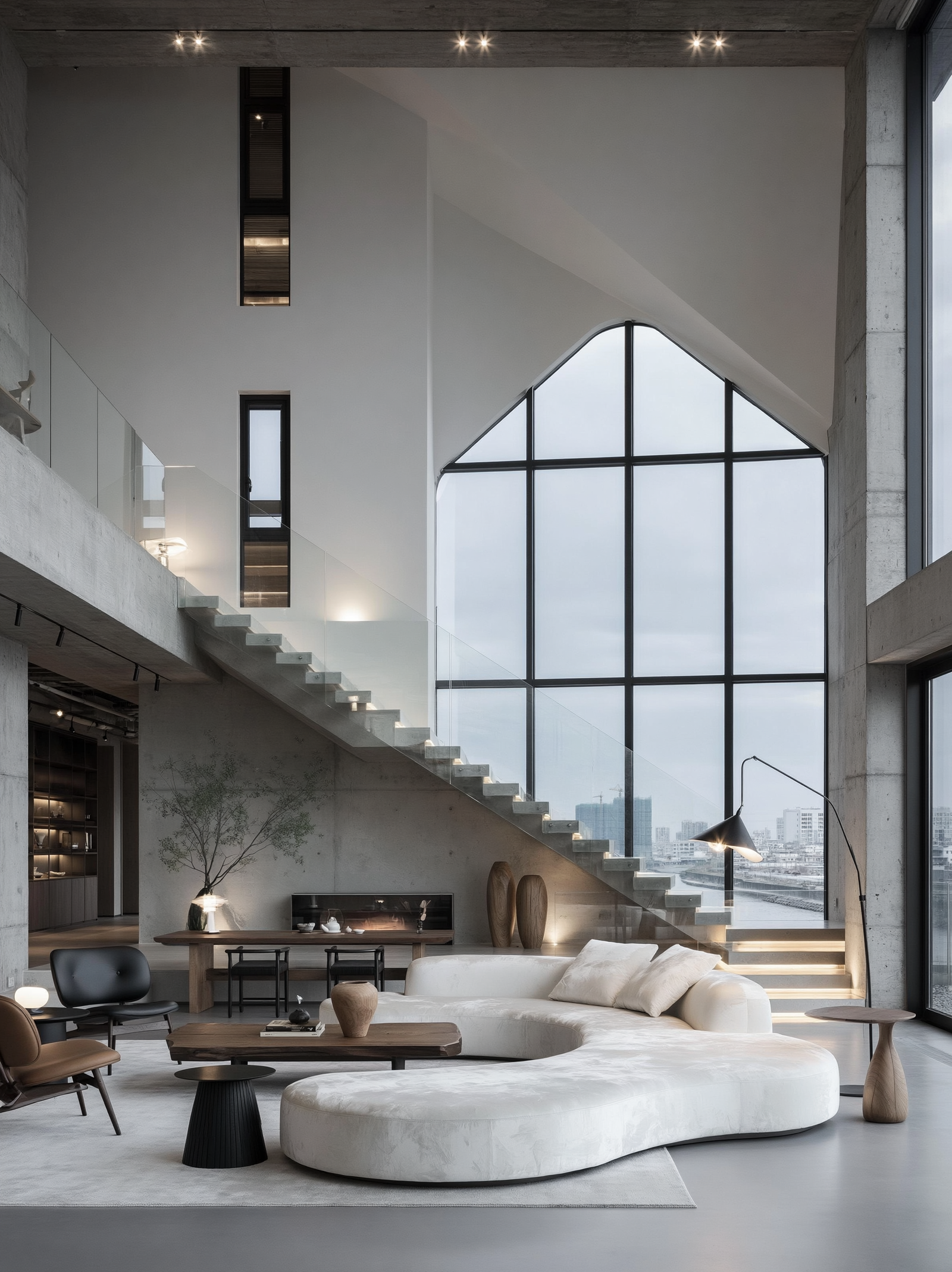
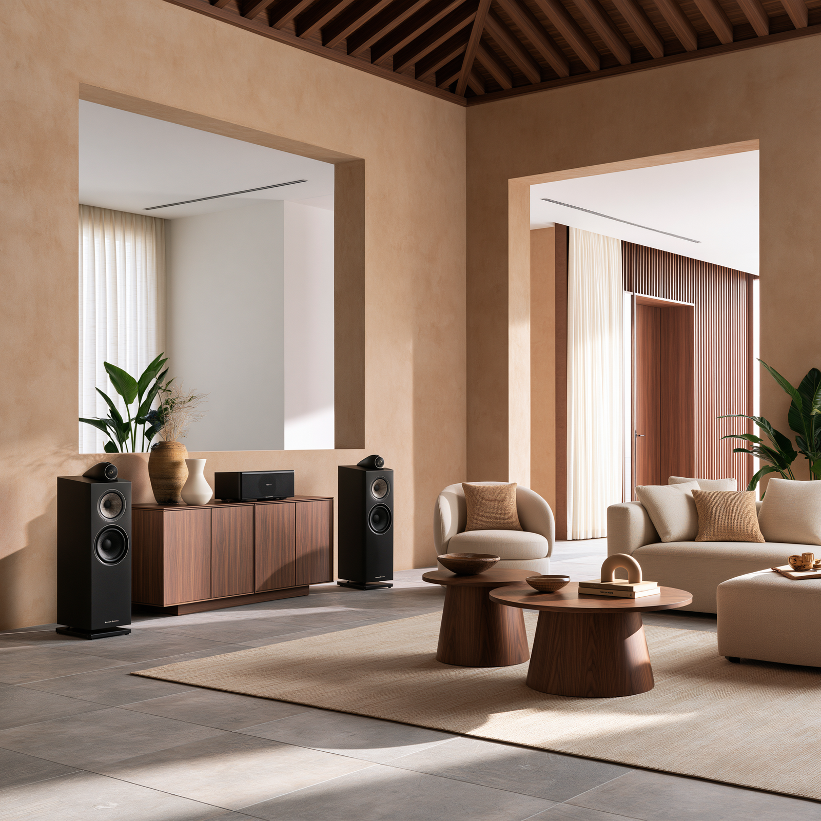
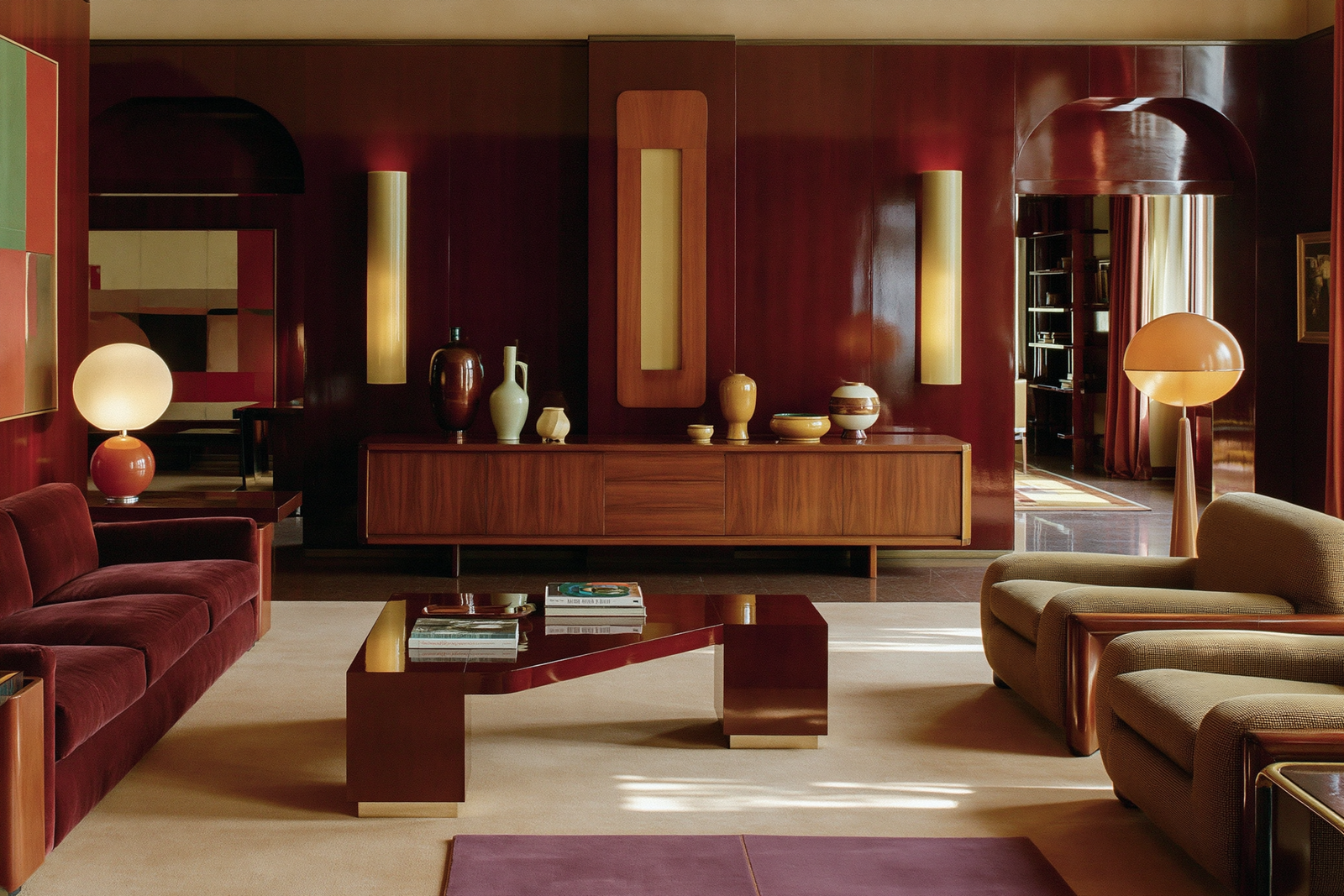
A home rarely looks cheap because one piece is inexpensive. More often, it looks cheap because the room feels unfinished, unbalanced or badly edited. That is the secret behind many interior design mistakes: the problem is not always the budget. It is scale, lighting, proportion, texture, layout and the way every piece relates to the next.

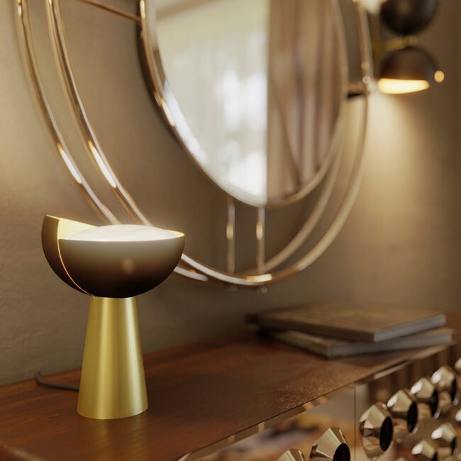
A beautiful sofa can look wrong if the rug beneath it is too small. A luxury sideboard can feel ordinary if the wall above it is bare. A marble coffee table can lose its impact if the room has harsh ceiling lighting. Expensive accessories can make a home look cluttered if they are scattered without rhythm. The difference between a home that looks collected and one that looks cheap is rarely about buying more. It is about choosing better, placing carefully and editing with confidence.

Interior designers understand this instinctively. A finished home has layers: furniture, rugs, lighting, curtains, artwork, storage, accessories, negative space and personality. When one of those layers is missing, the room can feel flat. When too many are competing, the room can feel chaotic.

Kelly Wearstler’s design philosophy is often linked to storytelling, materiality and confidence. In Forbes, her approach is described through the phrase “love color, take risks, stay curious”. That idea is useful because a beautiful home should never feel accidental. It should feel curious, layered and intentional.

If your home does not yet feel as expensive or finished as you want it to, the answer may not be a complete redesign. It may be correcting the small interior design mistakes that are quietly weakening the room.


Table of Contents

  1. Mistake 1: Buying Furniture Without Measuring Properly
  2. Mistake 2: Using a Rug That Is Too Small
  3. Mistake 3: Relying Only on Ceiling Lighting
  4. Mistake 4: Pushing All the Furniture Against the Walls
  5. Mistake 5: Choosing Curtains That Are Too Short
  6. Mistake 6: Leaving Walls Bare or Under-Styled
  7. Mistake 7: Ignoring Scale and Proportion
  8. Mistake 8: Buying Matching Furniture Sets
  9. Mistake 9: Forgetting Texture
  10. Mistake 10: Over-Styling Every Surface
  11. Mistake 11: Forgetting Storage
  12. Mistake 12: Copying Trends Without Personality
  13. What to Fix First If Your Home Looks Cheap
  14. Final Thoughts: Expensive-Looking Homes Are Layered, Not Loud
  15. FAQs About Interior Design Mistakes
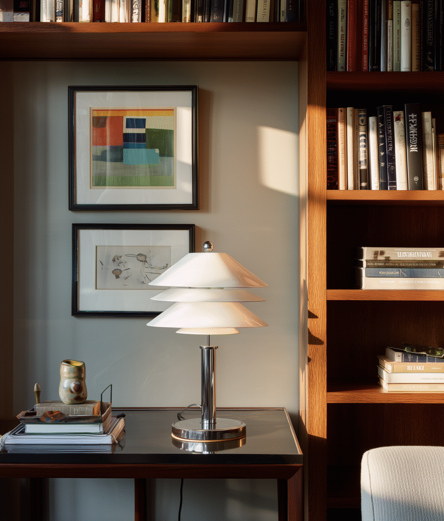
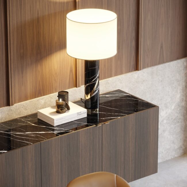
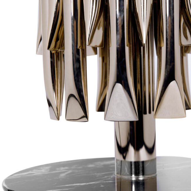
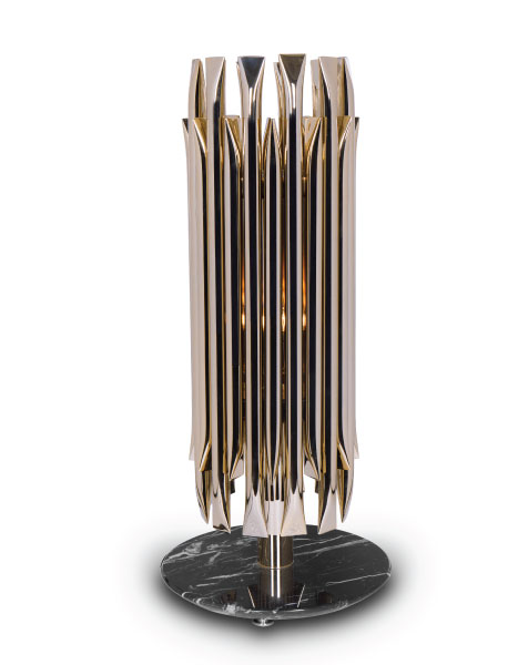
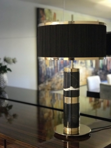
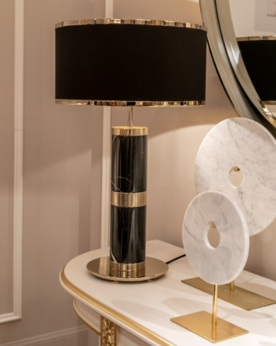
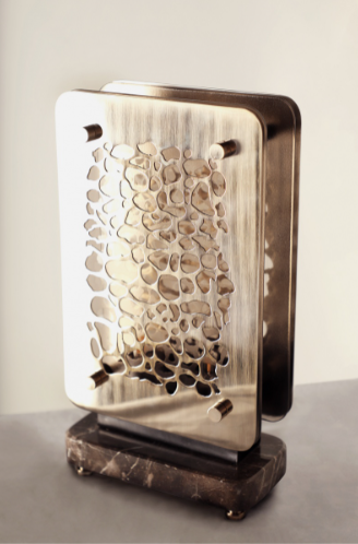
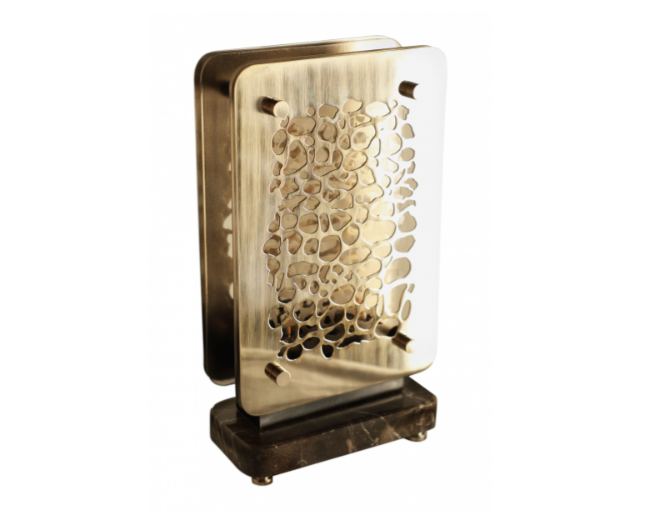
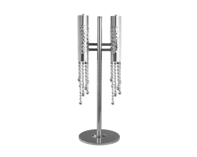
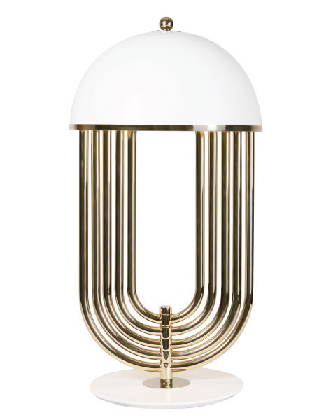
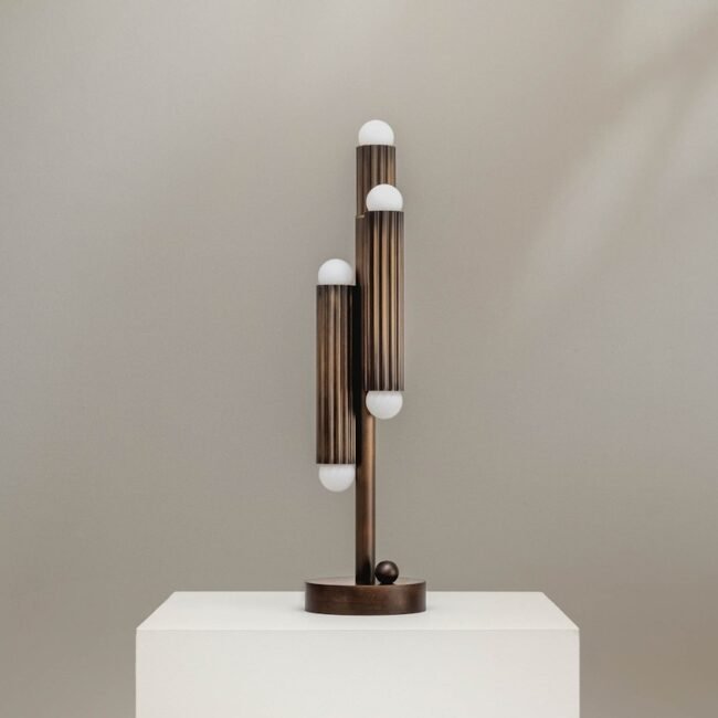
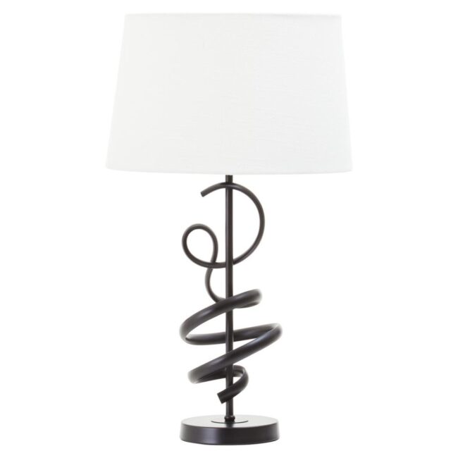
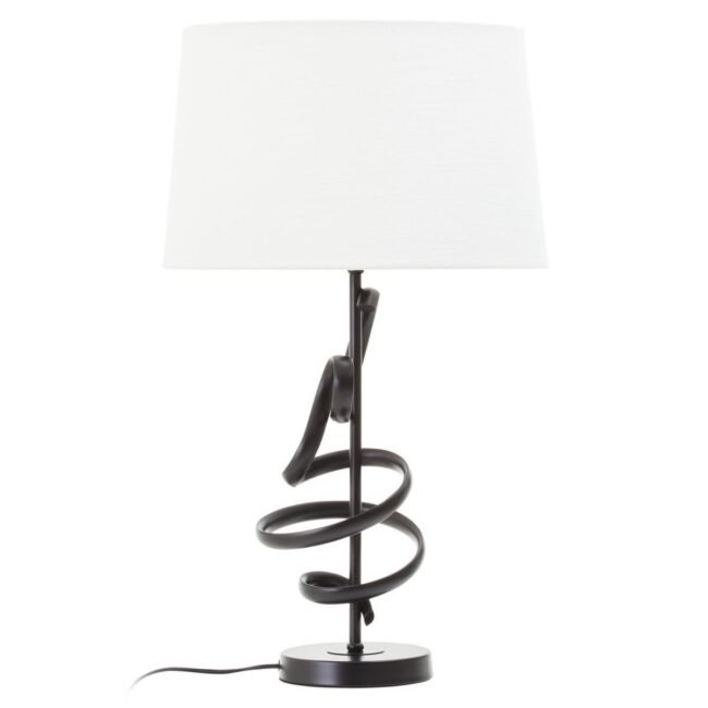
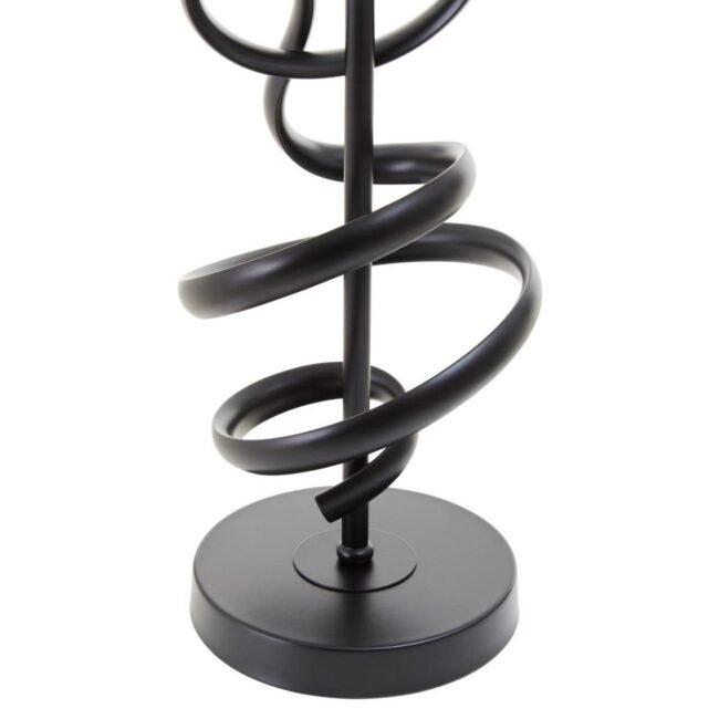
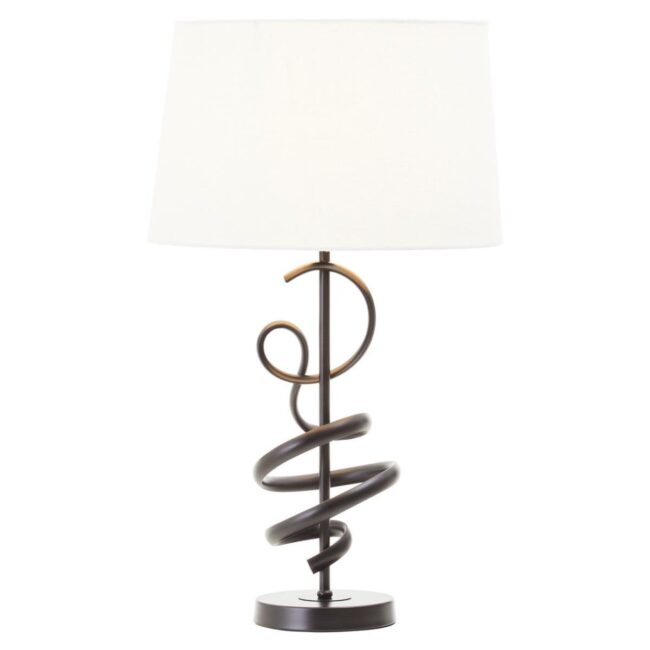
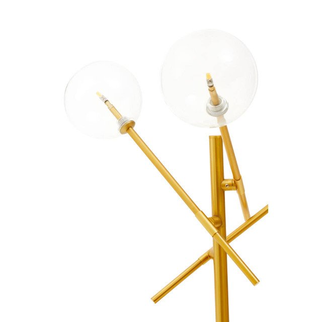
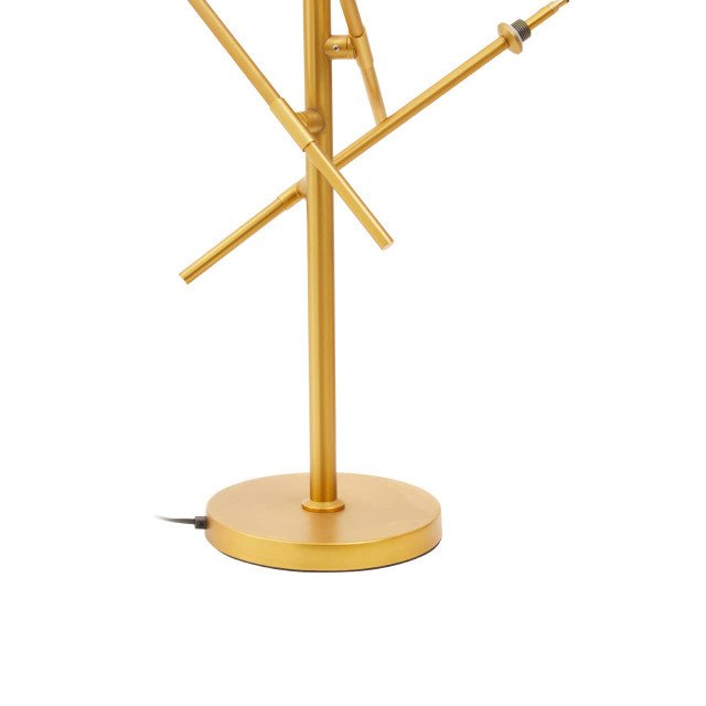
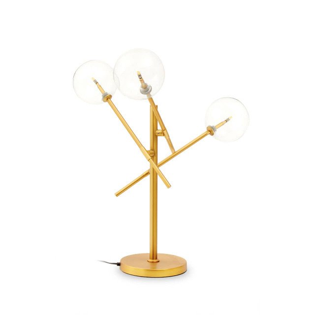
Table lamp for study 2

Mistake 1: Buying Furniture Without Measuring Properly

One of the quickest ways to make a home look cheap is buying furniture that does not fit the room. This does not always mean the piece is too large. Sometimes it is too small, too narrow, too low, too deep or simply wrong for the way the space is used.

A sofa that overwhelms a small living room can make the room feel cramped. A tiny coffee table in front of a large sofa can make the space feel unfinished. A narrow sideboard on a long wall can look lost. Dining chairs that cannot pull out comfortably make the room feel poorly planned. Even beautiful furniture loses its elegance when the scale is wrong.

Designers do not begin with shopping. They begin with the room. They think about how people move, where they sit, what they reach for, where the light comes from and what needs to be stored. This is why a room designed by a professional often feels calm before you even notice the individual pieces.

Designer Ashley Montgomery writes about designing homes around real life rather than just photographs. Her Homes & Gardens column on designing for real life without sacrificing beauty is a reminder that a beautiful home must still function once the styling is removed.

Before buying any major piece, measure the room, the wall, the doorways and the distance around the furniture. Use masking tape to mark out the size on the floor. Check how much walking space remains. Ask whether the table can be reached from the sofa, whether the sideboard doors can open and whether the room still feels comfortable.

Expensive-looking interiors are not just filled with beautiful things. They are planned.


Mistake 2: Using a Rug That Is Too Small

A small rug is one of the most common home decor mistakes, and it can instantly make a room look cheaper. The rug may be beautiful, but if it floats in the middle of the floor with only the coffee table touching it, the whole seating area can look disconnected.

A rug should anchor the room. In a living room, the front legs of the sofa and chairs should usually sit on the rug, or the rug should be large enough to hold the full seating arrangement. In a dining room, the rug should extend beyond the table so the chairs remain on it when pulled out. In a bedroom, the rug should extend beyond the bed so it creates softness underfoot.

The problem with a rug that is too small is that it makes every other piece look uncertain. The sofa looks separate from the chairs. The coffee table looks isolated. The room feels like furniture has been placed in it rather than designed as a composition.

A larger rug does not always need to be loud or expensive. A simple oversized rug in a good texture often looks more luxurious than a small decorative rug with a busy pattern. Scale is what gives it presence.

Rugs also soften sound, add warmth and make a room feel more comfortable. Without one, a room with wooden, stone or tile floors can feel hard and echoey.

A good rug is not an accessory. It is the foundation of the room.

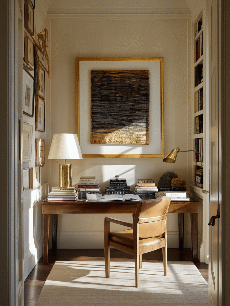
“A good study lamp should do two things beautifully: help you focus and make your workspace feel alive.”

Brandon Schubert

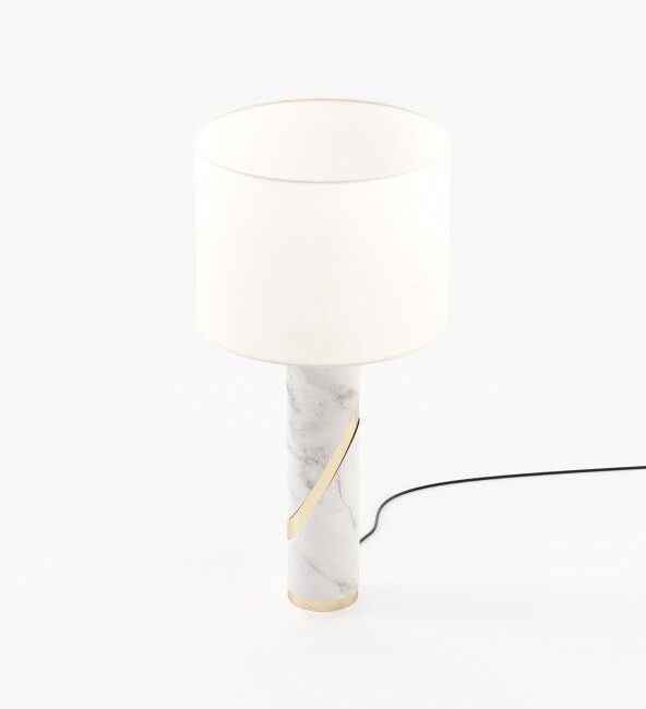
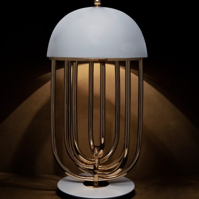
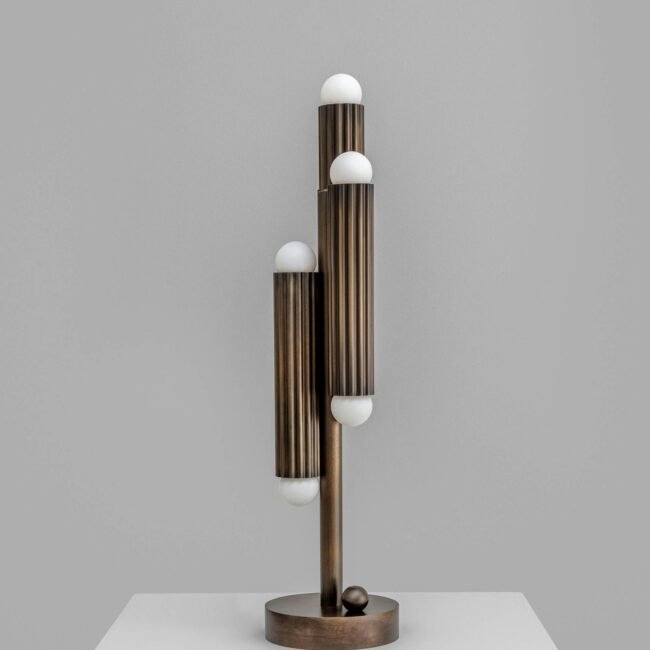
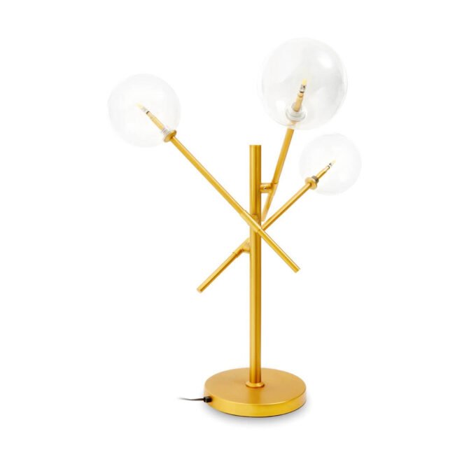
Best table lamos
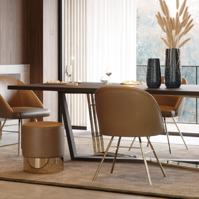
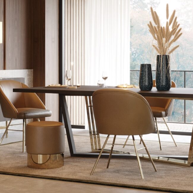
UK consumer furniture spending trends shown through a luxury dining room with upholstered chairs

Mistake 3: Relying Only on Ceiling Lighting

Nothing makes a home feel flat faster than relying only on one ceiling light. Overhead lighting can be useful, but on its own it often feels harsh, cold and unflattering. It lights the room, but it does not create atmosphere.

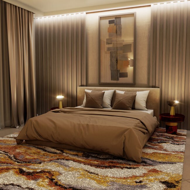
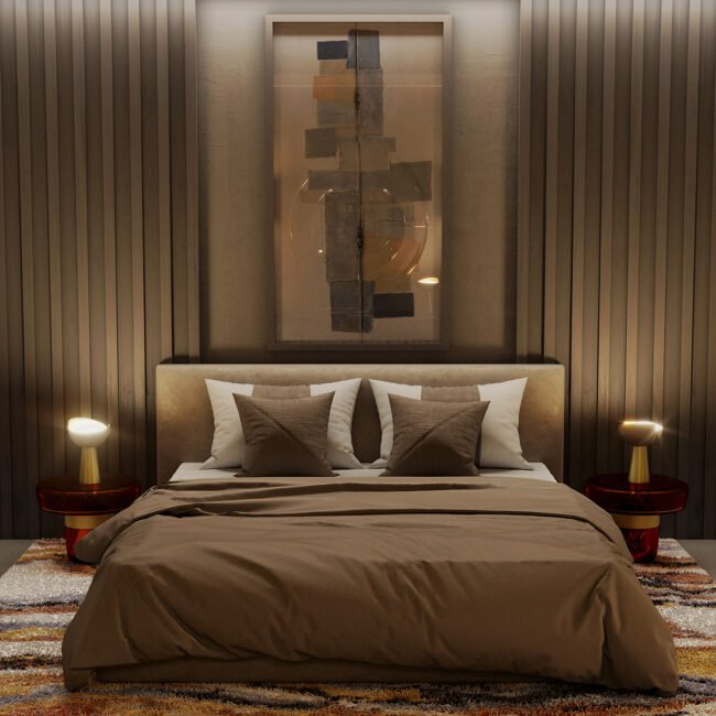
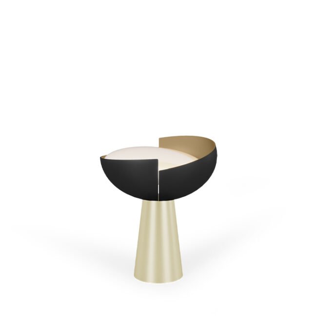
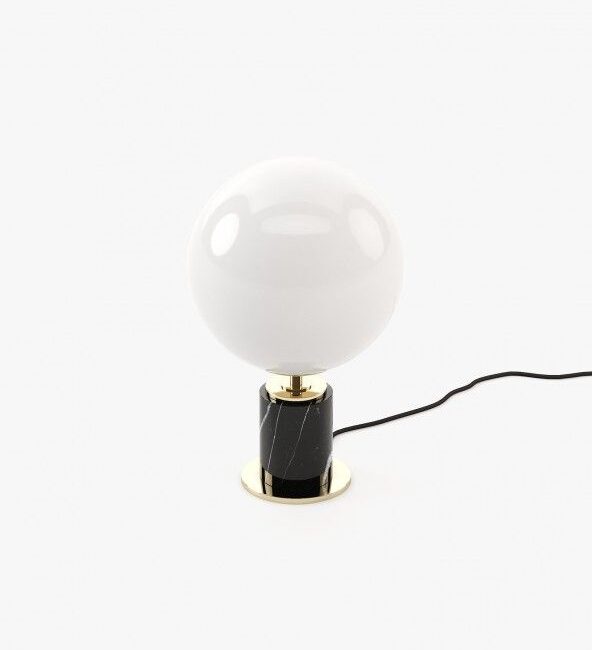
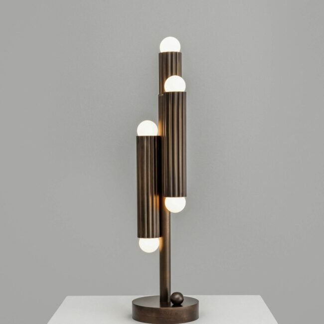
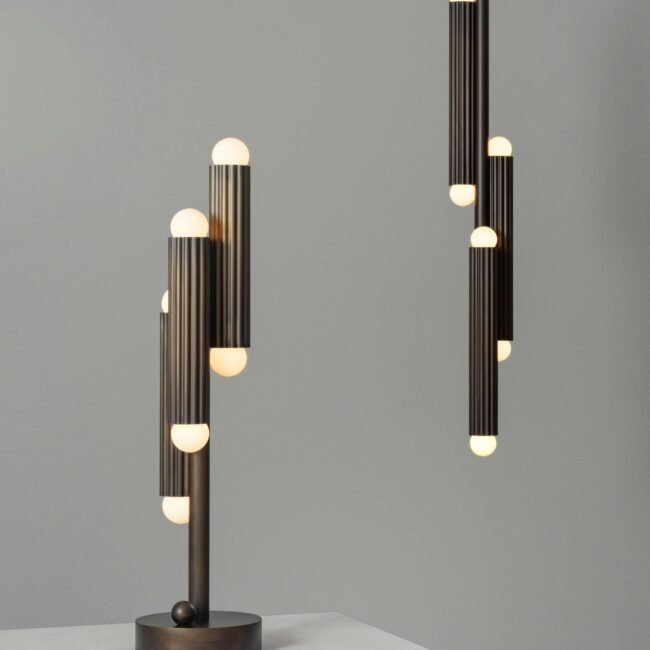
Interior designers layer lighting because different types of light do different things. Ceiling lights provide general brightness. Table lamps add warmth. Floor lamps create cosy corners. Wall lights add architectural interest. Picture lights make artwork feel intentional. Candles add softness.

In Architectural Digest’s designer-led feature on living room mistakes and how to fix them, designer Elizabeth Pash Banker recommends using table lamps, standing lamps, picture lights and sconces at different heights to create a welcoming glow. This is one of the simplest ways to make a room feel more expensive.

A living room should feel different in the evening than it does during the day. A bedroom should have soft bedside lighting. A dining room should have enough glow to flatter the table. A hallway should feel welcoming when you walk in.

Warm white bulbs are usually more flattering than cool white bulbs in living rooms, bedrooms and dining rooms. Dimmers also help because they allow you to control the mood.

Luxury interior design is not only about what you see. It is about how the room feels when the light changes.


Mistake 4: Pushing All the Furniture Against the Walls

Many people push furniture against the walls because they believe it will make the room feel bigger. In reality, it can make the room feel empty, awkward and unfinished.

When every piece is pushed to the perimeter, the centre of the room often becomes a blank space. The seating feels too far apart. Conversation becomes less natural. The furniture feels as if it is avoiding the room rather than inhabiting it.

Interior designer Louis Lin explains in House Beautiful that pushing furniture to the edges can leave the centre feeling empty and undefined. His advice on floating furniture away from the walls is especially useful for living rooms that feel cold or disconnected.

This does not mean every sofa must sit in the middle of the room. Smaller homes and narrow rooms may need furniture against walls. But even then, the arrangement should still create a proper zone. A sofa can sit against a wall while the rug, coffee table, side tables, lamps and chairs pull the room together.

In larger rooms, floating furniture can make the space feel more expensive because it creates intention. A sofa can divide an open-plan space. Two chairs can create a conversation area. A console behind a sofa can make the back of the seating feel styled.

A room looks more luxurious when the furniture relates to people, not just to walls.

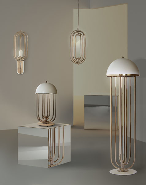
Living room with table lamps, floor lamp and wall lights

Mistake 5: Choosing Curtains That Are Too Short

Curtains can make or break a room. When they are too short, too narrow or hung too low, they can make the ceiling feel lower and the window look smaller. Even a well-furnished room can feel unfinished if the curtains look accidental.

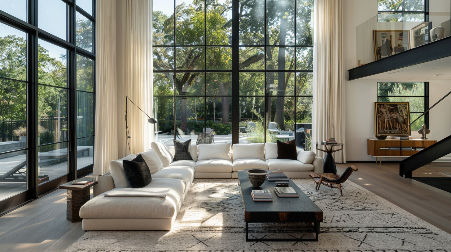
Full-length curtains instantly make a room feel more elegant. They add height, softness and movement. When hung higher and wider than the window frame, they can make the room feel taller and the window feel more generous.

Short curtains often look practical rather than polished. They stop the eye abruptly and can make the room feel less considered. Thin panels that barely cover the window can also look mean, even if the fabric itself is beautiful.

For a more expensive look, choose curtains with enough fullness. They should not look stretched when closed. Linen, velvet, cotton, wool blends and textured fabrics can all work beautifully depending on the mood of the room.

Curtains also soften sound. A room with hard floors, bare windows and minimal textiles can feel echoey. Fabric adds comfort as well as style.

A finished home rarely ignores the windows. It frames them.


Mistake 6: Leaving Walls Bare or Under-Styled

Bare walls can make a home feel temporary. Even if the furniture is beautiful, empty walls often make the room look unfinished. Artwork, mirrors, shelves, wall lights and framed pieces add the vertical layer that makes a room feel complete.

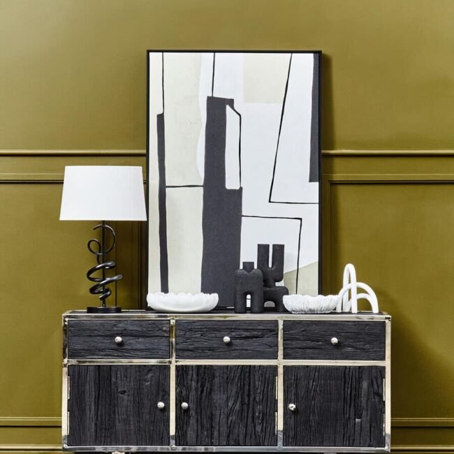
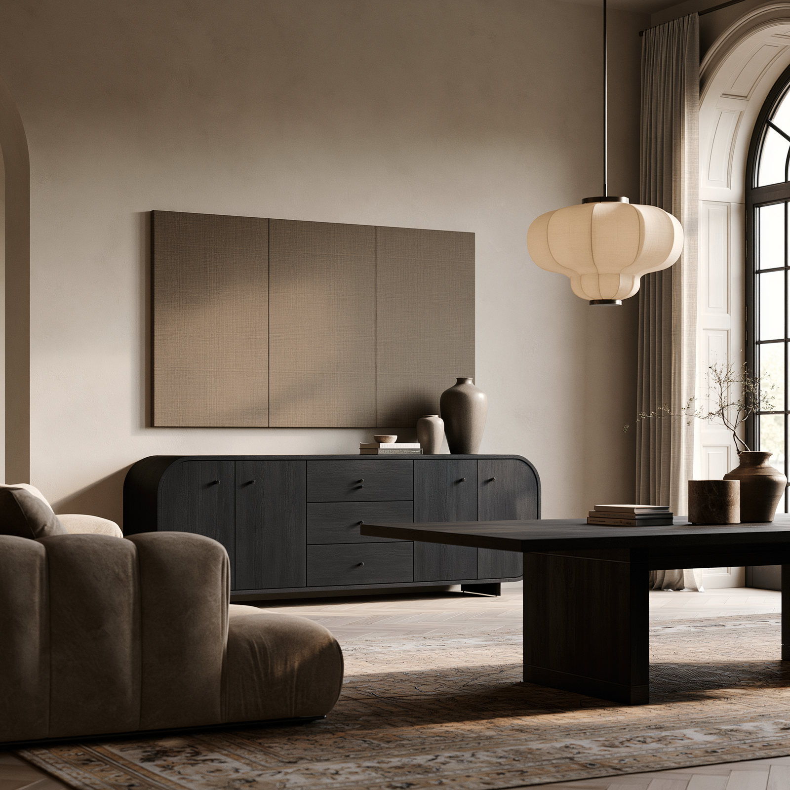
This does not mean every wall needs to be filled. Negative space can be elegant. But there should be at least a few intentional moments. A large artwork above a sofa. A statement mirror above a sideboard. A picture light over a painting. A pair of framed prints in a hallway. These details make the home feel considered.

The mistake is often scale. A tiny picture above a large sofa can look lost. A narrow mirror above a wide console can feel disconnected. The wall decor should relate to the furniture beneath it.

Mirrors are especially useful because they reflect light and create depth. A statement mirror above a console table can make a hallway feel more elegant. A large mirror above a sideboard can make a dining room feel brighter. A round mirror can soften a room full of straight lines.

Artwork adds personality. It gives the room a point of view. Without art, a home can feel like a showroom. With art, it begins to feel lived in.

A room looks cheap when the walls feel forgotten. A room looks finished when the walls are part of the design.

Full-length curtains hung high and wide

Mistake 7: Ignoring Scale and Proportion

Scale is one of the details people feel before they understand. A room can look wrong simply because the pieces do not have the right relationship to one another.

A tiny lamp beside a large sofa. A narrow coffee table in front of a generous sectional. Small cushions on a deep armchair. A delicate side table beside a heavy bed. A thin mirror above a large sideboard. These details can make a home look cheaper because the room feels visually unbalanced.

Scale is not only about measurements. It is also about visual weight. A glass coffee table may be large but visually light. A dark wooden sideboard may feel heavier than a pale oak one of the same size. A marble table may have more presence than a slim metal one.

Designers think about these relationships constantly. If a room has high ceilings, it needs height from curtains, artwork, lighting or tall furniture. If a sofa is deep and generous, the coffee table should have enough presence. If a sideboard is long, the mirror or artwork above it should be substantial enough to relate to it.

A room where every piece is small can look scattered. A room where every piece is large can feel heavy. The art is in the balance.

Expensive-looking rooms have pieces that understand each other.


Mistake 8: Buying Matching Furniture Sets

Matching furniture sets can feel safe, but too much matching can make a home look flat. A living room where the coffee table, side table, TV unit and sideboard all come from the same range may look coordinated, but it can also feel predictable.

Rooms look more expensive when they feel collected. That usually means mixing materials, shapes, finishes and sometimes eras. A walnut sideboard with a marble coffee table. A modern sofa with an antique-style mirror. A brass lamp on an oak console. A boucle chair beside a black metal side table.

Kelly Wearstler’s interiors are known for mixing vintage and contemporary pieces, bold textures and rich materials. Forbes describes her approach to design as storytelling through instinctive combinations of materials, eras and influences.

That does not mean the room should feel random. The secret is connection. Repeat certain tones or finishes in subtle ways. If you use brass in the lamp, repeat it in the mirror frame or cabinet handle. If you have oak furniture, echo warmth through a tray, picture frame or woven basket. If black appears in the coffee table legs, repeat it in artwork or lighting.

The best homes feel layered over time, not bought in one afternoon.

living room furniture layout mistakes

Mistake 9: Forgetting Texture

A room can have a good colour palette and still look cheap if every surface feels flat. Texture is what gives a home depth. It makes a simple room feel rich and a neutral room feel interesting.

Think about a cream living room. Without texture, it can look plain. Add a wool rug, linen curtains, velvet cushions, a marble coffee table, a wooden sideboard, ceramic lamps and a woven basket, and the room suddenly has depth.

Texture is not clutter. It is contrast. Soft against hard. Matte against glossy. Smooth against rough. Natural against polished.

Modern interior design especially needs texture because clean lines can become cold if everything is too smooth. A minimalist room still needs warmth. A luxury interior still needs softness. A neutral home still needs variation.

Use texture through rugs, cushions, throws, curtains, upholstery, ceramics, wood, stone, metal, glass and greenery. Even if the colour palette stays calm, the room will feel more layered.

A room without texture may look tidy, but it rarely looks expensive.


Mistake 10: Over-Styling Every Surface

A home can look cheap because it has too little, but it can also look cheap because it has too much. Over-styled surfaces can make even expensive accessories look like clutter.

Coffee tables, sideboards, console tables, shelves and bedside tables all need editing. Every surface does not need a candle, vase, stack of books, tray, bowl, sculpture and plant. Too many objects compete for attention.

Interior stylist Emma Thomas writes in Homes & Gardens about creating spaces that feel “effortless, as well as elevated.” Her advice on styling a welcoming home is a useful reminder that styling should not look forced.

The best surface styling has rhythm. Use height, texture and negative space. A lamp, a stack of books and a ceramic bowl may be enough on a sideboard. A tray, candle and vase may be enough on a coffee table. A bedside table may only need a lamp, book and small dish.

Luxury often comes from restraint. Negative space gives objects importance. When everything is displayed, nothing feels special.

A finished home is edited, not crowded.

Full-length curtains hung high and wide

Mistake 11: Forgetting Storage

A home cannot look expensive if everyday clutter has nowhere to go. Storage is one of the least glamorous parts of interior design, but it is also one of the most important.

If toys, remotes, cables, shoes, paperwork, books, blankets and random household items are always visible, the home will struggle to feel calm. The answer is not to get rid of everything. The answer is to give everything a place.

Sideboards, console tables with drawers, storage coffee tables, baskets, cabinets, ottomans and bedside tables can all make a room feel more polished. The best storage pieces look like furniture, not emergency solutions.

A living room may need a sideboard for games and media equipment. A hallway may need a console with a drawer for keys and letters. A bedroom may need bedside tables with storage. A dining room may need a sideboard buffet cabinet for tableware, candles and linens.

Storage allows the visible parts of the home to feel calm. Without it, even beautiful rooms can quickly become messy.

A finished home is not a home without practical things. It is a home where practical things have been beautifully considered.


Mistake 12: Copying Trends Without Personality

The final mistake is one of the most important. A home can follow every trend and still look cheap if it has no personality.

Trends can be useful. They can introduce new colours, materials and ideas. But when a home is built entirely from trends, it can feel generic. The room may be stylish, but it does not feel personal.

Personality comes from the objects that mean something: books, art, travel pieces, inherited furniture, handmade ceramics, photographs, unusual lamps, vintage mirrors, collected objects and favourite colours. These details stop a home from looking like a catalogue.

Design should not erase the person who lives there. It should reveal them.

This does not mean cluttering every shelf with sentimental items. It means choosing personal pieces carefully and giving them space. A framed photograph on a sideboard. A painting above a console. A ceramic bowl from a trip. A stack of books on a coffee table. A vintage chair beside a modern sofa.

The most expensive-looking homes often combine polish with imperfection. New and old. Smooth and textured. Practical and personal.

A home looks cheap when it looks like anyone could live there. It looks finished when it feels unmistakably yours.

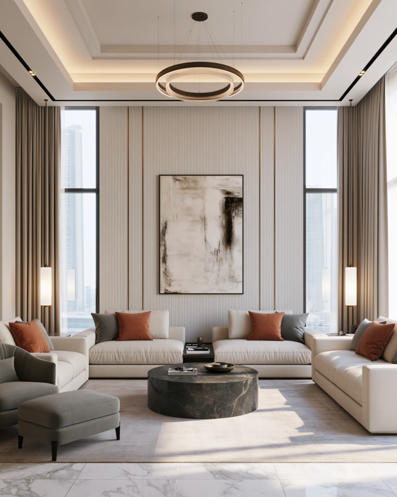
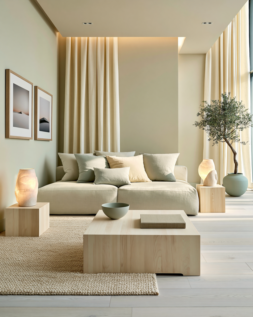
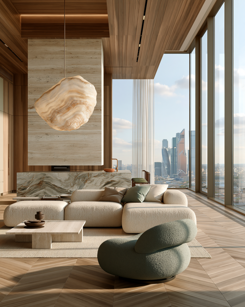
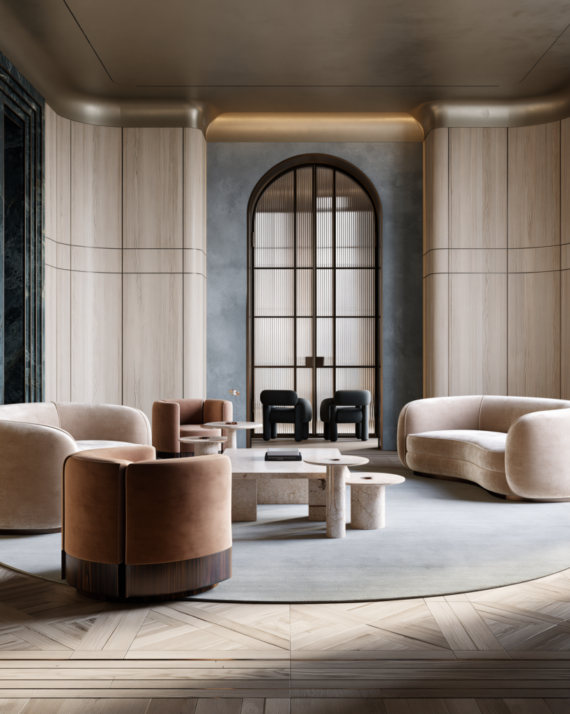
Elegant finished living room with layered lighting, rug and artwork

What to Fix First If Your Home Looks Cheap

If your home does not feel as expensive as you want it to, do not rush to buy more accessories. Start with the foundation.

First, check the layout. Are the furniture pieces arranged for comfort, flow and conversation?

Second, look at rug size. Is the rug anchoring the room or floating separately?

Third, review the lighting. Do you have lamps and soft light sources, or only overhead lighting?

Fourth, assess the walls. Do you need artwork, a mirror or a stronger focal point?

Fifth, check storage. Is clutter visible because there is nowhere for it to go?

Sixth, add texture. Does the room include a mix of fabric, wood, stone, glass, metal, ceramic or greenery?

Seventh, edit. Remove objects that feel random. Keep what adds beauty, function or meaning.

These fixes work because they address the structure of the room. Accessories can help, but they cannot rescue a room with poor layout, weak lighting and wrong scale.


Final Thoughts: Expensive-Looking Homes Are Layered, Not Loud

The interior design mistakes that make a home look cheap are usually not about taste. They are about missing layers. A room may have furniture but no lighting. Colour but no texture. Accessories but no scale. Storage but no style. Trends but no personality.

An expensive-looking home brings those layers together. It has furniture that fits, rugs that anchor, lighting that glows, curtains that soften, artwork that speaks, storage that hides the mess and personal details that give the room soul.

It does not need to be perfect. In fact, the best homes rarely are. They feel collected, lived in and intentional.

That is the real secret of good interior design. It is not about making a home look expensive in a showy way. It is about making it feel resolved. Every room should have something practical, something beautiful, something personal and something unexpected.

When those layers are present, the home stops looking cheap. It begins to feel finished, thoughtful and quietly luxurious.


FAQs About Interior Design Mistakes

What interior design mistakes make a home look cheap?

Common interior design mistakes that make a home look cheap include using rugs that are too small, relying only on ceiling lighting, choosing furniture that is the wrong scale, leaving walls bare, using short curtains, over-styling surfaces and buying everything from one matching set.

How can I make my home look more expensive?

Start with layout, lighting and scale. Use a properly sized rug, add table lamps and floor lamps, hang curtains high and wide, style surfaces with restraint, add artwork or mirrors, and use storage to hide clutter. Texture also makes a home look more expensive.

What makes a room look unfinished?

A room often looks unfinished when it lacks layers. Missing artwork, poor lighting, bare windows, small rugs, weak storage or furniture that feels out of proportion can all make a space feel incomplete.

Are matching furniture sets a mistake?

Matching furniture sets are not always wrong, but too much matching can make a room feel flat. Rooms usually look more expensive when materials, shapes and finishes are mixed thoughtfully.

What is the biggest living room design mistake?

One of the biggest living room design mistakes is using a rug that is too small. It makes the seating area feel disconnected and can make the whole room look less expensive.

How important is lighting in interior design?

Lighting is extremely important. It affects mood, colour, texture and atmosphere. Layered lighting with table lamps, floor lamps, wall lights and warm bulbs can make a home feel much more finished.

How do I make my home look finished without redecorating everything?

Start by correcting the details that have the biggest impact: rug size, lighting, curtains, wall decor, storage and surface styling. These changes can make a home feel more finished without a full redesign.

How do I add personality without making my home look cluttered?

Choose fewer personal objects and display them intentionally. Use books, artwork, ceramics, photographs or travel pieces, but give them space. A few meaningful objects styled well will look better than too many scattered items.

What do you think?
Leave a Reply

Blog

Get fresh home inspiration and helpful tips from our interior designers

top
1
    1
    Your Cart
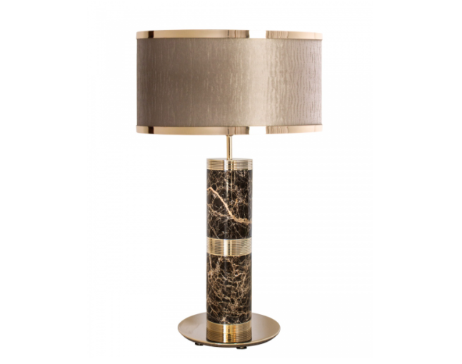
    Safari Table Lamp Remove
    Safari Table Lamp
    Qty: 1
    Price: £996
    £996

    Inactive

    Privacy Overview

    This website uses cookies so that we can provide you with the best user experience possible. Cookie information is stored in your browser and performs functions such as recognising you when you return to our website and helping our team to understand which sections of the website you find most interesting and useful.