Mistake 1: Choosing Furniture Without a Proper Layout
One of the biggest interior design mistakes is buying furniture before understanding the room. It is easy to fall in love with a sofa, dining table, sideboard or coffee table online, only to discover later that it does not work with the actual proportions of the space.
A home looks unfinished when furniture feels as if it has simply been placed into a room rather than arranged for the way the room is lived in. The sofa may be too large for the wall. The coffee table may sit too far away from the seating. The side table may not be reachable. The dining chairs may block circulation. The room may have furniture, but no flow.
A designer starts differently. Before buying, they consider the purpose of the room. Is it for conversation, television, reading, entertaining, family life or a mixture of all these things? Where does natural light come from? What is the focal point? Where do people walk? What needs to be stored?
These questions matter because layout is the skeleton of interior design. If the layout is wrong, decoration can only do so much.
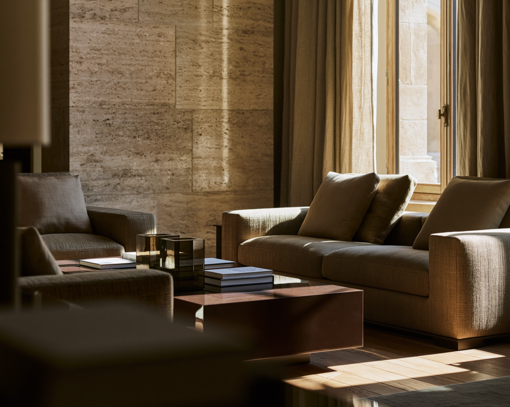
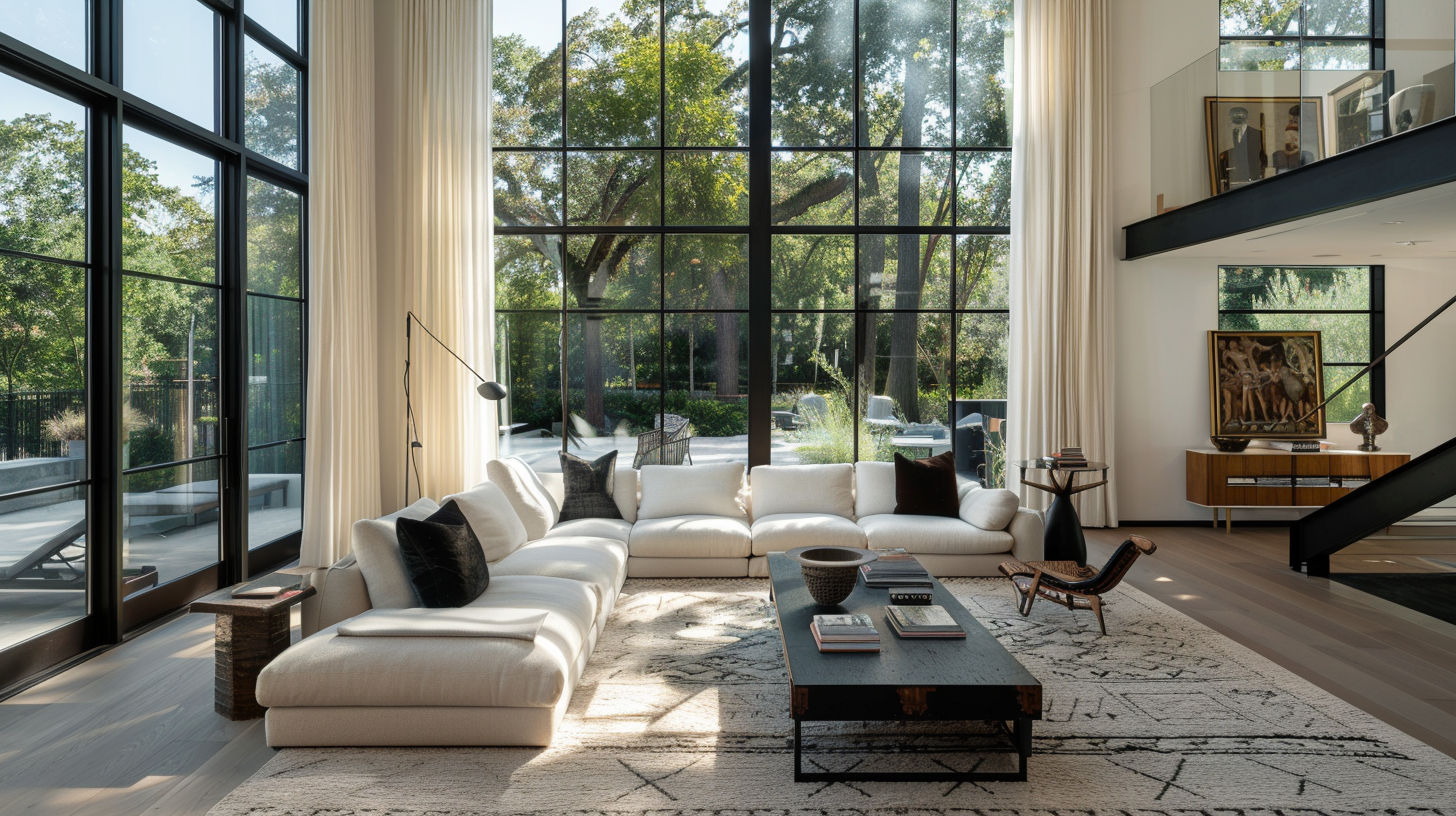
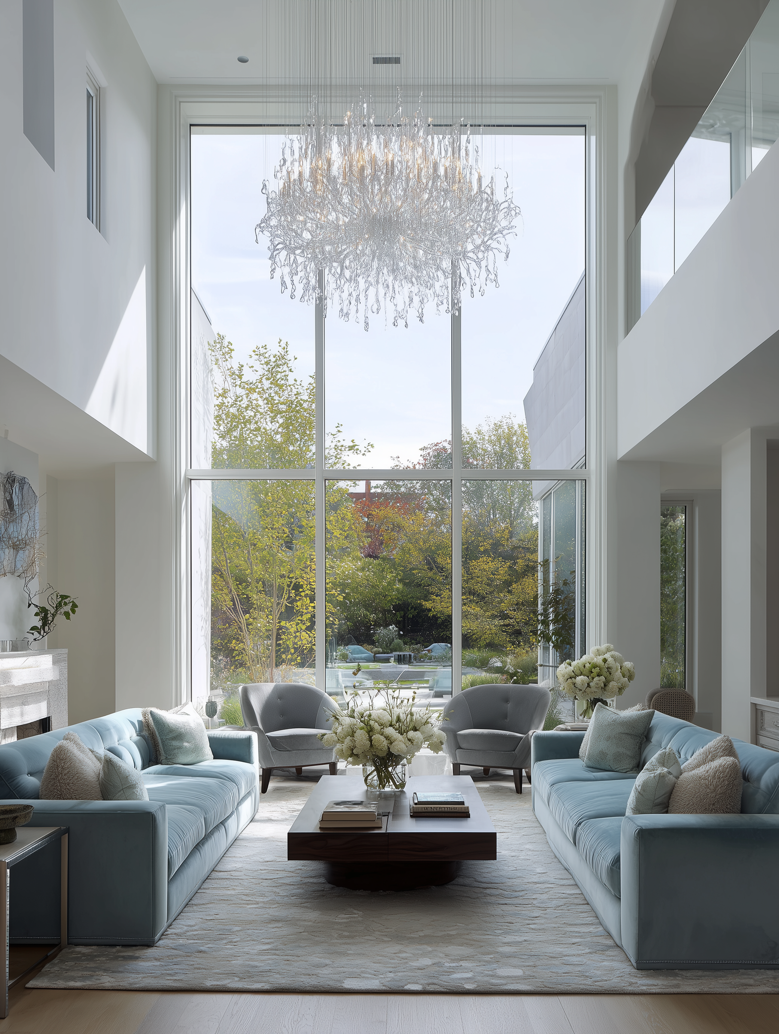
A living room, for example, should usually have a clear seating zone. The sofa, armchairs, coffee table and rug should feel connected. A dining room should allow enough room for chairs to pull out comfortably. A hallway should not be narrowed by furniture that is too deep. A bedroom should have bedside tables that are easy to reach and lighting that works for real life.
Before buying new furniture, measure the room and mark out the major pieces. Use masking tape on the floor if needed. This simple step can prevent costly mistakes and helps you see whether the room will feel elegant, crowded or empty.
A finished home begins with placement, not accessories.
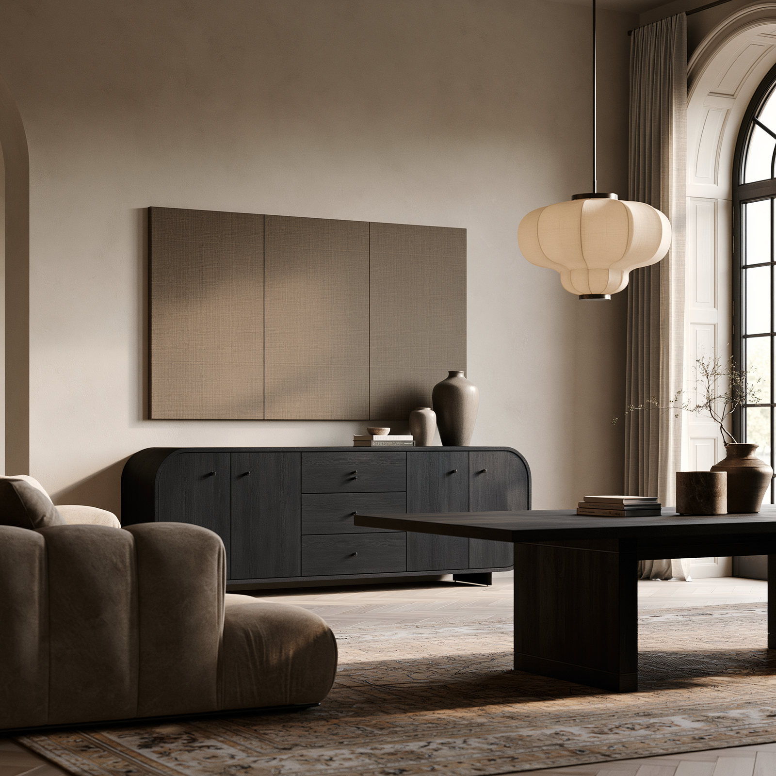
Mistake 2: Pushing Every Piece of Furniture Against the Wall
Many people push furniture against the walls because they think it will make the room feel bigger. Sometimes it does the opposite. The centre of the room becomes empty, the seating feels disconnected and conversation becomes awkward.
In a House Beautiful article, designer Louis Lin warns that pushing all the furniture to the perimeter can create an undefined centre and reduce intimacy; his advice on floating furniture away from the walls is especially useful for living rooms that feel cold or unfinished.
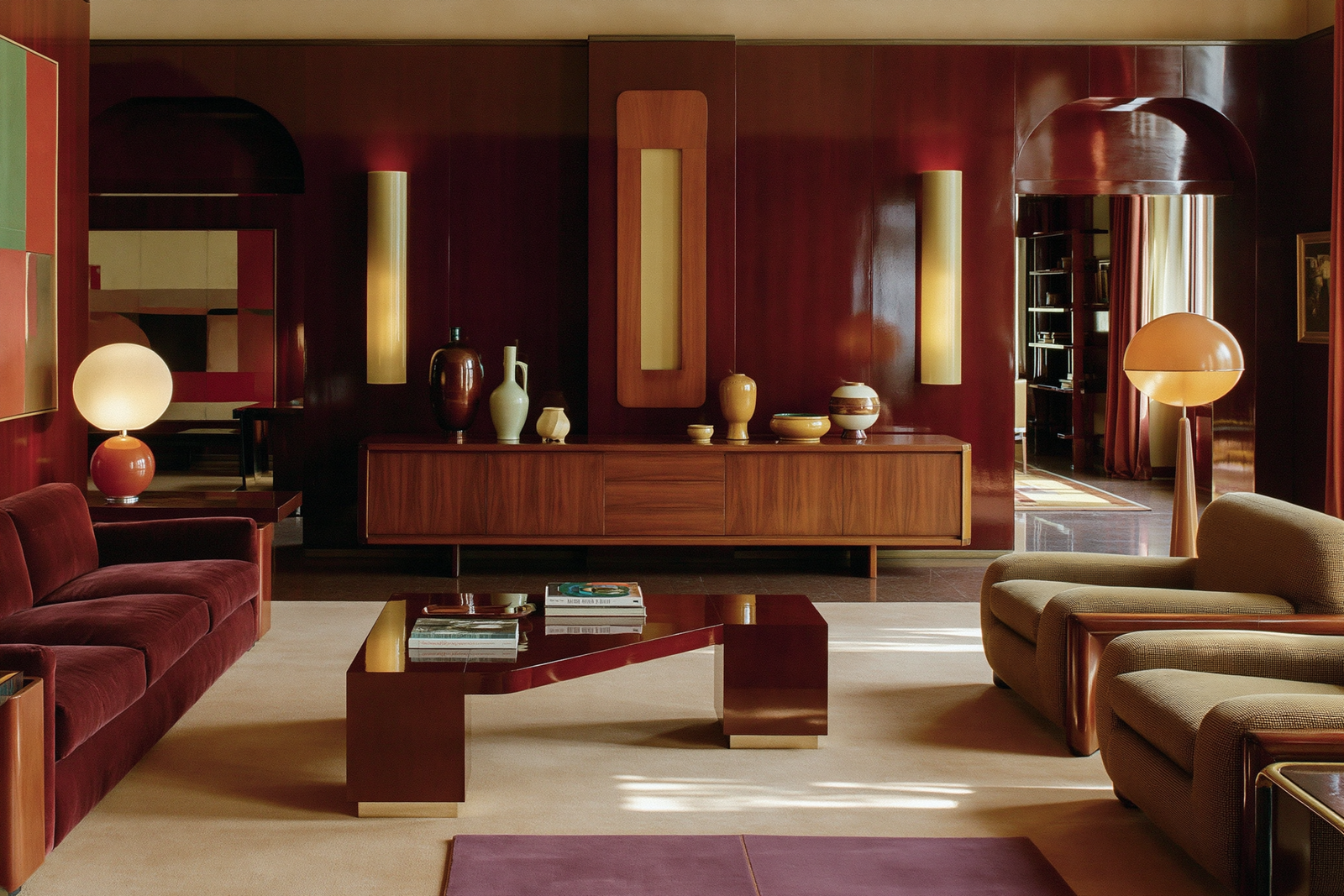
This does not mean every sofa must sit in the middle of the room. Small rooms and narrow rooms sometimes need furniture against the wall. But even then, the arrangement should feel intentional. A sofa can sit against a wall while the coffee table, rug, side chairs and lamps still create a proper seating area.
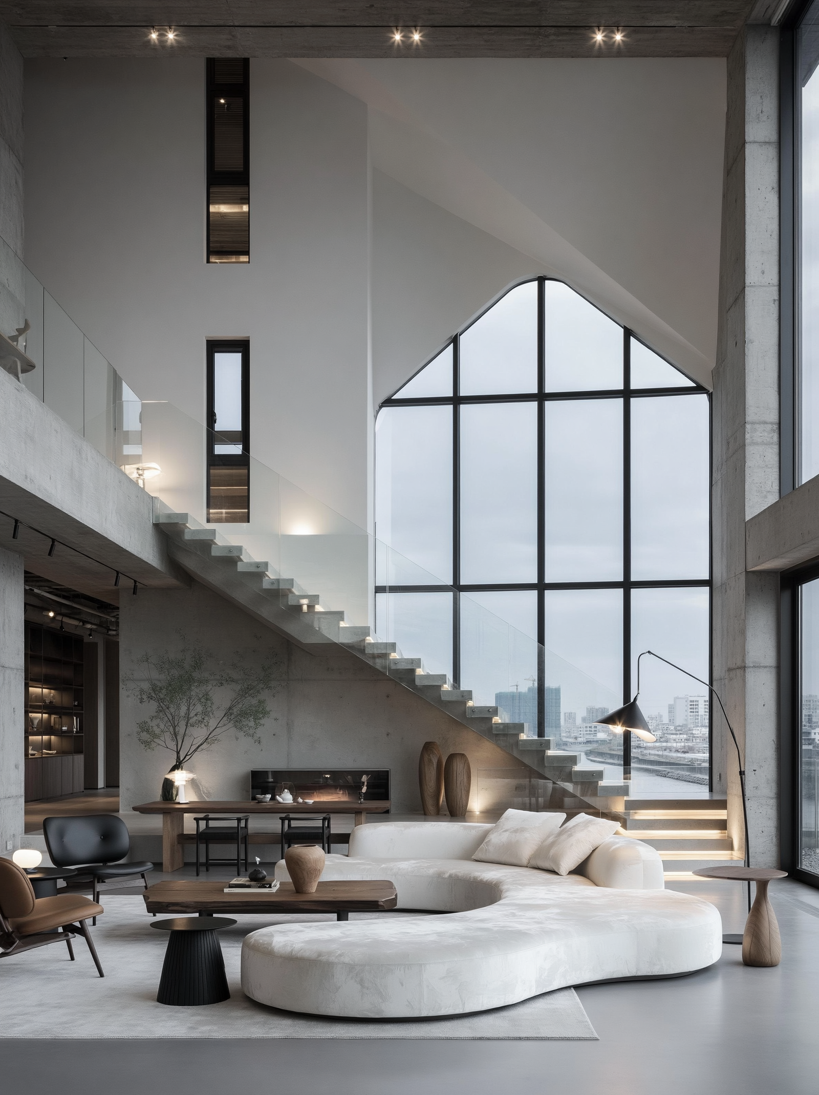
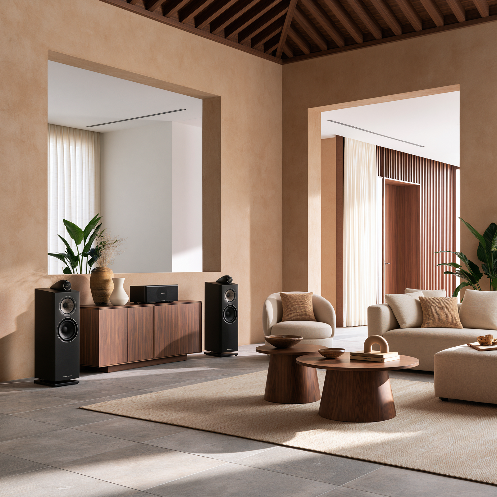
Floating furniture works particularly well in larger living rooms, open-plan spaces and rooms where you want to create zones. A sofa can divide a living area from a dining area. A pair of chairs can create a reading corner. A console behind a sofa can make the back of the room feel styled rather than empty.
The aim is not to maximise empty floor space. The aim is to create a room that supports the way people gather, talk and move.
A room looks finished when the furniture relates to itself, not just to the walls.