There’s a moment in every design conversation where someone says, “Let’s just go with beige—it’s safe.” And for decades, that logic held. Beige was the diplomatic choice, the color that offended no one and allegedly worked with everything. It promised resale value, visual calm, and the kind of inoffensive backdrop that let “other elements shine.” But here’s what no one admits: beige has become design shorthand for playing it safe to the point of erasure. It’s the color equivalent of saying nothing at all.
Walk into a beige room today, and you’re more likely to feel… nothing. Not calm. Not grounded. Just visually unchallenged. The walls recede. The light bounces flatly. The space feels like it’s waiting for permission to exist. This is the quiet crisis of contemporary interiors: rooms that photograph well but feel emotionally vacant when you’re actually living in them.
Enter rich chocolate brown—the grounding, dimensional, quietly luxurious neutral that’s replacing beige as the foundational color of choice for homeowners, renters, and designers who want spaces that feel genuinely contemporary without sacrificing warmth. This isn’t about swapping one neutral for another on a whim. Replacing beige with chocolate brown represents a fundamental shift in how we think about color as architecture: as something that creates atmosphere, depth, and subconscious comfort rather than simply avoiding conflict.
Chocolate brown doesn’t apologize for taking up space. It absorbs light and shadow in ways that create visual intrigue. It makes white trim look crisper, brass hardware glow warmer, and natural wood feel intentional rather than accidental. It’s the color that signals you’ve thought about how a room should feel, not just how it should photograph for a quick sale. And unlike beige—which reads increasingly sterile in an era of cozy luxury and dopamine-rich interiors—chocolate brown delivers richness without requiring maximalism, boldness without drama, and sophistication that doesn’t demand a designer budget.
This article unpacks why replacing beige with chocolate brown is the invisible upgrade most rooms desperately need, how to implement it across walls, furniture, and finishes, and why this shift represents more than a trend—it’s a return to color with confidence, purpose, and soul.
For thirty years, beige reigned as the ultimate safe harbor. It was the color of flip-ready homes, Airbnb neutrality, and the kind of design advice that prioritized future buyers over current residents. Designers recommended it. Real estate agents demanded it. Paint manufacturers created seventeen shades of “greige” to convince us there was variety in sameness. And for a while, it worked—beige felt like visual diplomacy, a way to create cohesion without making bold choices.
But something shifted. Perhaps it was the pandemic, when we were forced to actually live in our spaces rather than just stage them. Perhaps it was the rise of European design sensibilities—Belgian minimalism, French country warmth, Scandinavian coziness—that prioritized atmospheric depth over safe resale appeal. Or perhaps we simply reached peak beige: the moment when every rental, every hotel lobby, every “luxury” apartment building looked identical in its commitment to chromatic nothingness.
Replacing beige became less about rejecting neutrals and more about rejecting emotional flatness. Beige had stopped being a backdrop and started being the entire story—a story where nothing happens. Rooms painted in endless variations of cream, taupe, and greige began to feel like waiting rooms: technically functional, visually inoffensive, and utterly devoid of personality. The very quality that made beige “safe”—its ability to disappear—became its fatal flaw.
Chocolate brown emerged as the antidote precisely because it refuses to disappear. It grounds a room. It creates visual weight. It makes you feel held rather than floating in undefined space. Where beige whispers “this could be anyone’s home,” chocolate brown says “this is my home, and I chose this intentionally.” That psychological shift—from passive neutrality to active coziness—is what’s driving the mass exodus from beige interiors in 2026.
The cultural context matters too. We’re living in an era of sensory fatigue, digital overwhelm, and aesthetic homogenization. Instagram interiors all started looking the same: white walls, light wood floors, beige everything else. The algorithm rewarded safety, and safety meant beige. But human beings don’t actually want to live in algorithm-optimized spaces. We want rooms that feel textured, layered, and alive. Replacing beige with chocolate brown acknowledges this: that a home should stimulate the senses in gentle, grounding ways rather than numbing them into submission.
This isn’t about villainizing beige entirely. Cream, ivory, and warm taupes still have roles to play—as accents, as contrast, as breathing room. But as the foundational neutral, the color that sets the atmospheric tone? Beige is stepping aside for something with more substance.
-

Abberley Bedside | Brown
£464 Add to cart -

Airo Table Lamp
£194 Add to cart -

Corin bed
£6,332 – £8,940Price range: £6,332 through £8,940 Select options This product has multiple variants. The options may be chosen on the product page
Here’s what makes chocolate brown fundamentally different from beige: it has presence. Color psychology tells us that brown tones trigger associations with earth, wood, leather, and stone—materials that feel inherently stable, valuable, and permanent. When you walk into a chocolate brown room, your nervous system registers security. Not drama. Not stimulation. Just a deep, subconscious sense of being grounded.
Beige, by contrast, often reads as visually passive. It’s light enough to reflect rather than absorb, which sounds positive until you realize that all that reflection creates flatness. There’s no shadow play, no dimensional shift as natural light moves through the day, no sense that the walls themselves are contributing to the room’s atmosphere. Beige is there, but it’s not doing anything.
Chocolate brown works. It absorbs some light and reflects the rest with warmth. It creates subtle gradations in tone that make a room feel layered even when the furniture is minimal. It plays well with shadow, which means spaces feel more dynamic as morning light gives way to afternoon gold and evening amber. This is the quiet luxury effect: the sense that a room feels expensive not because of what’s in it, but because of how the space itself behaves.
There’s also an inherent coziness to brown that beige can’t match. Think of the most comforting spaces you’ve ever occupied: old libraries with wood paneling, leather-upholstered reading nooks, European cafes with dark wood tables, Japanese teahouses with tatami and timber. These spaces all use brown tones to create psychological warmth. They make you want to stay, to settle, to exhale. Replacing beige with chocolate brown brings that same quality into domestic interiors—the feeling of being cocooned rather than merely housed.
Interestingly, chocolate brown also reads as more expensive than beige, even when the actual finishes are identical. A chocolate brown painted accent wall feels intentional and designed. A beige painted accent wall feels… unfinished, somehow, like the first coat before you commit to real color. Chocolate brown upholstery looks like a statement piece. Beige upholstery looks like something you’re protecting until you figure out what you really want. This perception gap is critical: replacing beige with chocolate brown elevates budget interiors simply through chromatic confidence.
The key is understanding that chocolate brown’s richness doesn’t equal heaviness. Done well, it creates warmth without closing in, depth without darkness, and coziness without claustrophobia. The trick lies in undertones, contrast, and strategic placement—which we’ll unpack next.
One of beige’s supposed strengths was its versatility: it allegedly worked with everything. But in practice, beige often just faded into everything, creating a visual mush where nothing stood out and nothing felt anchored. Chocolate brown offers true versatility—not through disappearing, but through grounding whatever you place against it.
Consider chocolate brown in modern interiors. Paired with crisp white trim, matte black fixtures, and geometric furniture, it reads as sophisticated and architectural. The brown becomes the visual weight that prevents modern minimalism from feeling cold or sterile. It’s the warmth that balances all that clean-lined restraint.
In traditional spaces, chocolate brown brings heritage and gravitas. Think Georgian townhouses, Victorian libraries, craftsman bungalows—these architectural styles were designed for rich wood tones and deep wall colors. Replacing beige with chocolate brown in traditional homes doesn’t just honor the architecture; it makes the space feel cohesive with its own structural logic. The brown walls echo the wood floors, the dark-stained trim, the antique furniture. Everything converges rather than competing.
Maximalists love chocolate brown because it can handle bold accent colors without visual chaos. Try pairing bright coral, emerald green, or royal blue with a beige wall—it feels jarring, like the colors are fighting for dominance in a void. But chocolate brown holds those colors. It gives them context, creates visual hierarchy, and makes even the wildest color combinations feel curated rather than chaotic. The brown acts as the grounding force that lets everything else pop without screaming.
Even Japandi interiors—those serene, minimalist spaces that blend Japanese and Scandinavian aesthetics—benefit from chocolate brown. Traditional Japandi might default to beige or greige for walls, but replacing beige with a warm, muted chocolate creates that wabi-sabi richness: the sense of lived-in beauty, of materials aging gracefully, of color that references earth and wood rather than industrial neutrality.
The versatility extends to function, too. Chocolate brown works beautifully as:
- Wall color: Creates instant depth, especially on accent walls or in smaller rooms where you want cocooning intimacy rather than airy openness
- Cabinetry finish: Kitchen and bathroom cabinets in chocolate brown feel custom and high-end, even when they’re IKEA hacks
- Upholstery choice: A chocolate brown sofa or armchair becomes an anchor piece that grounds the entire room and hides wear better than light beige ever could
- Flooring complement: Dark brown floors or area rugs create visual continuity with brown walls or furniture, making spaces feel cohesive rather than disjointed
The key to chocolate brown’s versatility is its ability to shift tone based on undertones and surrounding colors. A warm chocolate with red undertones feels cozy and traditional. A cooler chocolate with gray undertones reads modern and sophisticated. A muted, earthy brown channels organic minimalism. This range—while still firmly in “brown” territory—gives you far more atmospheric control than beige’s endless variations on “vaguely warm neutral.”
Mastering Undertones: Choosing Chocolate Browns That Elevate Rather Than Overwhelm
Not all chocolate browns are created equal, and this is where replacing beige requires some chromatic literacy. Beige might have been forgiving—most shades looked vaguely similar under different lighting—but chocolate brown demands attention to undertones, natural light, and existing architectural elements.
Warm chocolate browns have red, orange, or yellow undertones. These are your classic “hot chocolate” shades: rich, enveloping, and inherently cozy. They work beautifully in spaces with warm-toned wood floors (oak, pine, walnut), brass or gold hardware, and rooms that get warm afternoon light. The danger with warm browns is veering into orange territory—test your paint samples in different lighting to ensure it reads as deep brown rather than terracotta-adjacent.
Cool chocolate browns carry gray, blue, or even slight green undertones. These feel more contemporary and sophisticated, almost like a very dark charcoal that’s been softened with brown. Cool browns work well with white oak or ash flooring, chrome or nickel fixtures, and rooms with northern light or cooler exposures. They’re the go-to for modern interiors where you want depth without traditional warmth.
Neutral chocolate browns balance warm and cool undertones, creating a true “middle brown” that’s versatile across different lighting conditions. These are your safest bet if you’re replacing beige throughout an open-concept space where natural light varies dramatically from room to room. They won’t shift dramatically between morning and evening, and they play nicely with both warm and cool accent colors.
The biggest mistake people make when replacing beige with chocolate brown is choosing a shade that fights their existing architecture. If you have honey-toned hardwood floors and you paint the walls a cool, gray-brown, the room will feel visually confused—like the walls and floors are in different houses. Similarly, painting warm chocolate walls in a room with stark white tile and chrome fixtures creates tonal dissonance.
Here’s a practical test: bring paint samples home and tape them to the wall. Live with them for at least 48 hours, observing how they shift in morning light, afternoon sun, and evening lamplight. Chocolate brown that looks perfect under the hardware store’s fluorescent lighting might read too dark, too orange, or too gray in your actual space. The right chocolate brown should feel grounding without feeling heavy, rich without reading as black, and warm without tipping into orange.
Also consider sheen. Matte or eggshell finishes make chocolate brown feel velvety and sophisticated—light absorbs rather than bouncing harshly. Satin or semi-gloss finishes can make chocolate brown feel too reflective, almost plasticky, unless you’re using it on trim or cabinetry where you want that subtle gleam.
-

Afe Pendant Light
£296 Select options This product has multiple variants. The options may be chosen on the product page -

Alaric Chair
£2,038 Add to cart -

Amalia Sofa With Chaise
£9,848 – £12,406Price range: £9,848 through £12,406 Select options This product has multiple variants. The options may be chosen on the product page
Practical Implementation: Replacing Beige with Chocolate Brown Across Walls, Furniture, and Finishes
The beauty of replacing beige with chocolate brown is that you don’t need a full renovation to achieve maximum impact. Strategic deployment—whether through paint, textiles, furniture, or accessories—can transform a space from beige-bland to richly grounded without breaking the budget.
Walls: Where Chocolate Brown Creates Instant Atmosphere
Full-room chocolate walls work best in:
- Bedrooms, where you want cocooning intimacy
- Dining rooms, where depth creates drama and makes gatherings feel special
- Studies or libraries, where you want focus and gravitas
- Powder rooms, where bold color in a small space feels luxurious rather than risky
Accent walls in chocolate brown are perfect for:
- Living rooms, behind the sofa or fireplace
- Entryways, creating immediate visual impact
- Kitchens, as a statement wall behind open shelving
The key is pairing chocolate walls with crisp white or cream trim. This contrast prevents the brown from feeling muddy and creates architectural definition. If you’re renting, removable wallpaper in chocolate brown patterns (think subtle damask, linen texture, or geometric designs) offers the same grounding effect without paint commitment.
Furniture: Chocolate Brown as the Anchor Piece
A chocolate brown sofa or sectional grounds an entire living room. Unlike beige upholstery—which often looks like it’s apologizing for existing—chocolate brown feels like a deliberate design choice. Pair it with:
- Ivory or cream throw pillows for contrast
- Brass or gold coffee table legs for warmth
- Natural wood side tables for organic continuity
- Jewel-tone accents (emerald, sapphire, burgundy) for richness
Chocolate brown dining chairs, especially in leather or velvet, create instant sophistication. They pair beautifully with natural wood tables, marble surfaces, or even glass-topped tables where you want the chairs to provide visual weight.
Textiles: Layering Chocolate Brown for Depth
Replacing beige doesn’t mean abandoning lighter neutrals—it means using chocolate brown as the grounding layer. Consider:
- Chocolate brown linen curtains that soften harsh light while adding warmth
- A chocolate brown area rug that anchors furniture arrangements
- Velvet throw pillows or blankets in chocolate that add tactile luxury
- Chocolate brown bed linens paired with white or ivory for a hotel-quality feel
The magic happens in the layering: chocolate brown as the base, lighter neutrals as the relief, accent colors as the punctuation. This creates visual depth that beige-on-beige interiors can never achieve.
Cabinetry and Built-Ins: Chocolate Brown as Architectural Detail
Kitchen and bathroom cabinets in chocolate brown—whether painted, stained, or laminate—feel custom and expensive. They work especially well:
- In kitchens with marble or quartz countertops, where the dark cabinets create dramatic contrast
- In bathrooms with white tile, where chocolate vanities ground the space
- In built-in bookcases or media centers, where chocolate brown creates a gallery-like backdrop for books and objects
Budget-Friendly and Renter-Friendly Strategies
Not ready to commit to chocolate walls? Try:
- Painting one accent wall or even just the back of a bookshelf
- Swapping out beige lampshades for chocolate brown linen
- Adding chocolate brown picture frames or wall art that creates visual weight
- Using chocolate brown storage baskets or bins that are both functional and grounding
- Replacing beige throw pillows with chocolate velvet or leather versions
- Adding a chocolate brown throw blanket to a beige sofa for instant richness
The goal isn’t to eliminate every trace of beige overnight. It’s to introduce chocolate brown strategically, in ways that create visual hierarchy and atmospheric depth. Even small shifts—a chocolate brown rug instead of beige, chocolate curtains instead of white—can transform how a room feels.
Pairing Chocolate Brown: The Colors and Materials That Make It Sing
One of beige’s limitations was that it supposedly “went with everything” but actually made everything look slightly washed out. Chocolate brown, by contrast, makes other colors look better. It’s a neutral that amplifies rather than dilutes.
Colors That Elevate Chocolate Brown
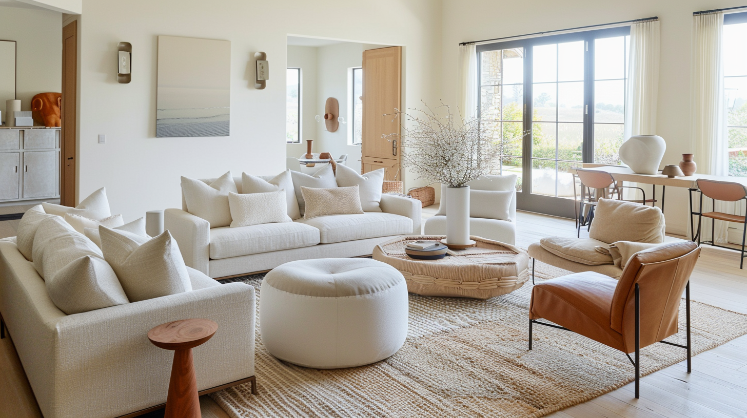
Whites and creams become crisper and more architectural against chocolate brown. Think of white trim, ivory upholstery, or cream-colored artwork—they pop without shouting, creating visual breathing room that prevents brown from feeling heavy.
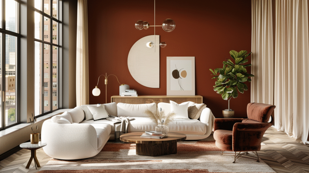
Terracotta and rust share brown’s warm, earthy palette but add vibrancy. A terracotta vase, rust-colored throw pillows, or clay pottery feel like natural extensions of chocolate brown rather than competing accents.
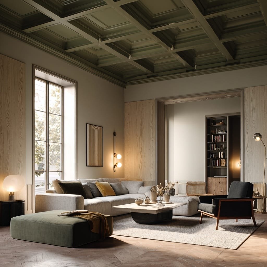
Forest green and olive create organic, nature-inspired combinations. Chocolate brown walls with forest green velvet seating feel like a sophisticated cabin retreat. Olive-toned artwork or plants against chocolate backgrounds create depth without drama.
Brass, gold, and warm metallics glow against chocolate brown in ways they never do against beige. The brown provides richness that makes metallic finishes feel intentional rather than shiny. Think brass cabinet pulls, gold-framed mirrors, or copper pendant lights.
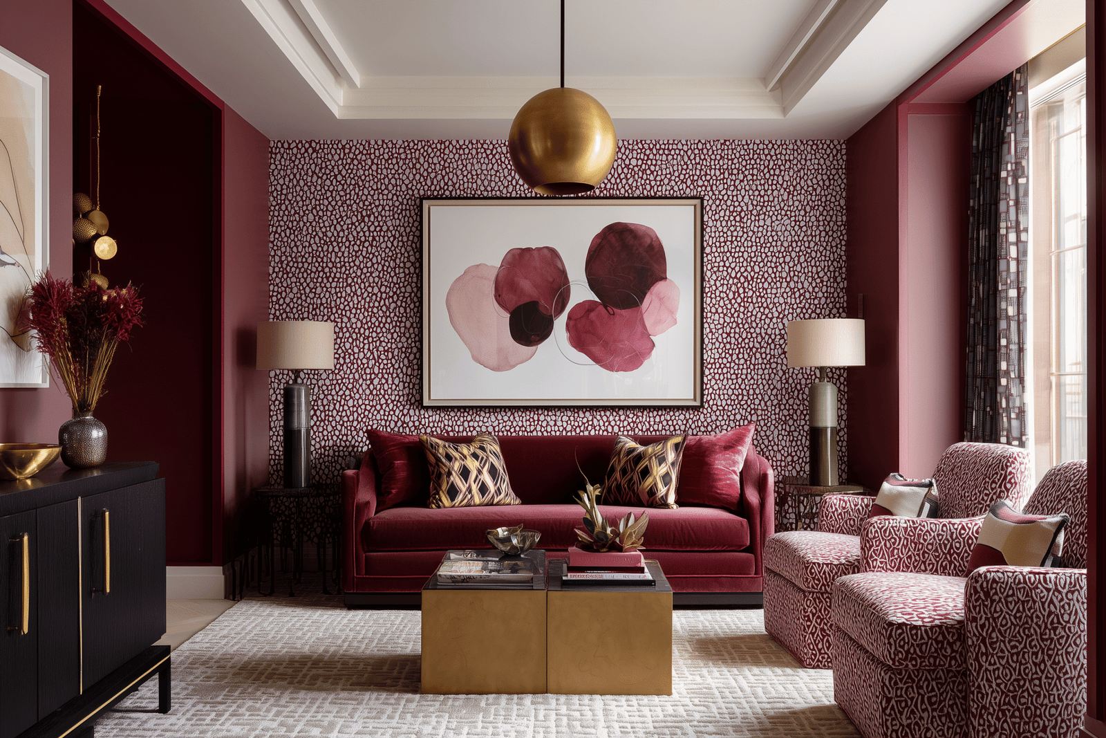
Navy and deep teal add unexpected sophistication. Chocolate brown and navy is a classic menswear-inspired combination that feels timeless and grounded. Deep teal adds just enough color to keep things interesting without tipping into bright or playful territory.
Blush and dusty pink soften chocolate brown’s richness with a feminine, romantic touch. This combination works beautifully in bedrooms or spaces where you want warmth without heaviness.
Materials and Textures That Make Chocolate Brown Feel Luxurious
The wrong texture can make chocolate brown feel flat or cheap. The right textures make it feel like a five-star hotel.
Velvet in chocolate brown is peak quiet luxury. Whether it’s a sofa, dining chairs, or throw pillows, velvet catches light in ways that create visual movement and tactile richness.
Leather in chocolate brown ages beautifully and feels inherently expensive. A chocolate leather sofa or armchair becomes an heirloom piece rather than disposable furniture.
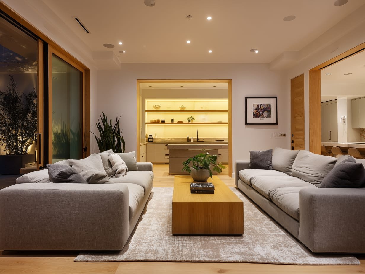
Natural wood creates continuity with chocolate brown walls or furniture. Whether it’s walnut floors, oak dining tables, or teak shelving, wood tones echo brown’s organic warmth.
Matte finishes make chocolate brown feel sophisticated and modern. Glossy or overly shiny browns can read as dated or cheap, but matte paint, matte tile, or matte upholstery feels current and intentional.
Linen and cotton in chocolate brown bring casual elegance. Think chocolate linen curtains, cotton bedding, or linen upholstery—they’re approachable rather than precious, warm rather than stuffy.
Stone and marble create gorgeous contrast with chocolate brown cabinetry or walls. White marble countertops against chocolate cabinets feel classic and timeless. Travertine or limestone in beige tones soften chocolate’s richness without washing it out.
The key is mixing textures rather than relying on a single finish. Chocolate velvet pillows on a leather sofa, with a wool rug and wood coffee table—this layering creates visual interest that beige interiors often lack.
Common Mistakes When Replacing Beige (And How to Avoid Them)
Mistake #1: Going too dark without enough contrast
Chocolate brown walls, dark brown furniture, and brown floors create a visual cave rather than a cozy retreat. The fix: introduce bright whites, creams, or metallics to create breathing room. White trim, light-colored upholstery, or cream area rugs prevent the space from feeling oppressive.
Mistake #2: Choosing cool browns in warm-toned spaces (or vice versa)
If your floors, wood furniture, or existing finishes skew warm, a cool gray-brown will clash rather than harmonize. Always test paint samples against your existing materials and observe them in your actual lighting conditions.
Mistake #3: Abandoning beige entirely
Replacing beige doesn’t mean eliminating it. Cream, ivory, and warm taupes still play critical supporting roles as contrast colors, breathing room, and visual relief. Use chocolate brown as the grounding neutral and lighter tones as accents.
Mistake #4: Fearing brown as “too bold”
This mindset is beige-era thinking: the assumption that safe equals successful. Chocolate brown isn’t bold in the neon-orange sense—it’s grounded, timeless, and emotionally resonant. If you’re nervous, start with an accent wall, chocolate textiles, or furniture before committing to full-room walls.
Mistake #5: Using chocolate brown in rooms with insufficient natural light
Dark colors need light to feel rich rather than dingy. If you’re replacing beige in a basement, windowless bathroom, or north-facing room, consider lighter chocolate tones or use brown strategically (on one wall, in furniture, via textiles) rather than everywhere.
Mistake #6: Choosing overly trendy brown shades
Some browns—particularly those with strong orange or reddish undertones—can feel dated quickly. Stick with classic chocolate tones that reference earth, wood, and leather rather than trendy “burnt sienna” or “caramel latte” shades that scream 2020s maximalism.
Mistake #7: Ignoring the ceiling
If you paint walls chocolate brown but leave the ceiling bright white, you create harsh visual separation. Consider painting the ceiling a lighter shade in the same brown family, or use cream or warm white rather than stark white to create cohesion.
-

Aie Unique Tripod Floor Lamp With Eu Plug
£196 Add to cart -

Amal Coffee Table
£540 Select options This product has multiple variants. The options may be chosen on the product page -

Candover Sofa
£1,230 Add to cart
Replacing Beige with Chocolate Brown: The Invisible Upgrade That Changes Everything
Here’s what happens when you replace beige with chocolate brown thoughtfully: guests walk into your home and immediately feel something, even if they can’t articulate what. The space feels intentional. Designed. Lived-in rather than staged. There’s a warmth that has nothing to do with temperature and everything to do with chromatic confidence.
This is the invisible upgrade—the shift from color as afterthought to color as foundational architecture. Beige was always about playing it safe: safe for resale, safe for Instagram, safe for anyone who might judge your choices. Chocolate brown is about designing for how you actually live: for the mornings you want to linger over coffee in a cozy kitchen, the evenings you want to sink into a sofa that feels like an embrace, the dinner parties where the room itself creates intimacy before the first course arrives.
Replacing beige with chocolate brown also future-proofs your space in ways beige never could. Design trends will shift—maximalism will give way to minimalism will give way to something new—but rich, grounding earth tones remain timeless precisely because they reference materials and landscapes that have always felt inherently beautiful. Chocolate brown doesn’t date the way trendy colors do because it’s not trying to be trendy. It’s trying to be foundational.
The practical beauty of this shift is that it works across budgets, styles, and commitment levels. You can replace beige by repainting a single wall for $50. You can invest in a chocolate brown sofa that anchors your living room for a decade. You can layer chocolate textiles into a rental you can’t permanently alter. The barrier to entry is low, but the impact is profound.
Most importantly, replacing beige with chocolate brown represents a broader philosophy about how we inhabit spaces. It’s the recognition that a home should stimulate the senses gently, create psychological comfort, and reflect the people who actually live there rather than some hypothetical future buyer. It’s color with purpose—not neutrality for neutrality’s sake, but warmth, depth, and atmosphere that makes every room feel like it was designed for living rather than listing.
Chocolate brown is the color of great libraries, old Parisian cafes, cozy Swedish cabins, and Japanese tearooms. It’s the color of materials that age beautifully: leather that develops patina, wood that darkens over time, stone that weathers gracefully. When you bring chocolate brown into your home—whether through walls, furniture, or textiles—you’re not just replacing beige. You’re replacing visual passivity with atmospheric presence, chromatic timidity with grounded confidence, and spaces that feel like waiting rooms with spaces that feel like home.
The question isn’t whether chocolate brown will work in your space. The question is: what’s the cost of continuing to live in beige rooms that feel emotionally flat, visually safe, and utterly forgettable? If the answer is “too high,” then it’s time to embrace the rich, dimensional, quietly luxurious world of chocolate brown interiors—where color itself becomes the architecture, and replacing beige becomes the best decision you never knew you needed to make.
