Colour First Design: Let Colour Choices Guide Your Furniture

Colour First Design

The Power of Colour-First Design

Most people begin decorating their homes by choosing furniture first—a sofa they fall in love with, a dining table that feels practical, or a bed frame that suits their needs. Colour often comes later, squeezed in to complement whatever pieces have already been purchased. But this common approach can leave a home feeling mismatched, disconnected, or flat.

Colour First Design flips the script. Instead of letting furniture dictate the look and feel of your interiors, you start with colour as the foundation. Your palette becomes the guiding principle for every decision that follows. This simple shift doesn’t just change the look of your space—it transforms its atmosphere, ensuring that every element, from the largest sofa to the smallest accessory, feels intentional and cohesive.

Why does this matter? Because colour is more than decoration—it’s mood, psychology, and flow. A carefully chosen palette tells the story of your home, while furniture steps in as the dialogue that brings that story to life. With Colour First Design, your home feels curated, harmonious, and timeless.

This blog explores how to harness this powerful design philosophy in practical, stylish ways.

  • We begin with the philosophy behind Colour First Design, explaining why this approach offers intention and consistency across your entire home. Rather than forcing colours to “fit” around your furniture, you’ll see how colour can create a blueprint that furniture naturally supports.

  • Next, we’ll dive into balancing colour with furniture choices. It’s not about matching everything perfectly—it’s about creating relationships between tones and textures. A blush wall paired with sleek black steel furniture, for example, becomes a bold yet elegant statement.

  • We’ll also unpack the psychology of colour and how warm, cool, and neutral tones influence emotions. From energizing kitchens to calming bedrooms, your palette can directly shape how each space feels and functions.

  • For those who want practical guidance, we’ll include a room-by-room breakdown of Colour-First Design. Each space has its own requirements, and we’ll show you how to apply the method to living rooms, bedrooms, kitchens, and even home offices.

  • Of course, no design approach is without its pitfalls. That’s why we’ll highlight common mistakes in Colour First Design—like over-saturating a room, ignoring undertones, or forgetting how lighting affects colour—and how to avoid them.

  • Finally, we’ll look at future-proofing your interiors by choosing palettes that outlast fleeting trends. Furniture and accessories may change, but with colour as your anchor, your space remains relevant and adaptable.

By the end of this exploration, you’ll see why starting with colour is more than just a design trend—it’s a timeless approach that ensures every decision you make supports the story of your home. Colour First Design doesn’t just decorate; it defines, connects, and elevates.

The Philosophy Behind Colour-First Design

In the world of interior design, there’s a long-standing habit: buy the furniture first, then figure out the rest later. A sofa, dining table, or bed often sets the tone, with wall colours, rugs, and accessories squeezed in around it. While this may seem logical, it often results in spaces that feel disconnected, rushed, or mismatched. The philosophy of Colour First Design challenges this convention, offering a fresh, intentional way to shape interiors.

At its core, Colour-First Design is about reversing priorities. Instead of treating colour as an afterthought, it becomes the foundation upon which every design decision is built. Think of colour as the blueprint for your home—an invisible structure that guides the mood, flow, and cohesion of each space. When colour leads, furniture becomes the supporting character, chosen carefully to complement and enhance the palette rather than dominate it.

This philosophy rests on three main pillars: intentionality, harmony, and storytelling.

Colour First Design

Intentionality

Colour-First Design forces you to make choices with purpose. Instead of asking, “What chair fits here?”, you ask, “What shade of green defines this room’s mood?” Furniture selection naturally follows, ensuring that each piece has context. This prevents impulse purchases that later feel out of place. When colour dictates the framework, every decision—from textiles to accessories—feels deliberate rather than accidental.

Harmony

Colour acts as the connective tissue between rooms. Without it, a home can feel like a patchwork of unrelated styles. By establishing a palette first, you create a sense of flow that links spaces together. A soft taupe in the hallway might transition seamlessly into a deeper clay in the living room, while complementary accents tie the two spaces together. Furniture, layered onto this base, enhances harmony instead of struggling to create it.

Storytelling

Perhaps the most compelling aspect of this philosophy is its ability to tell a story. Homes are not just functional—they reflect personality, memory, and mood. Colour captures these intangibles better than furniture alone. A pale lavender bedroom speaks of serenity; a bold terracotta dining area radiates warmth and hospitality. Furniture chosen after colour doesn’t fight for attention but instead joins the narrative, playing a role in the unfolding design story.

Designers who embrace Colour-First Design often describe it as liberating. Rather than being confined by the limitations of a sofa fabric or wood finish, they work with palettes that inspire. The walls, floors, and accents set the tone; furniture then slips seamlessly into place, amplifying the established mood.

It’s also a future-proof approach. Trends in furniture come and go, but colour foundations endure. A timeless neutral palette, for instance, can support endless furniture updates over the years. The philosophy ensures longevity, adaptability, and relevance, no matter how your style evolves.

In short, the philosophy of Colour First Design is about designing with intention, building harmony, and telling a cohesive story through colour. Furniture is still essential, but it no longer dictates the direction—it responds to it. By flipping the process, you gain control over how your home looks, feels, and lives.

Balancing Colour-First Design with Furniture Choices

Once you embrace the philosophy of Colour-First Design, the next challenge is learning how to balance those colour decisions with the furniture that fills your rooms. After all, a palette sets the emotional stage, but it is the furniture that gives your home structure, comfort, and personality. The art lies in ensuring that neither element overpowers the other but instead works in harmony to create spaces that feel intentional, cohesive, and inviting.

Furniture Choices

The Role of Colour as a Framework

Colour acts as a framework—think of it as the architectural outline of your design. When you establish a palette first, you narrow the possibilities for furniture selection in the best way. A living room painted in sage green, for example, immediately rules out pieces that would clash with its cool undertones. Instead, it points you toward warm oak wood, soft neutral textiles, or brass accents that bring balance. Furniture, in this sense, doesn’t compete with the palette but responds to it gracefully.

Avoiding the “Matchy-Matchy” Trap

One of the biggest misconceptions is that Colour-First Design requires everything to match perfectly. In fact, it thrives on contrast and layering. A blush-toned wall paired with a sleek black steel coffee table creates drama and sophistication. Likewise, neutral off-white walls can be the backdrop for a bold emerald sofa that commands attention. The key is to ensure that the colour-furniture relationship feels deliberate, not accidental.

Designers often recommend choosing one hero colour in the room and allowing furniture to echo or counterbalance it. For example:

  • Deep navy walls with a slate grey sofa for tonal depth.

  • Warm terracotta walls with woven rattan chairs for earthy harmony.

  • Soft beige walls with a caramel leather armchair for understated elegance.

The furniture acts as punctuation marks in a sentence written in colour.

Texture as a Bridge

Balancing colour and furniture isn’t just about visual tones—it’s also about texture. A velvet sofa in jewel tones will reflect light differently than a linen one in the same colour. Wood, metal, leather, and fabric all interact with colour uniquely. By mixing textures thoughtfully, you prevent a space from feeling flat while maintaining a cohesive palette.

For instance, a neutral cream wall paired with a walnut dining table may feel too stark unless softened by textured linen chairs or a patterned rug that ties the tones together. Colour-First Design thrives when texture acts as the bridge between bold palettes and functional pieces.

Scale and Proportion

Even when colours align, poorly scaled furniture can throw off balance. A palette may call for a rich burgundy sofa, but if the piece overwhelms a small room, it distorts the design narrative. Colour should guide the mood, but proportion should always respect the function of the space. Striking this balance ensures that colour and furniture complement one another without either becoming dominant.

The Takeaway

Balancing Colour First Design with furniture choices is about dialogue, not dominance. Colour sets the stage, but furniture delivers the performance. By avoiding rigid matching, embracing contrast, layering textures, and respecting scale, you create interiors that feel complete and authentic. In this balance lies the secret to timeless design: spaces where colour and furniture enhance one another, working together to tell your home’s unique story.

The Psychology of Colour

Colour is more than a visual element—it’s an emotional language that shapes how we experience a room. In interior design, every shade has the power to inspire, calm, energise, or even focus the mind. When you embrace Colour-First Design, you begin to understand that your palette is not just about style, but also about creating moods that align with how you want to live in your home.

Psychology of Colour

Cool colours, on the other hand, such as blues, greens, and purples, have a calming effect. They are often chosen for bedrooms, studies, or meditation corners—areas where tranquillity is key. For example, a bedroom painted in muted sage creates a sanctuary-like feeling, while navy paired with crisp white furniture feels both grounded and serene. With Colour First Design, the emotional weight of these hues becomes a guide for selecting the right fabrics, finishes, and textures.

Neutral tones like beige, cream, soft greys, and earthy taupes are timeless in their versatility. These shades form the foundation for many modern interiors because they balance emotional neutrality with sophistication. When used as part of Colour First Design, neutrals can provide a backdrop for bold furniture or act as a canvas for layering textures. The psychology here lies in restraint—creating a space that feels open, adaptable, and calm, without sacrificing depth or interest.

It’s also important to remember that cultural and personal associations shape our perception of colour. For some, yellow symbolises happiness and optimism; for others, it can feel overstimulating. A thoughtful Colour First Design strategy takes these nuances into account, making interiors both personal and functional. By starting with colour, you can ensure that the emotional atmosphere of a room matches its intended use.

Lighting further influences the psychology of colour. A shade chosen in natural daylight may shift entirely under warm artificial light. For this reason, designers who practice Colour First Design often test swatches at different times of day. This ensures the mood remains consistent and intentional, whether during a sunlit morning or a candlelit evening.

Ultimately, the psychology of colour underscores why starting with a palette matters. Colour influences how we feel, how we interact, and even how we rest. When you embrace Colour First Design, you’re not just decorating—you’re curating experiences. Every furniture choice that follows becomes a complement to that emotional foundation, creating interiors that don’t just look beautiful, but also feel deeply aligned with your lifestyle.

The Timelessness Factor in Colour-First Design

Trends come and go, but some interiors have a rare ability to remain relevant for decades. What sets these spaces apart is not just quality furniture or clever layouts, but the colour palette at their core. By applying the principles of Colour-First Design, homeowners and designers can create interiors that feel contemporary today and will still resonate tomorrow.

Timelessness Factor

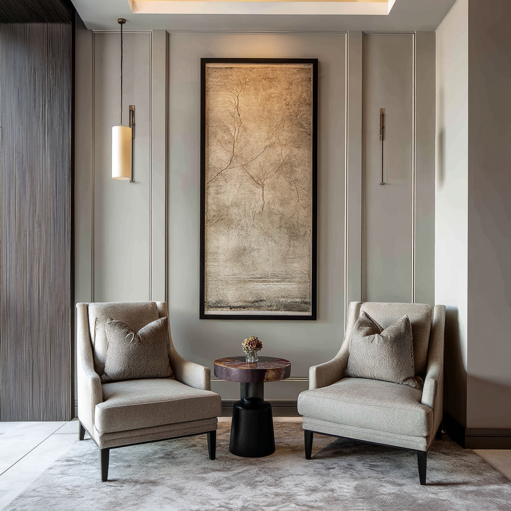
The first step in achieving timelessness is recognising the enduring power of neutrals. Shades like ivory, taupe, soft grey, and muted beige have always provided a stable backdrop for evolving design choices. They don’t dominate a room; instead, they offer flexibility. A neutral foundation means furniture, artwork, or seasonal accents can shift without requiring a full redesign. Within Colour First Design, neutrals function as anchors, ensuring your space has longevity while still leaving room for personal expression.

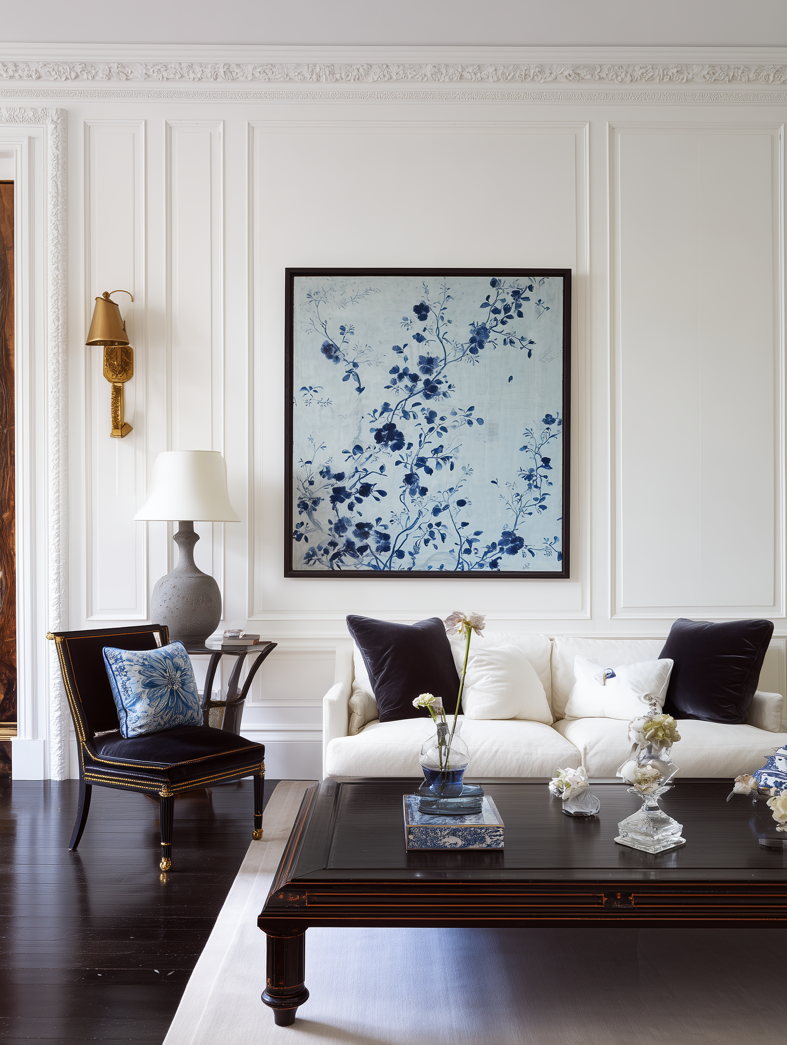
That doesn’t mean colour should be avoided. In fact, strategic use of classic accent hues adds depth and personality. Think navy blue, forest green, or burgundy—colours that have stood the test of time across centuries of interior history. When integrated through walls, upholstery, or cabinetry, these shades feel sophisticated rather than fleeting. A well-executed Colour First Design balances these timeless accents with contemporary details, creating an interior that evolves gracefully rather than dates quickly.

Another key to timelessness is balance between boldness and restraint. While statement colours can give a room personality, going all-in on a trendy shade risks making your home feel out of touch in just a few years. For example, millennial pink or ultra-violet may dominate Instagram feeds today, but they’re unlikely to feel as fresh a decade from now. A thoughtful Colour First Design approach treats these shades as accents—on cushions, artwork, or smaller furniture—so they can be swapped out without a costly overhaul.

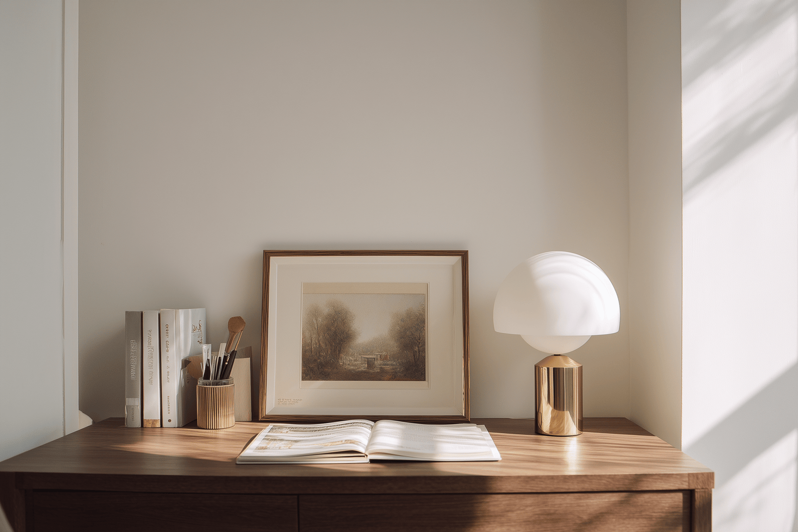
Texture and material choice also play a role in keeping colours timeless. Natural elements like wood, stone, linen, and leather pair seamlessly with enduring colour palettes. When layered correctly, these materials enhance the richness of your chosen hues and provide depth that transcends trends. This is where Colour First Design extends beyond paint swatches, ensuring that every finish supports the overall palette.

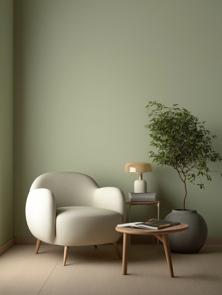
Finally, lighting is a timeless ally. Natural daylight paired with layered artificial lighting ensures colours remain consistent and flattering throughout the day and across seasons. A muted sage wall, for example, feels timeless not only because of its earthy tone but also because it adapts beautifully under different lighting conditions. Designers who apply Colour First Design know that timeless palettes are those that retain their integrity in varied light.

In essence, the timelessness factor is about foresight. Instead of chasing what’s fashionable, it’s about curating colours that reflect both your personal taste and the enduring qualities of good design. With Colour First Design, your interiors don’t just look stylish now—they are built to age gracefully, providing beauty, balance, and relevance for years to come.

Common Mistakes in Colour-First Design

Colour is one of the most powerful tools in shaping interiors, but even with the best intentions, it’s easy to misstep. While Colour First Design provides a clear framework for building a room around a chosen palette, many homeowners and even designers stumble when executing the concept. Recognising these pitfalls early helps ensure that your colour-led interiors achieve harmony rather than chaos.

Common Mistakes

One of the most common mistakes is over-saturation. Choosing bold colours is exciting, but when every wall, fabric, and accessory competes for attention, the room can quickly become overwhelming. A crimson sofa against ruby walls with red-patterned cushions may sound dramatic, but in practice, it often feels suffocating. In Colour First Design, the key is balance: pair bold choices with neutrals or softer shades to let the hero colour truly shine.

Another frequent misstep is ignoring undertones. Many people focus only on the obvious shade—blue, green, beige—without noticing the subtle undertones that can clash. For example, a cool grey sofa with blue undertones will look out of place against a warm beige wall. Undertones dictate whether colours feel harmonious or disjointed. A thoughtful Colour-First Design process always checks undertones in different lighting to ensure they align.

A third mistake lies in neglecting lighting altogether. A shade that looks elegant in natural daylight may appear flat or even jarring under artificial light. When applying Colour First Design, it’s essential to test paint swatches and fabric samples at different times of the day. This prevents the unpleasant surprise of discovering that your “calm sage green” looks more like a muddy olive once the sun sets.

People also often fall into the trap of forgetting about function. A bright yellow might look cheerful in a kitchen but may be too stimulating for a bedroom. Similarly, deep moody hues might create atmosphere in a dining room but could feel oppressive in a small hallway. With Colour First Design, colour choices should align with both the mood and the purpose of the room, ensuring the space feels intentional rather than mismatched.

Another oversight is buying furniture as an afterthought. If you’re embracing Colour First Design, furniture should be chosen to complement your palette, not fight against it. Too often, people fall in love with a sofa or table without considering how it will interact with the room’s dominant colours. The result is furniture that feels “dropped in” rather than integrated.

Lastly, there’s the mistake of following trends blindly. Just because a particular shade is on every magazine cover doesn’t mean it will suit your home. Trend-led colours can date quickly or feel disconnected from your personal style. A smarter approach to Colour First Design is to use trends as accents—through cushions, throws, or artwork—while keeping your core palette timeless and adaptable.

By being mindful of these common mistakes, you can avoid costly redesigns and instead create a space where colour and furniture work in perfect unison. The beauty of Colour First Design is its ability to personalise interiors—when done right, it produces spaces that feel not only stylish but also authentically yours.

Designing Beyond the Surface

Colour is not just decoration—it’s the backbone of every interior story. By embracing Colour First Design, you’re no longer treating colour as an afterthought but as the guiding principle that shapes mood, function, and flow. From understanding its psychology to avoiding common mistakes, balancing it with furniture choices, and selecting timeless palettes, this approach allows you to create spaces that are both beautiful and deeply intentional.

The true power of Colour First Design lies in its adaptability. Trends will shift, furniture may be replaced, but when your palette is chosen with care, it becomes a constant thread weaving your interiors together. Whether you’re designing a single room or an entire home, starting with colour ensures cohesion, harmony, and personal expression that lasts.

Ultimately, when colour leads, design follows with confidence. And that is how you create interiors that are not only stylish today but remain meaningful and inspiring for years to come.

What do you think?
Leave a Reply

Blog

Get fresh home inspiration and helpful tips from our interior designers

top
2
    2
    Your Cart
    Campden Club Chair - Rust Orange Remove
    £590
    Angie Pendant Nickel Remove
    Angie Pendant Nickel
    Qty: 1
    Price: £248
    £248

    Inactive

    Privacy Overview

    This website uses cookies so that we can provide you with the best user experience possible. Cookie information is stored in your browser and performs functions such as recognising you when you return to our website and helping our team to understand which sections of the website you find most interesting and useful.