The “Unexpected Red” Theory: Why Designers Are Obsessed with Burgundy Interior Design This Year

Burgundy Interior Design

Step into the most compelling interiors of this year and a subtle pattern begins to emerge. The rooms that linger in your mind—the ones that feel layered, intentional, quietly luxurious—aren’t relying on more furniture, louder statements, or trend-heavy styling. Instead, they hinge on something far more precise: a single, strategic shift in color.

Not an obvious one. Not a loud one. But a deliberate one.

A deep-toned cushion breaking up a neutral sofa. A wine-colored chair anchoring an otherwise calm room. A hint of richness that feels almost accidental, yet completely transformative.

This is the foundation of the Unexpected Red Theory—the idea that introducing a red tone, particularly one as nuanced as burgundy, has the power to instantly elevate a space. And right now, burgundy interior design sits at the center of that transformation.

Unlike brighter reds that demand attention, burgundy operates differently. It doesn’t interrupt a space—it deepens it. It doesn’t compete—it anchors. It introduces contrast without chaos and warmth without overwhelming the senses.

This isn’t about adding color for the sake of it. It’s about understanding impact. Burgundy is not just a hue—it’s a design decision. One that allows interiors to feel richer, more grounded, and infinitely more considered.

The "Unexpected Red" Theory: Why Designers Are Obsessed with Burgundy Interior Design This Year

At first glance, the Unexpected Red Theory feels almost too simple to matter. Add a touch of red, and the room improves. But like most powerful design principles, its effectiveness lies in nuance.

It’s not about any red. It’s about the right red, in the right amount, in the right place.

And this is where burgundy interior design becomes essential.

Burgundy occupies a uniquely balanced position on the color spectrum. It carries the energy of red but softens it with brown and purple undertones, resulting in something far more grounded and sophisticated. It feels intentional rather than impulsive—refined rather than reactive.

Bright reds tend to command attention immediately. They energize a space, but often at the cost of subtlety. Burgundy, on the other hand, settles into a room. It absorbs light, creates depth, and enhances everything around it rather than competing with it.

This is why it works so effortlessly. Burgundy doesn’t try to be the focal point—it becomes it naturally.

At its best, burgundy acts as a visual anchor. It completes a space in the same way a well-placed shadow completes a photograph. Without it, a room may feel pleasant but slightly unresolved. With it, everything sharpens into intention.

And importantly, this movement is not about excess. It’s not about drenching a room in red or recreating outdated, overly saturated interiors. Burgundy works because it is used with restraint. It’s the contrast, not the quantity, that makes it powerful.

2. Why Burgundy Interior Design Is Having a Major Moment

Design trends rarely emerge in isolation—they respond to how people feel. And right now, there’s a clear shift happening.

After years of cool-toned minimalism, many homes feel visually clean but emotionally distant. At the same time, maximalism—while expressive—can feel overwhelming when applied without restraint.

People are looking for something in between: spaces that feel calm, but not empty; expressive, but not chaotic.

This is exactly where burgundy interior design thrives.

There’s a growing desire for interiors that feel lived-in and emotionally grounded. Burgundy answers that need by introducing warmth without sacrificing sophistication. It softens sterile palettes and adds depth to overly uniform spaces.

It also aligns with a broader cultural shift toward richness—richer textures, deeper colors, more meaningful environments. We’re seeing it in fashion, where earthy tones and deep reds are replacing stark monochromes. We’re seeing it in hospitality, where boutique hotels lean into moody, layered palettes to create memorable experiences.

Interiors are simply reflecting this shift.

What makes burgundy particularly compelling is its duality. It feels timeless, yet current. Familiar, yet fresh. It carries historical weight—reminiscent of heritage interiors and classic design—but when used with restraint, it feels entirely modern.

How Burgundy Interior Design Is Redefining Modern Living Spaces

The "Unexpected Red" Theory: Why Designers Are Obsessed with Burgundy Interior Design This Year

Modern living is no longer about static, single-purpose rooms. Our spaces need to adapt—to work, rest, entertain, and restore.

The challenge is creating interiors that can handle this complexity without feeling disjointed.

This is where burgundy interior design proves its strength.

Burgundy acts as a bridge between calm and expression. In minimalist spaces, it introduces depth and prevents the room from feeling flat. In more layered interiors, it provides cohesion, tying together different materials, tones, and elements.

It also creates a sense of identity. A single burgundy piece—whether a chair, rug, or artwork—can define the mood of an entire room. It gives the space a focal point without overwhelming it.

More importantly, burgundy adapts. It works just as well in contemporary apartments as it does in more traditional homes. It complements both clean lines and organic forms. It enhances both light-filled spaces and moodier environments.

That versatility is what makes it so relevant today.

3. The Psychology of Burgundy: Why It Feels So Good in a Space

Color shapes how we feel in a space, often without us realizing it.

Burgundy is particularly effective because it balances stimulation with calm. It carries the warmth of red, but tempers it with depth, resulting in a color that feels grounding rather than overwhelming.

It creates a sense of enclosure—not in a restrictive way, but in a comforting one. Like being wrapped in something soft and familiar.

This is why burgundy works so well in spaces where we want to relax and connect. Living rooms feel more intimate. Bedrooms feel more cocooned. Even dining areas feel more inviting.

There’s also an inherent richness to burgundy. It doesn’t rely on shine or excess to feel luxurious. Its depth alone communicates quality and substance.

And perhaps most importantly, it feels human. Burgundy reflects tones found in nature—wine, earth, aged wood—which makes it feel instinctively familiar. That familiarity is what gives it emotional staying power.

The "Unexpected Red" Theory: Why Designers Are Obsessed with Burgundy Interior Design This Year

The most successful interiors using burgundy are not the loudest—they are the most intentional.

Designers are approaching burgundy with precision, using it to enhance rather than dominate.

At the most accessible level, burgundy appears in soft furnishings. Cushions, throws, and rugs allow for easy integration and flexibility. These elements introduce warmth without requiring a long-term commitment.

At a more defining level, burgundy is used in statement pieces—sofas, armchairs, or cabinetry. These elements anchor a space, creating a focal point that feels both bold and grounded.

But perhaps the most interesting approach is the subtle one.

Small, almost imperceptible moments—a book spine, a ceramic object, a detail within artwork—can carry just enough burgundy to shift the tone of an entire room. These micro-accents are what make a space feel layered and considered rather than styled.

Material pairing also plays a critical role. Burgundy thrives when combined with natural textures—linen, wool, wood, and stone. Metallic accents like brass or bronze enhance its richness, while lighter neutrals provide balance.

The key is not how much burgundy you use, but how well you place it.

5. The Rules for Mastering Burgundy Interior Design at Home

Mastering burgundy isn’t about boldness—it’s about control.

Start small. Let yourself understand how the color behaves in your space before expanding. A cushion or throw can teach you more than a full sofa ever could.

Balance is essential. Because burgundy absorbs light, it needs contrast. Pair it with lighter tones and allow space around it so it can breathe.

Texture matters. The same shade of burgundy can feel entirely different depending on the material. Velvet adds softness and luxury. Linen feels relaxed and organic. Leather introduces structure and depth.

Anchor your choices. Pair burgundy with timeless elements—solid wood furniture, classic silhouettes, neutral foundations—to ensure it feels enduring rather than trend-driven.

And above all, edit. Burgundy is most powerful when it stands out. Overusing it reduces its impact. Restraint is what makes it feel refined.

The "Unexpected Red" Theory: Why Designers Are Obsessed with Burgundy Interior Design This Year

Burgundy’s strength lies in its adaptability, but its impact varies depending on how—and where—it’s used. Understanding this is what separates a well-designed space from one that feels slightly off.

Living Rooms: Depth, Warmth, and Conversation

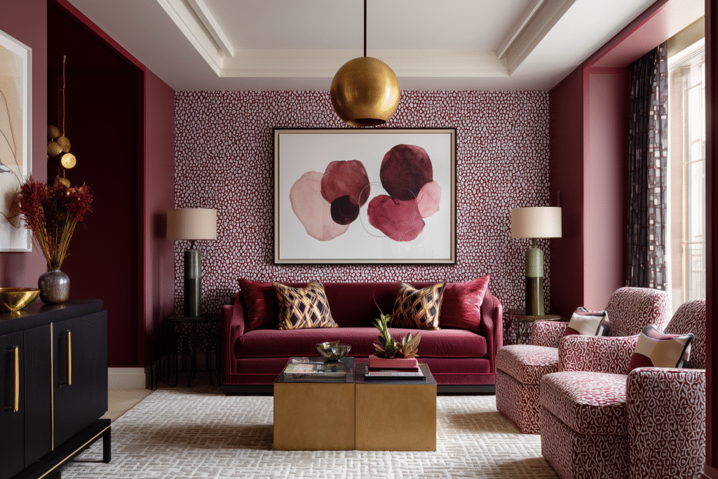
The living room is where burgundy truly comes into its own.

This is a space designed for connection—for conversation, relaxation, and presence. Burgundy enhances all of these by introducing visual warmth and emotional depth. A burgundy sofa or armchair can anchor the entire room, giving it a sense of gravity without making it feel heavy.

If a full piece feels like too much, layering is key. Cushions, throws, or even a rug can subtly shift the tone of the space. The goal is to create a focal point that draws people in without overwhelming the overall palette.

Bedrooms: Intimacy and Soft Enclosure

In bedrooms, burgundy becomes softer, more enveloping.

Used in textiles—duvets, cushions, upholstered headboards—it creates a cocooning effect that enhances rest and comfort. Unlike brighter colors, which can feel stimulating, burgundy supports a slower, more relaxed atmosphere.

The key here is softness. Pair burgundy with natural fabrics like linen or cotton to keep the space feeling breathable and calm.

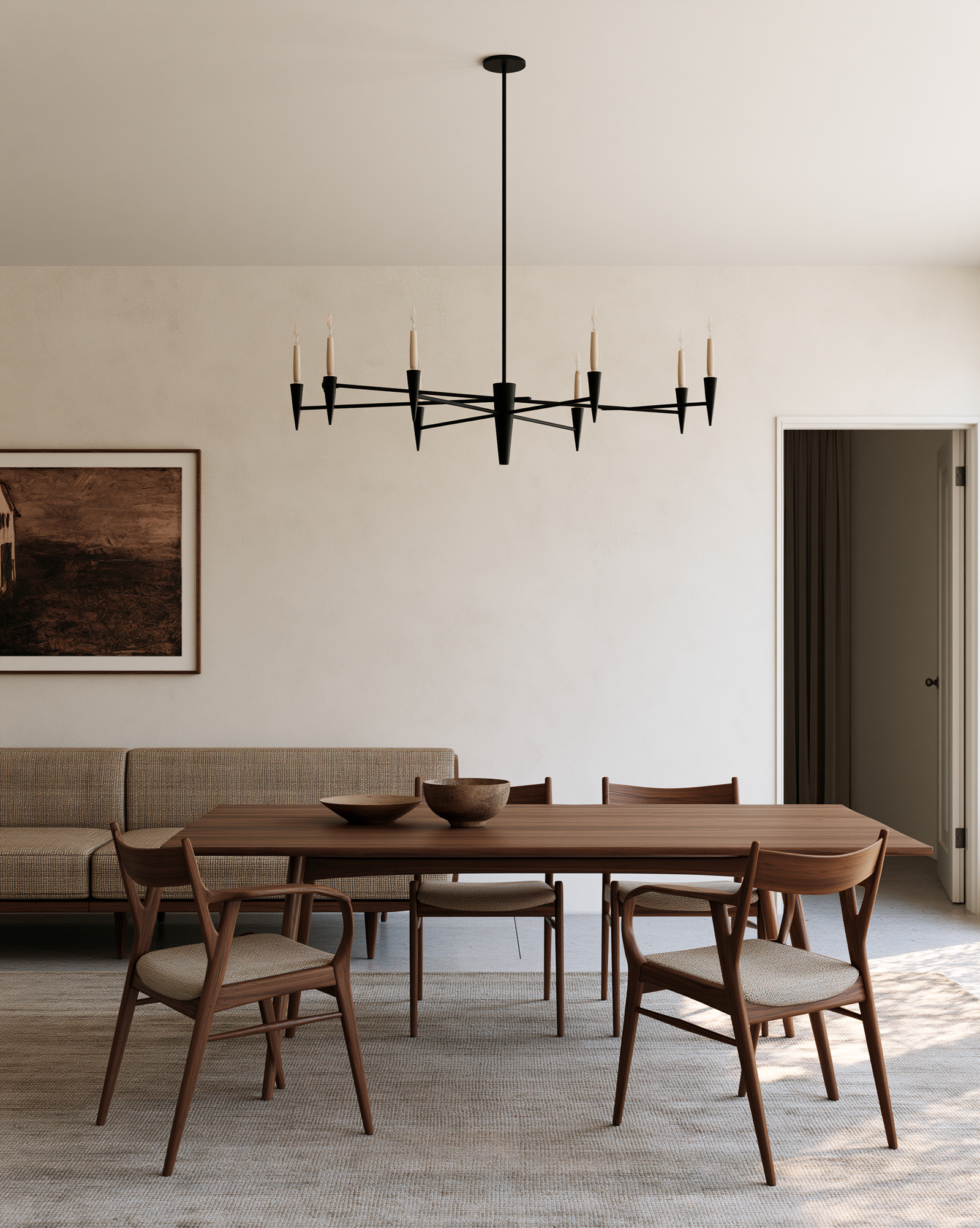
Kitchens & Dining: Richness and Appetite

Burgundy has a long-standing relationship with food and dining—it evokes wine, warmth, and shared experiences.

In kitchens, it works beautifully in cabinetry or as an accent through bar stools or accessories. In dining areas, it adds richness and intimacy, making meals feel more intentional.

When paired with wood and warm lighting, burgundy transforms these spaces into something far more inviting.

Bathrooms: Unexpected Luxury

Bathrooms are often overlooked when it comes to color, which is exactly why burgundy works so well here.

Used sparingly—through tiles, vanities, or even towels—it introduces a sense of quiet luxury. It elevates the space without requiring a full redesign.

The contrast between burgundy and lighter elements like marble or ceramic creates a refined, almost spa-like atmosphere.

Small vs Large Spaces: Scale Matters

In smaller spaces, restraint is key. A single burgundy element can create contrast without overwhelming the room.

In larger spaces, layering becomes more effective. Multiple burgundy elements—spread thoughtfully across the room—can create cohesion and depth.

Understanding scale is what allows burgundy to feel intentional rather than excessive.

7. Styling Like a Pro: Making Burgundy Feel Effortless, Not Forced

The "Unexpected Red" Theory: Why Designers Are Obsessed with Burgundy Interior Design This Year

The difference between a space that feels designed and one that feels overdesigned often comes down to styling.

Burgundy should never feel like an afterthought—or worse, a trend you’re trying to “add in.” It should feel like it belongs, like it was always part of the story.

Practice Restraint

One of the most common mistakes is repetition without intention. Adding burgundy everywhere—on every cushion, every object—dilutes its impact.

Instead, choose a few key placements. Let those moments stand out.

Create Visual Rhythm, Not Symmetry

Burgundy works best when it appears in a rhythm across the room—not in perfect symmetry, but in subtle repetition.

A cushion on one side, an artwork detail on another, perhaps a book on a shelf. These small echoes create cohesion without making the space feel staged.

Mix Old and New Thoughtfully

Burgundy pairs beautifully with vintage pieces. Its richness complements aged wood, worn leather, and antique metals.

Blending old and new adds depth and authenticity. It prevents the space from feeling overly curated or showroom-like.

Layer Through Seasons

One of burgundy’s strengths is its ability to transition.

In cooler months, it can feel cozy and grounding. In warmer months, when paired with lighter fabrics and tones, it becomes softer and more relaxed.

Rotating textiles—throws, cushions, even small decor—allows you to adapt the mood of your space without a complete overhaul.

Tell a Cohesive Story

Every well-designed space tells a story. Burgundy should be part of that narrative—not an isolated decision.

Think about how it connects to your materials, your lighting, your overall palette. When everything works together, burgundy doesn’t stand out awkwardly—it elevates everything around it.

The Color That Completes the Room

The brilliance of the Unexpected Red Theory lies in its simplicity—but its impact is anything but small.

Burgundy doesn’t ask you to redesign your entire home. It asks you to look closer. To notice where a space feels flat, where it lacks depth, where it feels almost—but not quite—complete.

And then, to respond with intention.

Because that’s what great design ultimately is. Not more, but better. Not louder, but deeper. Not trend-driven, but thoughtful.

Burgundy offers a way into that mindset. It gives you permission to move beyond safe palettes and explore something richer, more expressive, more human.

And when used well, it does something remarkable—it doesn’t just change how a room looks.

It changes how it feels to live in it.

What do you think?
Leave a Reply

Blog

Get fresh home inspiration and helpful tips from our interior designers

top
5
    5
    Your Cart
    SCUTUM WALL LIGHT Remove
    SCUTUM WALL LIGHT
    Qty: 1
    Price: £1,231
    £1,231
    Tarte Black Finish 3 Tiered Glass Chandelier Remove
    VALKIE WALL LIGHT Remove
    VALKIE WALL LIGHT
    Qty: 2
    Price: £1,484
    £2,967
    CYRUS WALL LIGHT Remove
    CYRUS WALL LIGHT
    Qty: 1
    Price: £1,231
    £1,231
    Alia Yin-Yang Stainless Steel Coffee Table Remove
    £1,082

    Inactive

    Privacy Overview

    This website uses cookies so that we can provide you with the best user experience possible. Cookie information is stored in your browser and performs functions such as recognising you when you return to our website and helping our team to understand which sections of the website you find most interesting and useful.