Why Paint Colours Look Different at Home: LRV, Undertones and Lighting Explained

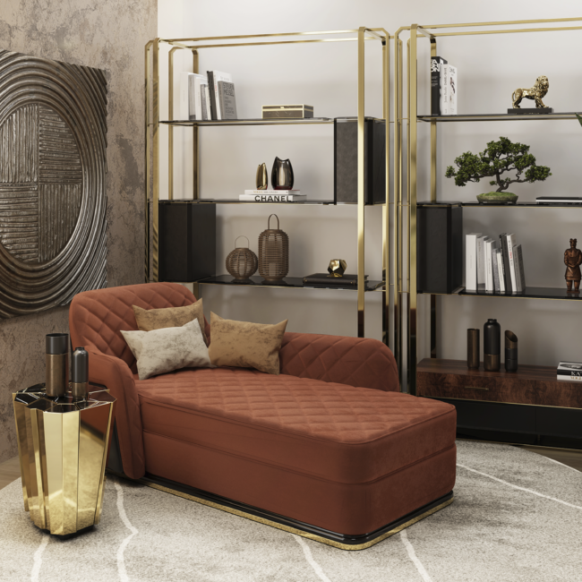
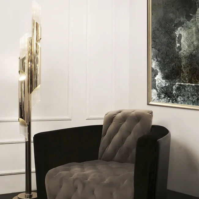
Sculptural furniture

You choose a beautifully restrained neutral from a paint card. In the showroom it feels warm, chalky and sophisticated. At home, it turns grey on one wall, faintly green on another and distinctly beige when the lamps come on. By the following morning, it seems to have changed again.

So, why do paint colours look different at home? Usually, the paint is not the problem. Colour is never seen on its own: it is created by the relationship between pigment, light, surface finish, surrounding materials and the way our eyes interpret them.

A colour card can introduce a shade, but it cannot predict its behaviour in your room. That requires an understanding of light reflectance value (LRV), undertones, lighting, metamerism and how to test paint beside the furniture that will live with it.

Table of content

  • Why paint colour is not visually fixed
  • What LRV means in paint
  • Why undertones suddenly appear
  • How room direction changes paint colour
  • Why paint changes throughout the day
  • How artificial lighting affects paint colour
  • What metamerism really means
  • How sheen and surface texture change colour
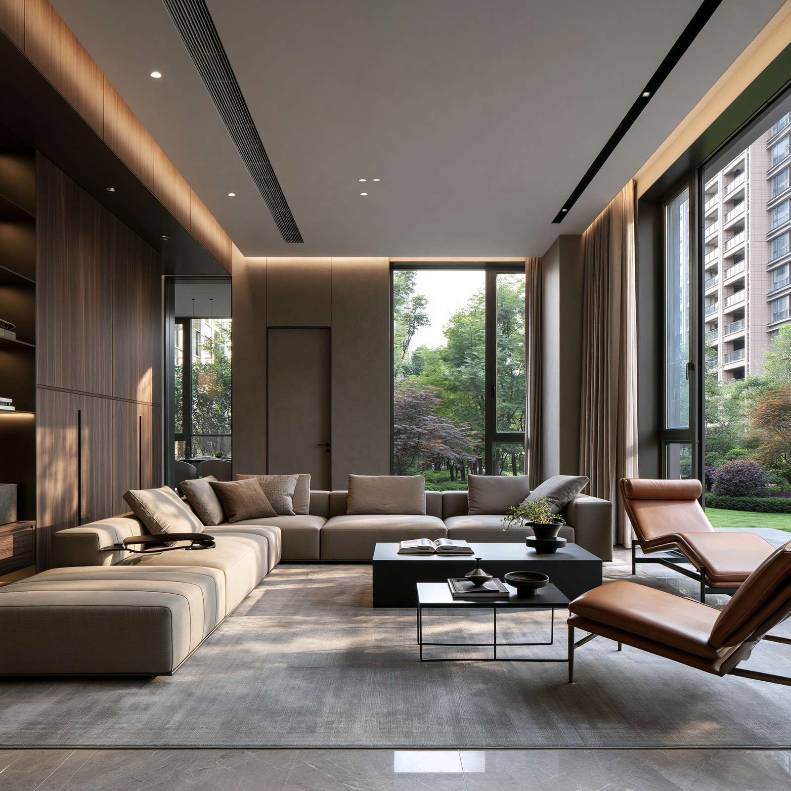
  • How furniture and flooring influence the walls
  • Why a colour card is not enough
  • How to test paint colour properly
  • How to rescue a paint colour that looks wrong
  • Common paint-colour myths
  • Frequently asked questions
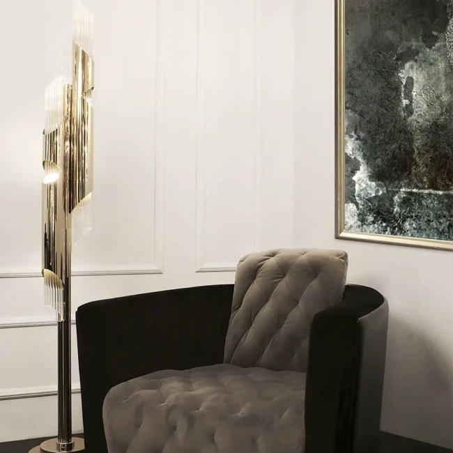
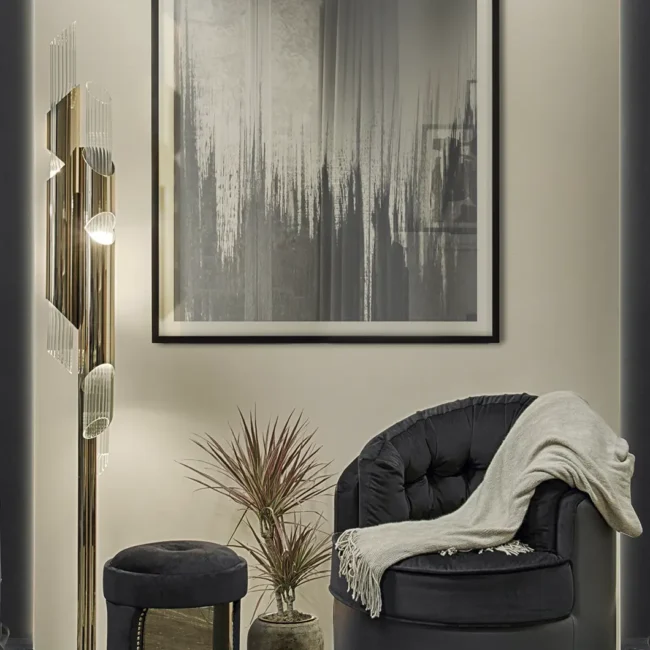
sculptural furniture 2

Why Paint Colour Is Not Visually Fixed

We describe colour as though it belongs permanently to an object: a cream wall, a blue chair, a walnut table. What reaches the eye, however, is reflected light. Paint pigments absorb some wavelengths and return others; our visual system interprets that reflection as colour. Change cool daylight to warm lamplight and the available wavelengths change too.

The result is a simple but important design principle:

You are not choosing a paint colour in isolation. You are choosing how that colour will behave in a specific room, under specific light, beside specific materials.

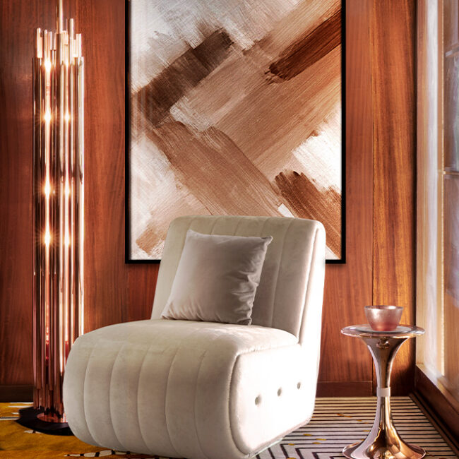
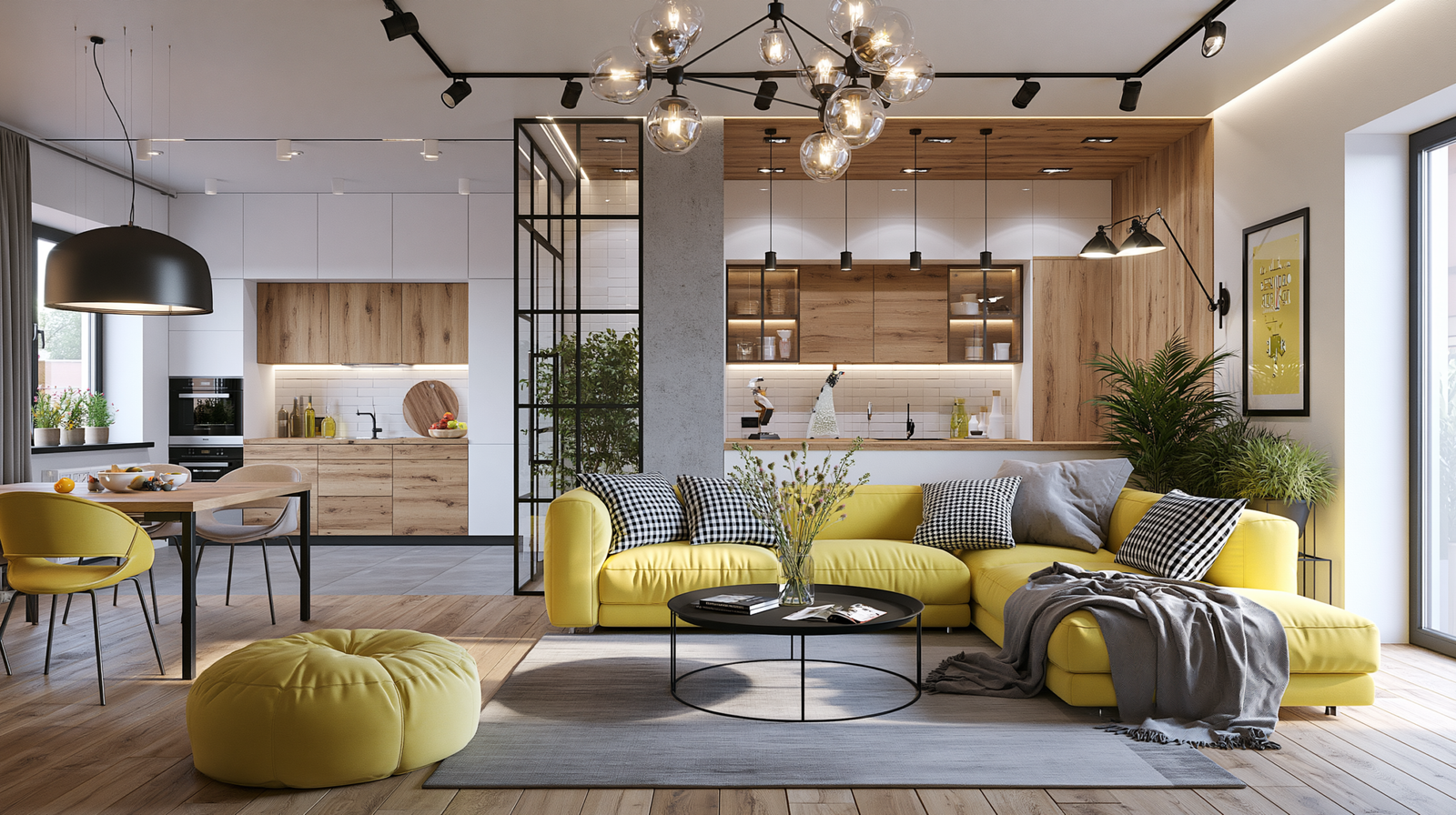
The room matters too. Peer-reviewed research on simultaneous colour contrast shows that surroundings alter perception. A grey beside navy upholstery may look warmer; beside orange-toned timber, the same grey may reveal a cooler or greener cast.

This is why light and colour sit among the seven essential elements of interior design. They do not simply decorate a room; they determine how its forms, textures and materials are seen.

What Does LRV Mean in Paint?

LRV stands for Light Reflectance Value. The UK Government’s Approved Document K defines it as the total quantity of visible light reflected by a surface, across all wavelengths and directions, when that surface is illuminated.

For paint selection, LRV uses a 0–100 scale: theoretically, absolute black is 0 and perfectly reflective white is 100, although ordinary paint rarely reaches either extreme.

A practical guide to how different Light Reflectance Values generally behave in an interior.
Approximate LRV How the Colour Is Likely to Behave
0–20 Very deep; absorbs most available light and creates a strong, enveloping effect.
21–40 Dark to mid-depth; feels grounded and responds strongly to the room’s lighting plan.
41–60 Mid-range; can appear noticeably lighter or darker as the natural light changes.
61–80 Light; reflects more of the available light back into the room.
81–100 Very high reflectance; visually bright, but still dependent on the amount and quality of light present.

Note: These LRV bands are practical interior-design guidelines, not an official classification system.

Why Paint Undertones Suddenly Appear at Home

An undertone is the quieter colour bias beneath a paint’s most obvious appearance. Whites, greys, beiges and taupes may lean towards yellow, pink, green, blue, violet or red.

That bias can hide on a small card and become obvious across a wall, especially beside cleaner white or a material with a competing undertone.

“Greige” might read grey beside cream upholstery, reveal green against orange-toned oak and look beige under a warm bulb. Each is the same paint in a different relationship.


A simple way to identify undertones

Place each candidate beside clean white card, warmer and cooler versions of the same colour family, the flooring or stone, and the main upholstery fabric.

Comparison exposes hidden colour biases. The goal is not to avoid undertones—they make neutrals interesting—but to choose one that relates to the room’s fixed elements.

A pink-beige wall and a yellow-beige sofa can make each other look unsettled. A green-grey wall beside stone with subtle green veining can feel intentional and calm. The difference is not the quality of either colour; it is the relationship between them.


How Room Direction Changes Paint Colour

Room orientation affects when direct sun enters, how intense it is and how the room changes through the day. CIBSE’s technical discussion of daylight, window orientation and obstructions also shows why direction is only one part of the equation: window size, aspect, balconies and neighbouring buildings all influence the daylight that reaches an interior.

For homes in the UK and elsewhere in the northern hemisphere, these are useful starting points:

How room orientation typically affects paint colour in UK homes and elsewhere in the northern hemisphere.
Room Direction Typical Daylight Behaviour What to Watch For
North-facing Cooler, diffused and relatively consistent natural light. Blue, green and grey undertones may become more noticeable.
South-facing Stronger, warmer light for more of the day. Warm neutrals may appear creamier, while saturated colours can intensify.
East-facing Brighter, warmer morning light followed by a cooler appearance later. Assess the paint at the time of day when the room is most frequently used.
West-facing Cooler in the morning, becoming warmer and more golden later. Beige, pink, red and yellow undertones may become richer towards sunset.

Note: These are useful starting points rather than fixed rules. Window size, trees, balconies, neighbouring buildings and reflective exterior surfaces can all change the result.

In a north-facing room, warm whites, clay shades and ochres can balance cool indirect light. Deep blue, forest green, plum or chocolate can also work by embracing the shade. Be cautious with pale blue-grey or green-grey neutrals: northern light may make them feel colder than they appeared on the card.

South-facing rooms offer more flexibility, although warm whites may become creamier and saturated colours more intense. East-facing rooms are brightest in the morning and cooler later; west-facing rooms move from subdued morning light to a golden late-afternoon glow.

Judge the paint when the room is normally used. Trees, brick walls, deep reveals, blinds and neighbouring buildings may alter every pattern, so orientation is a clue rather than a verdict.

Why Paint Colour Changes Throughout the Day—and the Year

Daylight changes in direction, intensity and spectral character from dawn to dusk; weather and season modify it further.

A nuanced green might feel grey in the morning, cleaner at midday and olive towards sunset. A soft white may be crisp on an overcast afternoon and noticeably creamy when low sun enters the room.

In the UK, lower winter sun and shorter days increase reliance on lamps. Summer light and green foliage produce another effect, while brick, paving and neighbouring façades may throw reflected colour indoors.

A successful colour cannot look identical all day. Ask whether you enjoy its important versions; many complex paints are compelling precisely because they move with the light.

How Artificial Lighting Affects Paint Colour

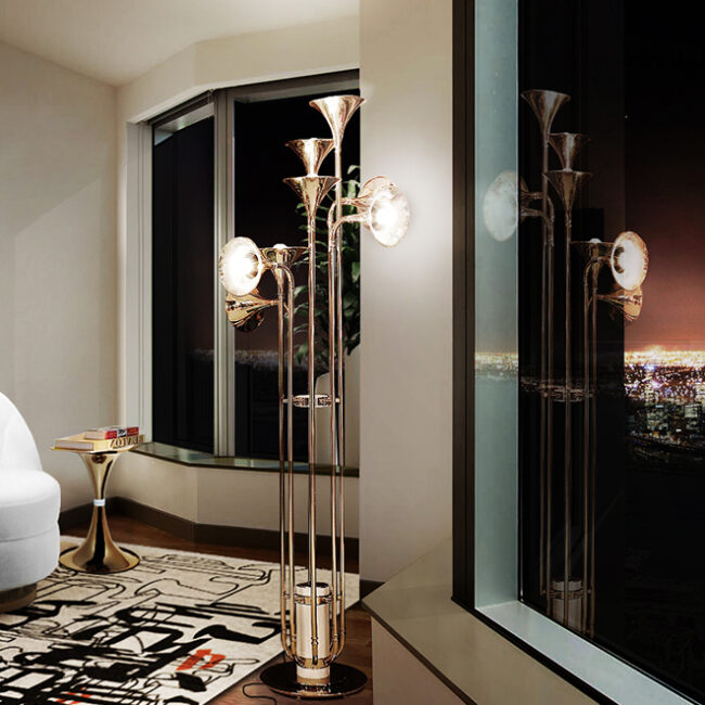
After sunset, the light bulbs become part of the palette. Their colour temperature, colour-rendering quality, brightness, position and shade material all influence the paint.

Kelvin: the apparent warmth of white light

Correlated colour temperature (CCT) is measured in Kelvin (K). Lower numbers look warmer and more yellow; higher numbers look cooler and more blue. The numerical direction feels counterintuitive, but the visual effect is straightforward.

A practical guide to common colour temperatures and their use in residential interiors.
Colour Temperature Typical Appearance Common Domestic Use
2200K–2700K Very warm to warm white, with an intimate or candle-like quality. Bedrooms, intimate dining rooms and decorative lamps.
2700K–3000K Warm, comfortable white that complements many residential materials. Living rooms, bedrooms, dining rooms and relaxed entertaining spaces.
3000K–3500K A clearer, warm-neutral white with less visible yellow. Kitchens, bathrooms, home offices and multifunctional rooms.
4000K+ Cool, crisp white that can feel clinical in relaxed interiors. Task-led spaces where a cooler and more energising appearance is required.

Important: Kelvin describes whether white light appears warm or cool. It does not measure colour accuracy. Check the bulb’s CRI as well as its colour temperature.

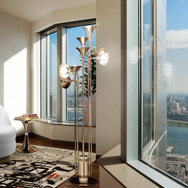
The U.S. Department of Energy’s guide to bulb colour characteristics explains how CCT affects a room’s appearance and mood. Warm light can enrich timber, cream, terracotta and brass but make white look yellower; cooler light can sharpen blue and green while flattening warm neutrals.

There is no universal Kelvin value, although visible bulbs should be reasonably consistent so that the wall does not look fragmented.


CRI: how convincingly a bulb reveals colour

The Colour Rendering Index (CRI) estimates how faithfully a light source renders colours compared with a reference source. The Department of Energy’s LED guidance recommends at least CRI 80 for interiors and describes CRI 90 or above as excellent colour fidelity, while noting that newer measures such as TM-30 provide a more complete assessment.

For nuanced paint, artwork, upholstery and timber, high colour fidelity is worth prioritising. Two bulbs labelled 2700K may still reveal reds, greens and skin tones differently.


Position matters as much as the bulb

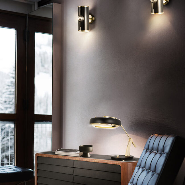
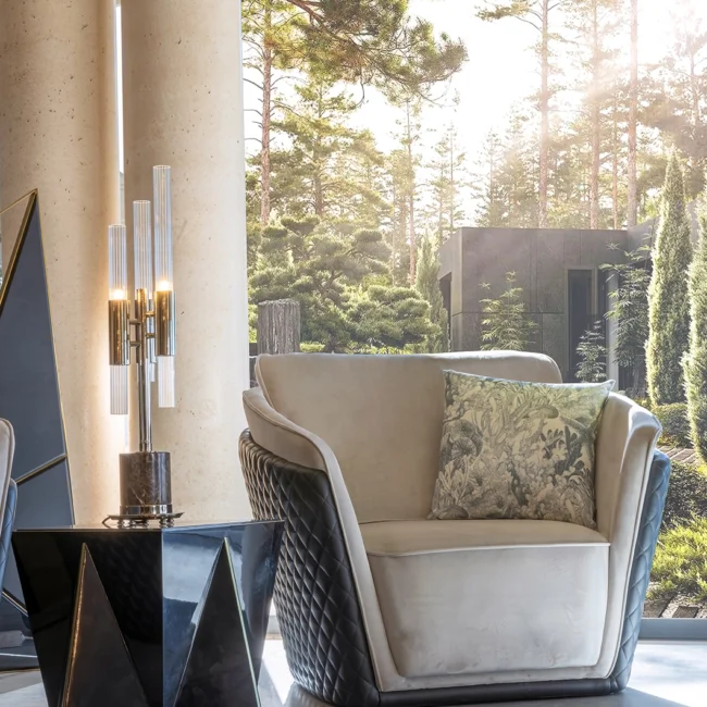
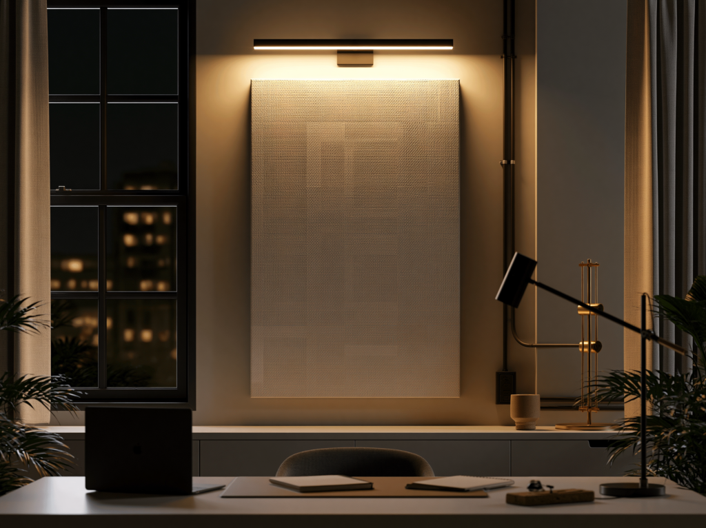
A central pendant creates a different colour experience from a layered scheme. Downlights make pools and gaps; wall lights skim texture; shaded lamps create concentrated warmth; uplighters soften the room through the ceiling.

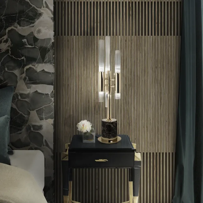
This is why depending on one ceiling light can make a room feel flat. Use table lamps to create warm pools of light and floor lamps to balance darker corners.

Test the paint with those lights in their intended positions—not under a temporary bare bulb.

Metamerism is often used to describe any colour that shifts under changing light, but its technical meaning is more precise.

RMIT University’s colour-theory guide to metamerism explains that two colours are metameric when they match under one lighting condition but no longer match under another.

Imagine a beige wall paint and a beige sofa that appear perfectly coordinated in daylight. In the evening, the sofa looks pink while the wall turns yellow. Their dyes and pigments reflect light differently, so the match separates under the LED lamp. That is metameric failure.

A single wall looking warmer at sunset than at noon is simply a change in colour appearance. Metamerism requires a comparison between materials that match in one condition and separate in another.

It matters whenever paint is coordinated with upholstery, curtains, stone, cabinetry or another “matching” white. The solution is practical: view the materials together in daylight and under the actual evening bulbs.

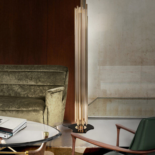
This is especially important when following a mix-and-match approach to furniture, because velvet, linen, leather, stone, metal and paint respond to light differently.

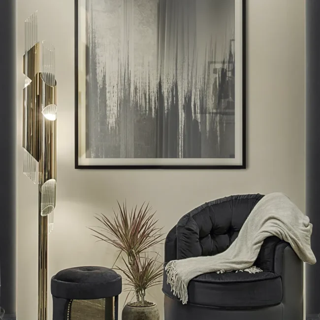
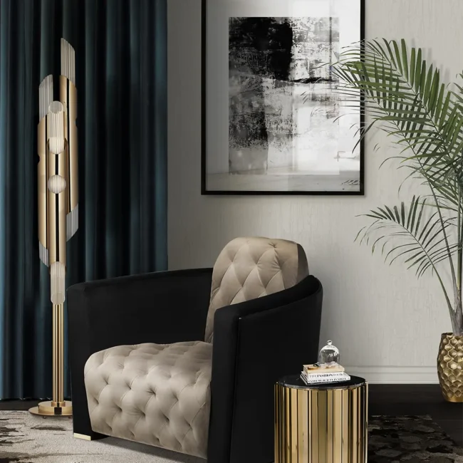
sculptural furniture 3

How Paint Finish and Wall Texture Change Colour

The same colour can differ in matt, eggshell, satin and gloss. Matt paint scatters light diffusely for a softer result; higher sheen produces directional reflections, looking lighter where it catches light and deeper elsewhere.

Smooth plaster, paper, panelling, brick and render also create different highlights and shadows. Unprimed filler, inconsistent rolling or isolated touch-ups may resemble colour variation when the real difference is absorption or sheen.

Always make the final sample in the finish you intend to buy. A matt sample cannot accurately predict a satin woodwork result.


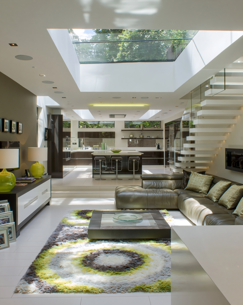
How Furniture and Flooring Influence Wall Colour

Paint may cover the largest area, but other large surfaces affect its appearance:

  • A navy sofa can make a neutral wall look warmer.
  • Honey-toned flooring can intensify yellow undertones.
  • A rust rug may reveal pink or red in beige paint.
  • Cool marble can make a warm white seem creamier.
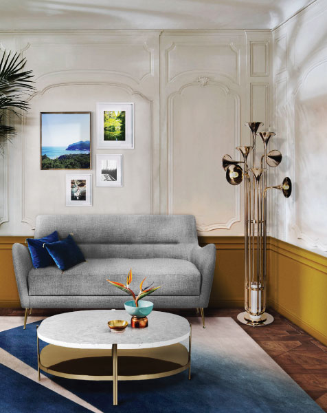
  • Brass adds reflected warmth under evening light.
  • A large pure-white wardrobe can make an off-white wall look dull by comparison.

An empty room therefore changes when furnished: it gains new colour, reflectance and texture.

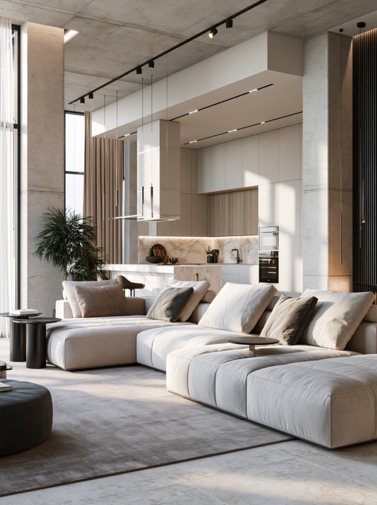
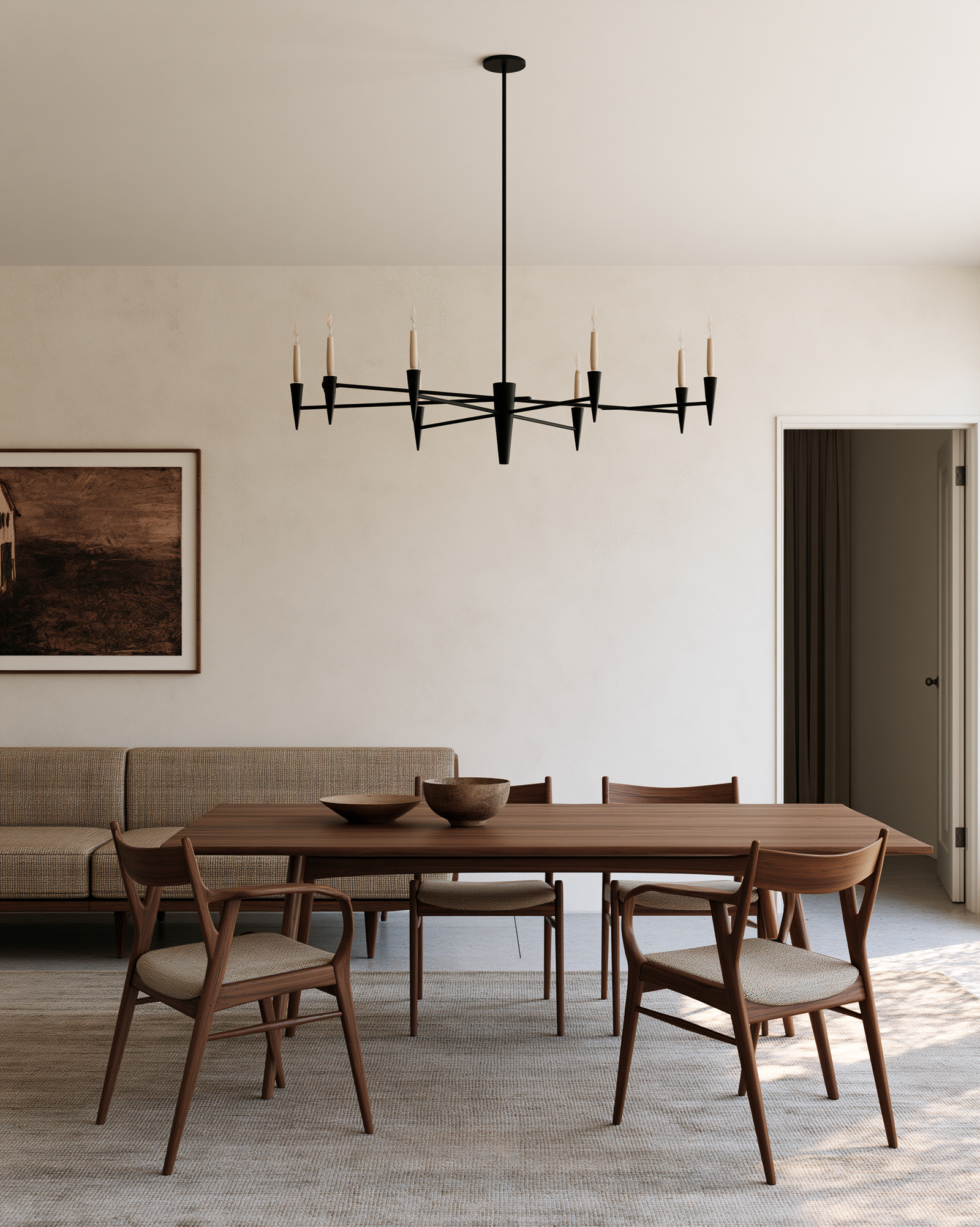
If the major pieces exist, let them lead. Compare paint with the sofa, rug, flooring, curtains and timber. With walnut, mahogany or smoked oak, use our guide to styling dark wood furniture in a modern interior.

Seek a controlled relationship between warm and cool notes rather than an exact match.

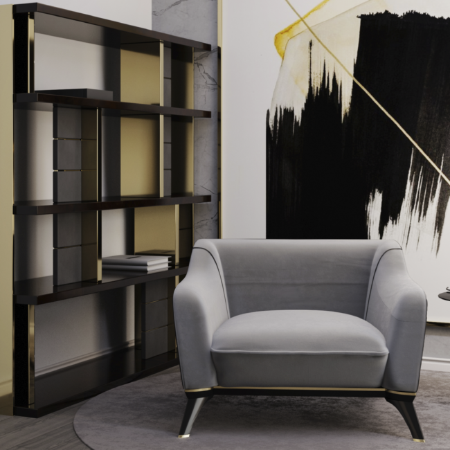
A large rug can anchor the room’s colour palette, while an armchair or accent chair can introduce a deliberate contrast. Test all three—paint, textile and evening light—as one composition.

Why a Colour Card Is Not Enough

A colour card is useful for narrowing the field, but it cannot reproduce a complete wall.

A subtle undertone can disappear on a small chip and become obvious across four walls. In the shop, the card is also framed by other swatches and commercial lighting; at home, the colour is judged against your ceiling, floor, windows and furniture.

Digital previews create another distortion. Screens emit light while walls reflect it, and display calibration, photography and automatic white balance all affect the result. Use an online visualiser to shortlist colours, never to approve one.

Even a small patch on the wall can mislead. A grey sample surrounded by warm cream may look much cooler than it will once the old colour is covered. Fresh plaster, filler and different primers can also absorb paint unevenly.

Large sample boards reduce the contextual distortion, but the final choice should still be confirmed on a properly prepared section of wall.

How to Test Paint Colour Properly

Testing is the only reliable bridge between a promising colour card and a successful room.


1. Start with the room

Record its orientation, window size, obstructions and principal time of use. Decide whether the atmosphere should be airy, quiet, dramatic or enveloping.


2. Identify what cannot easily change

Flooring, stone, cabinetry and major furniture are more restrictive than paint. Establish their undertones first.


3. Compare several related colours

Test three to five warmer, cooler, lighter or deeper variations. Differences are easier to recognise when candidates sit together.


4. Make large samples

Use at least A3-sized boards where possible. Prime them and apply two coats of the intended finish. A clean white card beside the sample will help expose its undertone.


5. Keep them vertical and move them

Tape each board at normal viewing height. Check it beside the window, in the darkest corner, behind the sofa and opposite the main light source.


6. Observe every important light

View the samples in the morning, afternoon, at dusk and under the finished evening scheme. Give the greatest weight to the time when the room is normally occupied.


7. Add the real materials

Hold upholstery, curtain, stone and timber samples against the paint. The decision concerns the complete palette, not an isolated colour.


8. Check the bulbs

Confirm the CCT, CRI and consistency of the lights that will remain. Poor or mismatched LEDs can undermine a beautiful shade.


9. Live with the final two

Leave the leading samples in place for several days. The best choice is often the one that supports the room without demanding constant attention.

Before ordering the full quantity, apply the final choice to a properly prepared section of the actual wall. A moveable board is excellent for comparison, but the wall confirms how the real substrate and texture affect the finish.

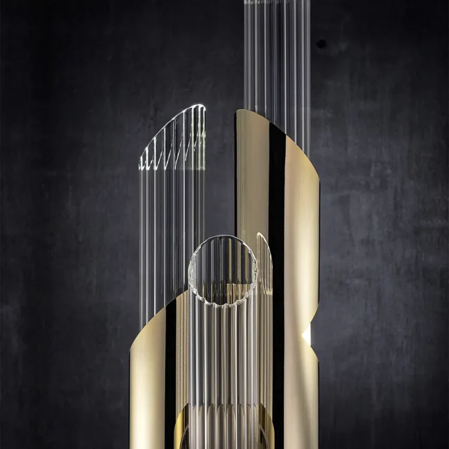
Sculptural furniture 4

How to Rescue a Paint Colour That Looks Wrong

Before repainting, identify whether the problem is light, context, sheen or application.

Common paint-colour problems, their likely causes and the first corrective steps to consider.
What Looks Wrong Likely Cause What to Try First
Too cool or grey Cool daylight, high-CCT bulbs or dominant blue furnishings. Test a high-quality 2700K–3000K bulb and introduce warm timber, brass or textiles.
Too yellow or pink Competing undertones in the flooring, curtains, stone or upholstery. Compare the wall with each large material and rebalance the element creating the clash.
Too dark Limited natural light or an incomplete artificial-lighting plan. Add layered light to vertical surfaces and introduce lighter textiles or controlled reflection.
Different on each wall Directional daylight, shadows or uneven artificial illumination. Accept the variation if it is attractive; otherwise test a quieter or more stable shade.
Patchy or flashing Filler, insufficient primer, uneven coats, absorption differences or isolated touch-ups. Prepare and prime the surface correctly, then repaint the complete wall rather than touching up individual areas.

Before repainting: Observe the wall in daylight and artificial light. Determine whether the real problem is the paint undertone, bulb, surrounding materials, surface preparation or finish.

Changing lamps may solve an evening problem, but it will not correct an undertone that feels wrong in every light. Accessories can balance colour, but cannot always resolve conflict with permanent flooring or stone.

Do not assume a dark room must be white. A deeper wall colour with layered lighting and pale upholstery can feel more resolved. See our living-room interior design ideas for ways to combine contrast, furniture and lighting.


Common Paint-Colour Myths

  • “White always makes a dark room brighter.” White can reflect available light, but it cannot reflect light that is not there. In a poorly lit room, stark white may look blue, grey or flat.
  • “A high LRV means the colour is warm.” LRV measures reflectance, not undertone. A high-LRV blue-white can still feel decidedly cool.
  • “A 4000K bulb shows the truest colour.” Kelvin describes apparent warmth or coolness, not colour fidelity. A high-CRI 2700K bulb may reveal materials more convincingly than a poor 4000K bulb.
  • “The paint code guarantees the same result everywhere.” Product, sheen, substrate, application, light and surroundings all affect appearance.
  • “A colour that changes is a bad colour.” Every colour responds to changing illumination. The question is whether you like its different versions when the room is in use.

The Final Paint-Testing Checklist

Before buying paint for the whole room, make sure you have:

  • Identified the room’s orientation and main usage time
  • Checked the colour’s LRV and undertone
  • Compared at least three related shades
  • Tested large samples vertically
  • Viewed the sample on more than one wall
  • Observed it in morning, afternoon and evening light
  • Switched on the bulbs that will remain in the room
  • Checked bulb Kelvin and CRI
  • Compared the paint with flooring, upholstery, curtains, stone and timber
  • Used the intended paint finish and allowed it to dry fully
  • Lived with the final choice for several days

Final Thoughts: Choose Paint for the Room You Actually Have

The paint card is not lying; it is showing colour under conditions that do not exist in your home. Successful schemes treat colour as part of a living composition.

LRV explains reflectance, undertones reveal relationships, daylight changes with time, and Kelvin and CRI shape the evening atmosphere.

No specification replaces looking. Move large samples, switch on the real lights and place the actual materials beside them. The right shade is the one that continues to make sense from morning to evening.

Frequently Asked Questions

Why does my paint colour look different from the sample card?

The card is small and was viewed under different light. Wall scale, direction, finish and neighbouring colours can expose undertones that were hidden on the card. Test a large sample in the room.


Why does the same paint look different on two walls?

Each wall receives light from a different direction and intensity. One may face the window while another receives indirect light; shadows, sheen and nearby furniture increase the difference.


What does LRV mean in paint?

Light Reflectance Value describes how much visible light a surface reflects. A higher number reflects more of the light present, but LRV does not identify undertone or guarantee brightness.


Why does grey paint look blue, green or purple?

Most greys contain undertones. Daylight, bulbs and adjacent materials make those notes more visible. Compare several greys beside clean white card and the room’s fixed finishes.


What paint colours work in a north-facing room?

Warm whites, clay shades and ochres can balance cool northern light. Deep blues, greens and plums can instead embrace the shade. Window size and the desired mood matter more than any universal rule.


What colour temperature is best for viewing paint at home?

Use the bulbs that will remain. Residential spaces commonly use 2700K–3000K, while task areas may use 3000K–3500K. Prioritise good colour fidelity where nuance matters.


Is paint changing colour during the day metamerism?

Not necessarily. One paint changing appearance as the illumination changes is normal. Metamerism describes two materials that match under one light source but no longer match under another.


Should I choose paint or furniture first?

Choose the element with the fewest alternatives first. A distinctive sofa, rug, stone or artwork is harder to match than paint, so establish the important furnishings before the wall colour.

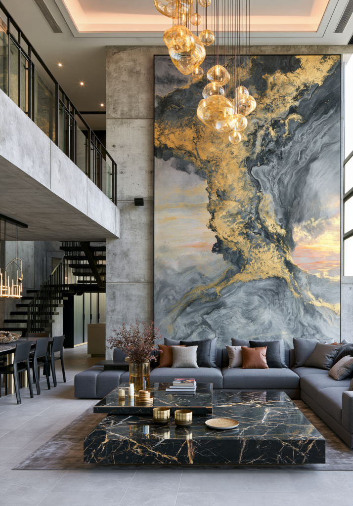
Sculptural piece 5
What do you think?
Leave a Reply

Blog

Get fresh home inspiration and helpful tips from our interior designers

top
1
    1
    Your Cart
    Vinicius dining table Remove
    Vinicius dining table
    Qty: 1
    Price: £7,124
    £7,124

    Inactive

    Privacy Overview

    This website uses cookies so that we can provide you with the best user experience possible. Cookie information is stored in your browser and performs functions such as recognising you when you return to our website and helping our team to understand which sections of the website you find most interesting and useful.